Last week several lovely ladies requested a post detailing my method for styling a room. I’m not going to lie, putting this together made me feel a little awkward. I don’t want to be seen as positioning myself as an expert, particularly after ‘bookgate‘ where journalists seem keen to suggest I have delivered a sermon preaching how everyone should display their books. Simply take this post as a few musings from someone who loves plumping her cushions and putting final touches to a room.
Unique
Most of the trinkets in my home are brand spanking new items from the High Street, usually HomeSense or H&M. However to move away from a carbon copy style I always bring in a couple of more individual elements; perhaps a bespoke piece of furniture or a DIY hand crafted creation as well as something vintage. There are car boot, antique shop, eBay and thrift store finds in more or less every room of our house, or something we’ve knocked up in the garage. I am a huge fan of the idea that these pieces are one-of-a-kind, or have been fashioned for a new purpose, or that they have a history. Not to mention the fact that others are less likely to have them.
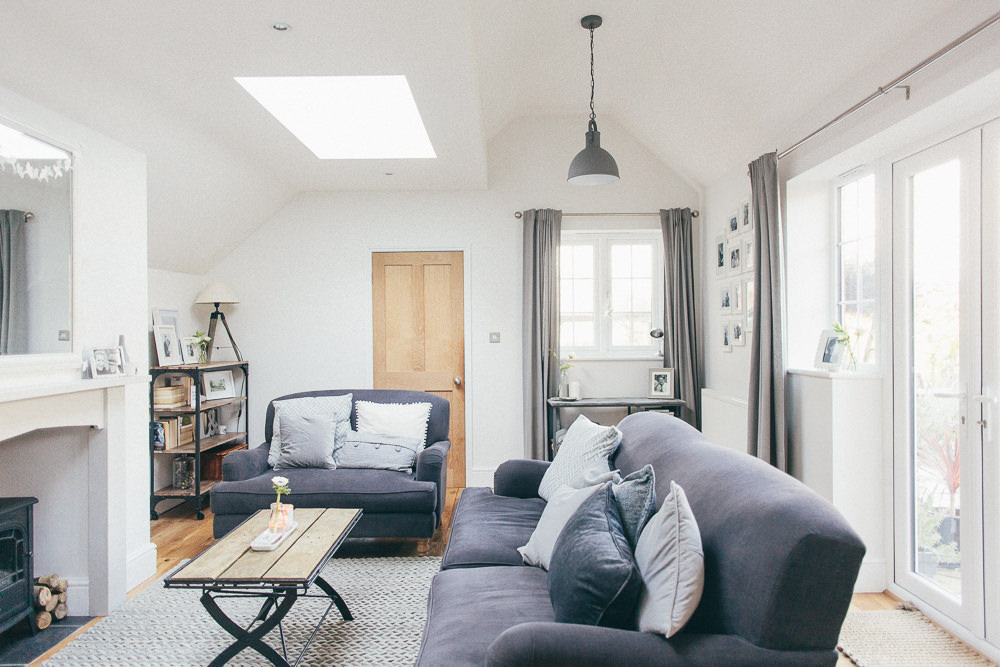
The coffee table in our living room is an old set of table legs repurposed with a discarded wooden pallet. Image by Adam Crohill.
Purposeful
William Morris uttered the words ‘Have nothing in your house that you do not know to be useful, or believe to be beautiful’. However in our house I actually try to make the make sure even the more practical of things are aesthetically pleasing and I rarely buy anything just because it’s attractive. I think that’s why I have so many candles and vases as to me they’re a double whammy – pretty and purposeful.
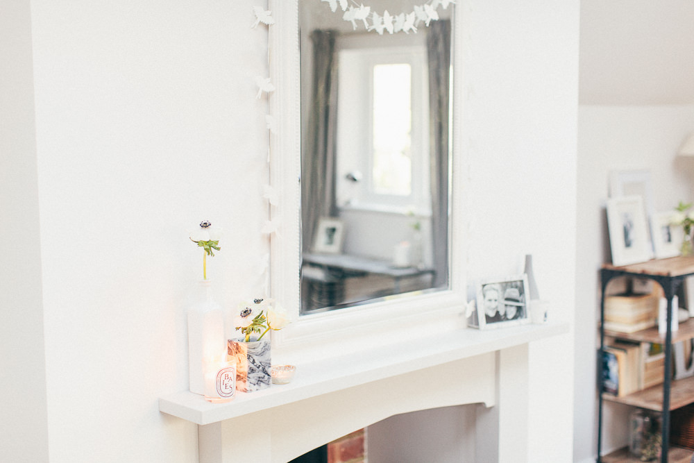
Vases and candles in our living room. Image by Adam Crohill.
Reflect Your Personality
For a room to feel truly authentic I feel it needs to incorporate your own personality and your interests. Don’t worry if an item is en vogue or not. If you like it then you should have it in your home regardless of fads and trends.
We still have lots of bits and pieces from our wedding dotted about the house and whenever we’re away I like to pick up a memento from the trip. The bar tray I bought from Brighton is a reminder of a great weekend away staying with friends. We have loads of photos of our motley crew on display in our house too. I love how pieces can evoke memories and become conversation starters too.
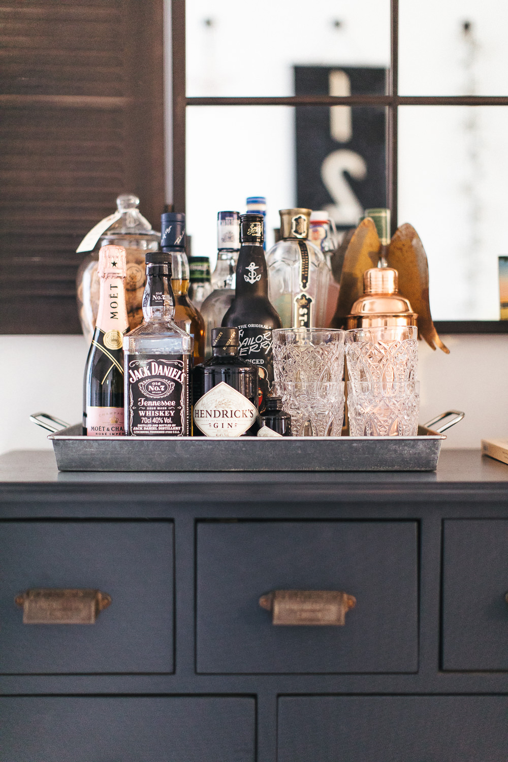
Bar tray in the dining room. Image by Adam Crohill.
Groupings
Whenever I’m creating a display (or a vignette if I’m feeling French) I usually group objects together in various heights, materials and forms to create visual interest. I tend to gather items in groups of three or five often using photo frames, candlesticks and plants for height. Throw in smaller standing objects, such as candles, smaller frames or floral stems and voila an interesting display. If you have a neglected space in a room consider adding a shelf or a piece of furniture with a collection of your treasures on top to let an unloved area reflect your personality. If your curation looks a bit haphazard placing together on a tray can give it a little more purpose.
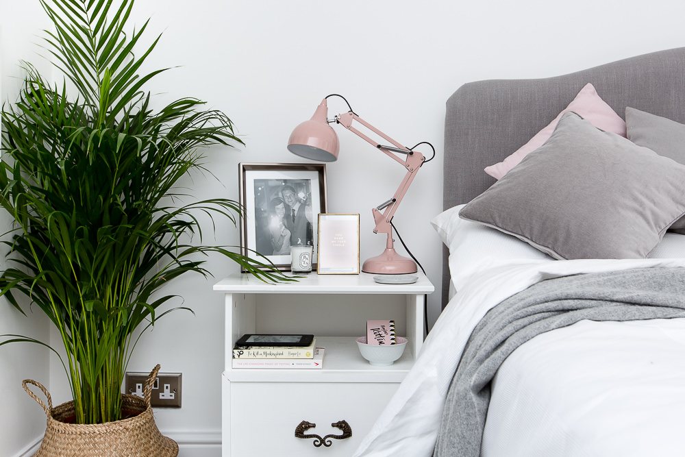
Collection of items on our bedside table Image by Little Beanies.
Eye Line
I often carry a tape measure with me and it’s probably my most frequently used tool when it comes to styling a room. I hang pictures and shelves at a height that works in tandem with the rest of the space. In the dining room the three frames over the radiator are the same height as the shelf over the cupboard. Yep it’s anal but it really helps balance a room and prevents the eye from jarring. However sometimes no amount of measuring can deter me from hanging at a certain height because it just ‘looks right.’
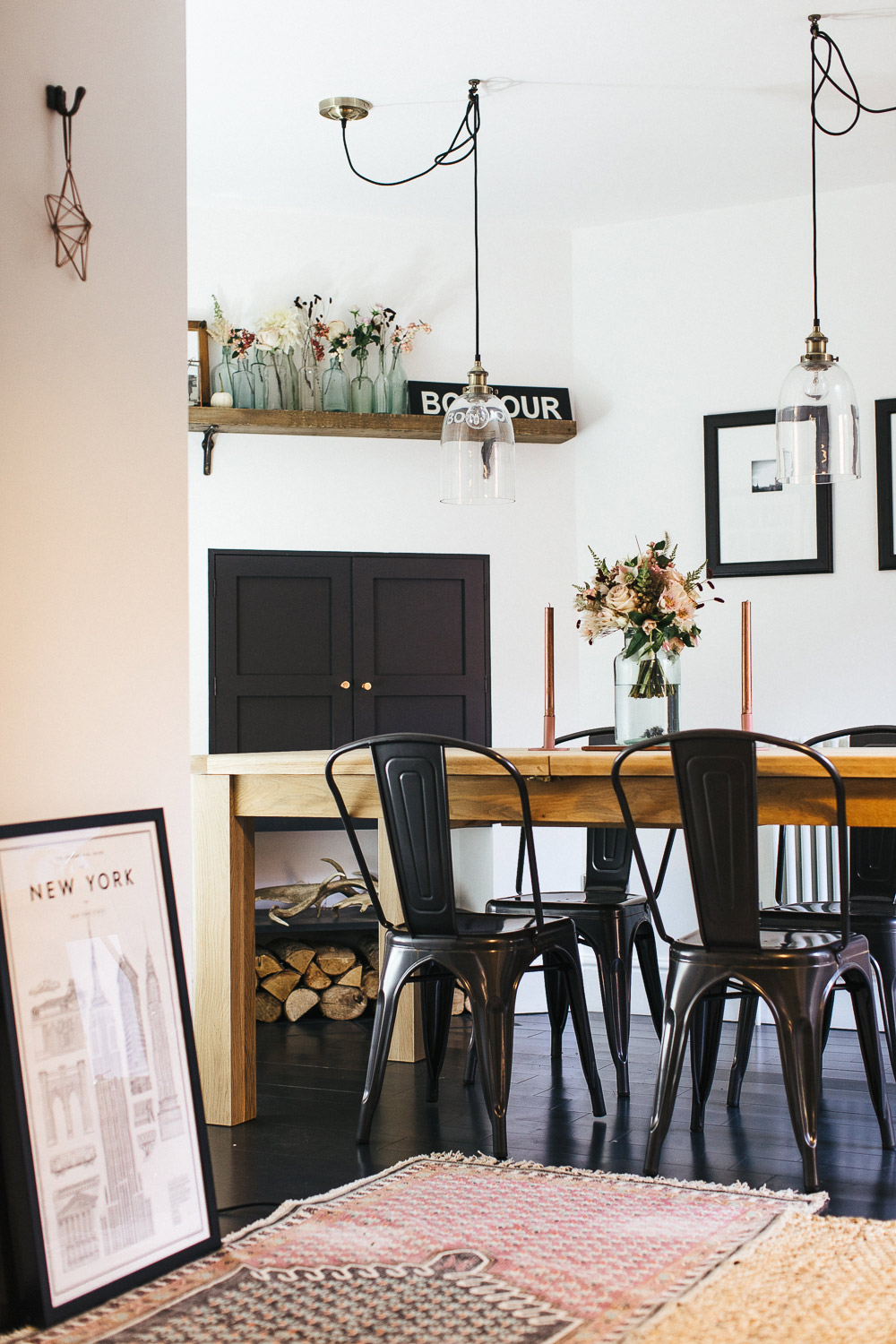
Dining room reclaimed shelving and custom framed instagram prints. Image by Adam Crohill.
Circle
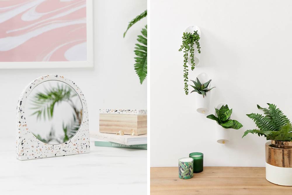
In awkward spaces I find circular objects work well. In our old bedroom the chimney breast swept through the room at an angle. A regular shaped frame on the wall may have looked peculiar due to the angled space around it so instead I opted for a circular mirror. In my dining room down a thin slither of wall I’ve added round plates due to the limited wall space.
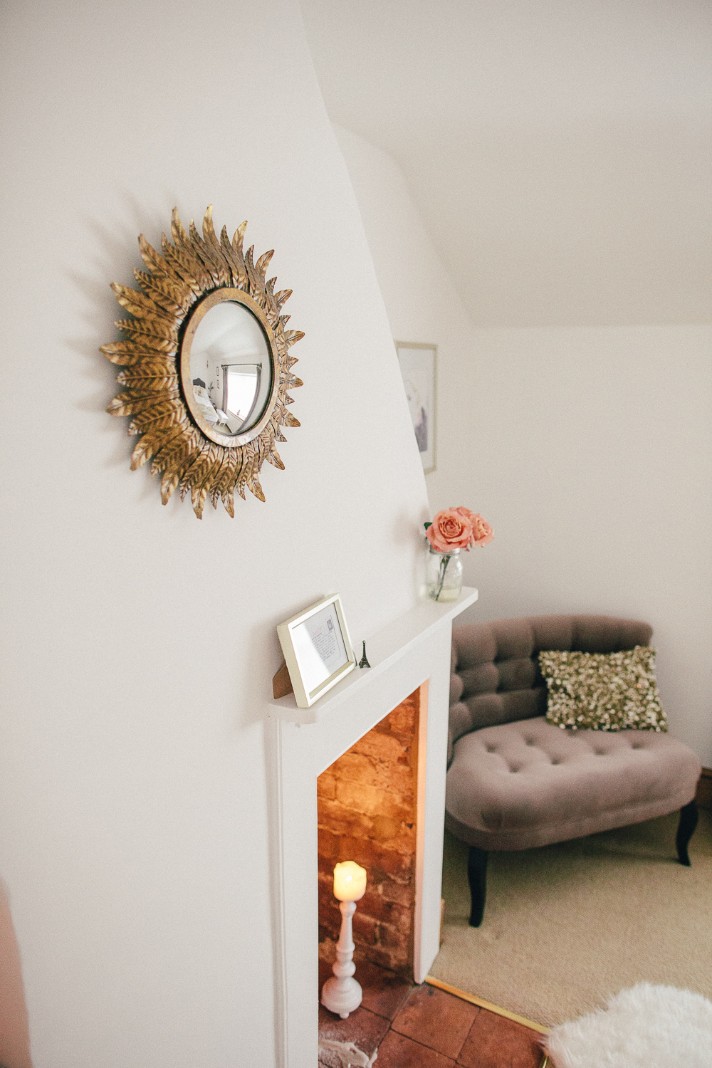
My old home tour. Image by Adam Crohill.
Accent Colours
If you’re introducing another colour to a room I often find you need at least three pieces in a contrasting colour dotted about the space otherwise it can look slightly random. I usually tend to balance out the pieces too by spreading them around the room rather than positioning them all in one area.
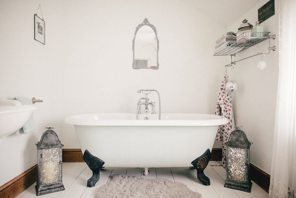
My old home tour. Image by Adam Crohill.
Go Green
From my perspective a room isn’t finished if it doesn’t have some form of flora or fauna in it. I love faux though there can be real health benefits to having a real potted plant or two in the room. It’s unusual for me not to have flowers in the house too, whether they be from the florist, supermarket or more often than not snipped from my own garden.
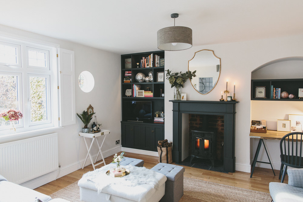
Faux stems, real potted plants and stems in vases in the snug. Image by WE ARE // THE CLARKES.
Texture
Building layers and adding texture are a sure-fire way to making a room feel cosy, lived-in and relaxed. I’m not adverse to putting a floor covering in an unexpected place either such a the rug we have in our kitchen or the sheepskin we used to have on our bathroom floor.
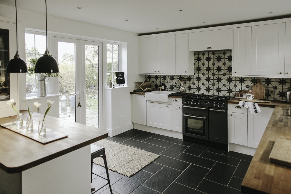
Jute rug in my kitchen. Image by Adam Crohill.
Art
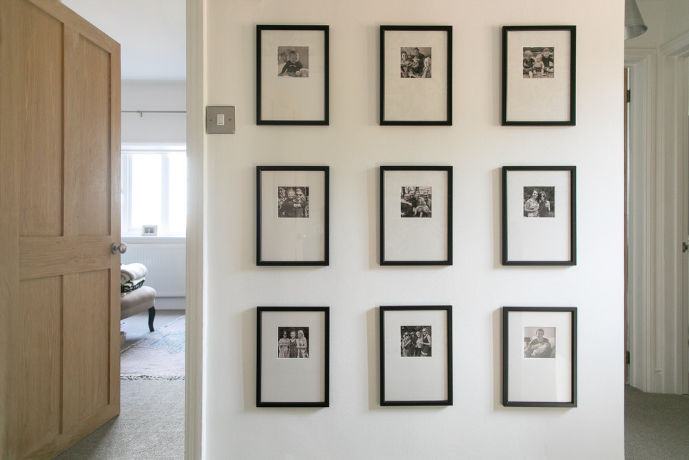
As mentioned last week, art doesn’t need to be expensive. I do however find getting well acquainted with a custom framer really elevates your art. While I still use inexpensive frames, I often ask a local framer to create bespoke mounts for my photos and prints which in my opinion makes the final product seem far more luxe.
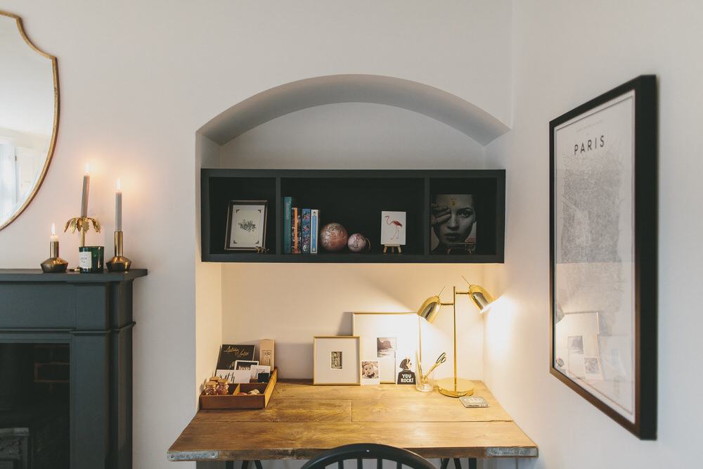
Custom mounts on my desk in the snug. Image by WE ARE // THE CLARKES.
Consider
I’m a much more considered shopper than I used to be. If I see something and really, really love it I would probably buy it but most of the time I am on the look out for something very specific to fill a space. I’ll start searching for decorative items in the planning stages of a room but these days I’m unlikely to commit until the design starts to come together to avoid any costly mistakes.
I often let a room evolve and constantly add pieces and take them away. I’m not too precious and at the end of the day all I want is a cosy, comfy home that feels loved and lived-in.
How do you finish a room? Do you have any elements you like to make sure are incorporated in a space?

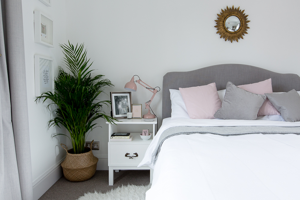

This is really helpful, thanks Lauren. We’ve got a dated conservatory that I really want to make a more enjoyable and liveable space (until I can convince my husband to rip it down and replace with the kitchen of dreams) – I think a plant in a wicker basket will help. They seem to be all over Instagram – where do I get them?! Do you have any tips for styling a conservatory? Why did so many people get them built!
If the wicker basket is the one I think you’re referring to, they can be found everywhere. Think they’re called belly baskets. You can get them with Pom poms or dip dyed etc all over the Internet but IKEA do the plain ones and they are cheap. I use them for keeping teddies blankets and small toys in. I also fold some In half and use them in shelving in the hallway for hats and gloves.
Hi Sian, I’ve got three of the ikea ones and I think they’re less than a tenner. They are folded down flat in ikea stores though so easy to miss! I got my palm plant from there too and another one from B&Q x
I feel for you Sian – we recently moved into a house with an enormous conservatory, which I hate and would like to rip down (but can’t afford to!). Both my parents & inlaws have commented how ‘lucky’ we are to have such a wonderfully large conservatory (say whaaat?!). So I have tarted it up with the following: new thick carpet with thick underlay – makes it very cosy, even in this cold weather; new super efficient electric radiator (again, so not freezing in winter); plant in a basket – identical to the one in Laurens pics – both plant and basket were a bargin from ikea; more nice belly baskets with sequins on the bottom for storing the kids toys; nice corner sofa, fairy lights all around the ceiling line, plus i’m about the paint the lower brick wall with a soft white / grey paint (because I hate looking at the red brick). Its still an ugly conservatory, but more bearable now! xx
We also have the conservatory conundrum. The space for storing toys is quite useful but it’s really a messy junk room attached to my living room by a see through wall. The woman who lived here before us apparently used it as a dining room! There must have been about three days in the year where the conditions were just right and it could be used to sit in. I haven’t considered painting the bricks before, but I might do now. Ours have ‘decorative’ lines all over them which will still show through the paint. Imagine a creature wildly slashing at the walls in an attempt to escape the extremes of temperature 😄
I think that’s the main problem with conservatories Nicola – the temperature so good on you for you carpet and your radiator. I bet painting the brick will make a huge difference too x
This post is everything I hoped for. Thorough, relatable (and by the way, not even remotely preachy). I’m going to have this bookmarked on my browser forever! We move in to our new place next week and whilst I want to live in it for a few weeks to unpack and get to know the light etc, I know I’m going to be itching to put some of these tips to good use!
Thank you lovely lady. So excited for you guys and the new pad and looking forward to you sharing more about it soon! x
Thanks for this post, Lauren! Particularly the bit about groupings. I am all about texture and I add circles and curves everywhere, so it’s good to know i’m doing something right.
I don’t know whether you follow sfgirlbybay, but she is one of my favourite bloggers. She posted a photo of a bookcase filled with backwards books a week or so ago. I liked to think of it as a show of support for you 😄
I do Jade. She’s fab! x
Thank you for all the useful information. I love the bar tray, and like the idea of bringing items together on a tray. I also agree that it’s necessary to be a more considered shopper. We’ve come back from holidays so many times, with loads of tut that just doesn’t go anywhere in the house! In recent years, I’ve put a lot more thought into what items would look good and where they should go. However, I’m often thawted when I find my husband has ruined the effect by leaving a tube of Pringles, random receipts and spare change on the coffee table!
Oh those random receipts! I swear they breed in the presence of husbands!
I love the idea of using circular objects for wonky spaces! And I’m the same when it comes to hanging pictures/shelves at a specific hight – drives my husband mad 😀 We’ve also become a whole lot more considerate about what we buy for the house, I think the fact that we’re fairly sure we’ll be staying in it for a fair few more years to come makes it all the more important to find pieces that will last and grow with us.
I wish we could use baskets and pretty storage options downstairs more, but with three dogs (one of which is a chewer extraordinaire), there really is no point, boohoo!
James gets annoyed with me when I start to say ‘can you just hold this here?’ and then I step back for ages and make him hold all sorts of random objects against the wall to check their heights.
Oh no to the chewed baskets 🙁
I love this… thank you! It’s these tips that are going to help me turn our new home into the vision I have! Echoing Maike above – as we know we’re staying put for a few years we’re putting a more consideration into everything we buy. It means we love it all!
Big congrats on the long term home Sian x
Thank you for sharing all these tips and tricks Lauren. We moved into our house this week and whilst We are still surrounded by boxes (husband has to do an assault course to get to his side of the bed 🙈) I am starting to plan out where to put our odds and ends to make rooms look finished. I’m bookmarking this for when we get to that stage! However I feel like plants will definitely be a quick win – although the cats love to eat them so going to go for fake rather than real (unless anyone has any tips on how to stop them chowing down on my daffodils!)
Unpacking is so much fun Jo when you find all the bits and pieces you’d forgotten about! Enjoy your new home x
So useful Lauren, I love your style. I always feel hopeless at doing the final few bits to pull a room together so this is so helpful – thanks for sharing!
I hope it’s ok to point readers to another blog – I’m sure most people will know Lisa Dawson from instagram and she’s recently done a post about how to moodboard ideas for rooms and gather the initial ideas idea which I’ve also found super useful.
You’re more than welcome to mention the lovely Lisa and her fab posts. We did an interview with her last year all about her move to her gorgeous current home x
Thanks for this, perfect timing as I will be tweaking bits of our house tonight ahead of the estate agents taking photos of if tomorrow 😊 x
Ps. If anyone wants to buy a 2 bed cottage in Derbyshire….
Izzie, I’m currently preparing my house for sale (in Derbyshire also!), the thought of strangers looking at the photos and judging what I’ve done with the house is slightly terrifying 😬
Totally with you on being worried what people will think of your work. We’ve totally renovated this place so i’m not sure if i’ll be insulted if people don’t like it – think we’ll get the estate agents to be in charge of viewings!!
Hope your house sale all goes okay. Hooray for Derbyshire x
I always break it down into three areas – fixed (walls & floor), semi-permanent (essential or large furniture such as sofas or tables) and accent (art, lighting, rugs etc). Decide what you want to be the focus and then find ways of complementing it which gradually draws your eyes around the room. If it is a bold coloured sofa, take your gaze past it with some artwork and add texture with a rug – just adding these two items creates three levels of interest. If you want to show off an amazing piece of art, think about whether a colour on the wall would make it pop, rather than white sometimes being a bit clinical and then think about what lighting can help keep the focus on that area.