The hiatus from decorating lasted about two minutes. I’m now hatching a plan for what we’re referring to as the ‘snug.’ This space was originally the main living room of the cottage though we’re intending it to be our home office.
As it’s the first room you come to when you walk through the front door I really don’t want this to be a corporate, business-like space and instead want to create a dual purpose office-cum-library-cum-whiskey lounge kind of vibe.
I don’t think I’ve been in many whiskey lounges that have a TV. Come to think of it I don’t think I’ve been in that many whiskey lounges full stop. However in order to make the most of the stunner of a log burner, we want to make this space a cosy relaxing one to curl up in to and perhaps indulge in an episode or two of Peaky Blinders. Whether or not we’ll actually work in this room is another story but it will give us a place to store all the office-type contraptions, filing and whatnot. We both spend about fifty percent of our time working from home so need a defined area rather than spreading out across the kitchen and other living room.
So how am I going to get an office-living room without it all looking a bit too, erm, busy? Well a couple of pointers worth remembering when it comes to giving an area a cohesive two-in-one treatment.
Same style
For a uniform and consistent space then try using similar decor elements across the room.
For our snug I don’t think I’ll go for a traditional desk lamp and instead will probably use a regular style table lamp. The cupboard we’ll build in the alcoves to house a small bar area will mirror the larger free-standing cupboard which I’ll use to store the printer and filing boxes and I’ll dot my coffee table books all around the room for a consistent, easy-on-the-eye space. Bingo a bit of consistency.
Complement
Use complementary shades and patterns for a cohesive look
Not much explanation required here. I’m thinking the palette in here will be navy, grey and white with a hint of silver thrown in. I’m not too sure about window treatments but in they way of pattern I’ve got my eye on this shaggy bolster cushion from M&S and maybe this geometric one from H&M in similar shades and complementary patterns.
Zone off
Zoning creates more intimate yet functional areas. In order to zone off an area you could paint it another complementary colour, hang a sheer curtain or use transparent storage or maybe lay down a rug.
While I plan to echo similar decor elements around the room I will zone off the desk space to one area. Without going through a bit of a rigmarole the TV has to go in left hand alcove meaning the large cupboard has to go behind the door and therefore I’m stuck with the desk in the right hand alcove.
In this room I think it’ll be the positioning of the furniture which zones off the desk where hopefully I’ll use a strategically placed arm chair to guide the eye into the centre of the room.
Double up
If you’re able to shut away your furniture when it’s not in use, for example if you have a fancy close-up bed or a fold-away desk then it’s a sure-fire way to bring a bit of harmony to a room. It’s handy if you can make your furniture work harder and blend two functions, therefore taking up less room and easing the potential chaos.
I’ve had to be really realistic about how much furniture I can fit in the room. I don’t want it to appear cramped so plan to leave adequate room around the sofa and chairs and am also likely to go for a round top side table rather than a square one as they take up a smaller footprint. I’d like to include an upholstered footstool in here which could lift up to provide storage as well as offering additional seating.
Open up
In double duty spaces it’s a good idea to remember the principles to bring in light and space.
I plan to use several mirrors to reflect and bounce around the light. This room is well proportioned but I’m conscious there’s going to be a lot going on. Remember the shield mirror Lolly mentioned recently? My sister has a similar one and I wonder if she’d notice if I shamelessly copied her?
Anyone else doubling up? How have you created a dual space room? Any tips and tricks you’d like to share? We’re starting to clear the room this week so hopefully I’ll have a few more updates over the next few months.

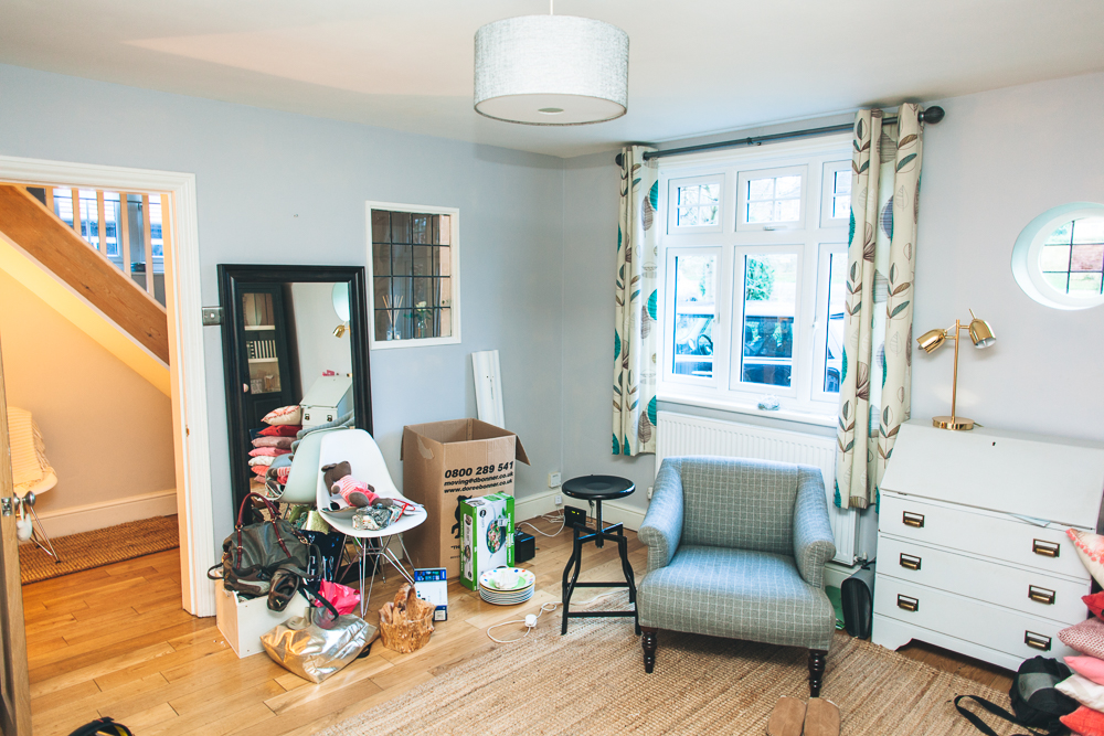
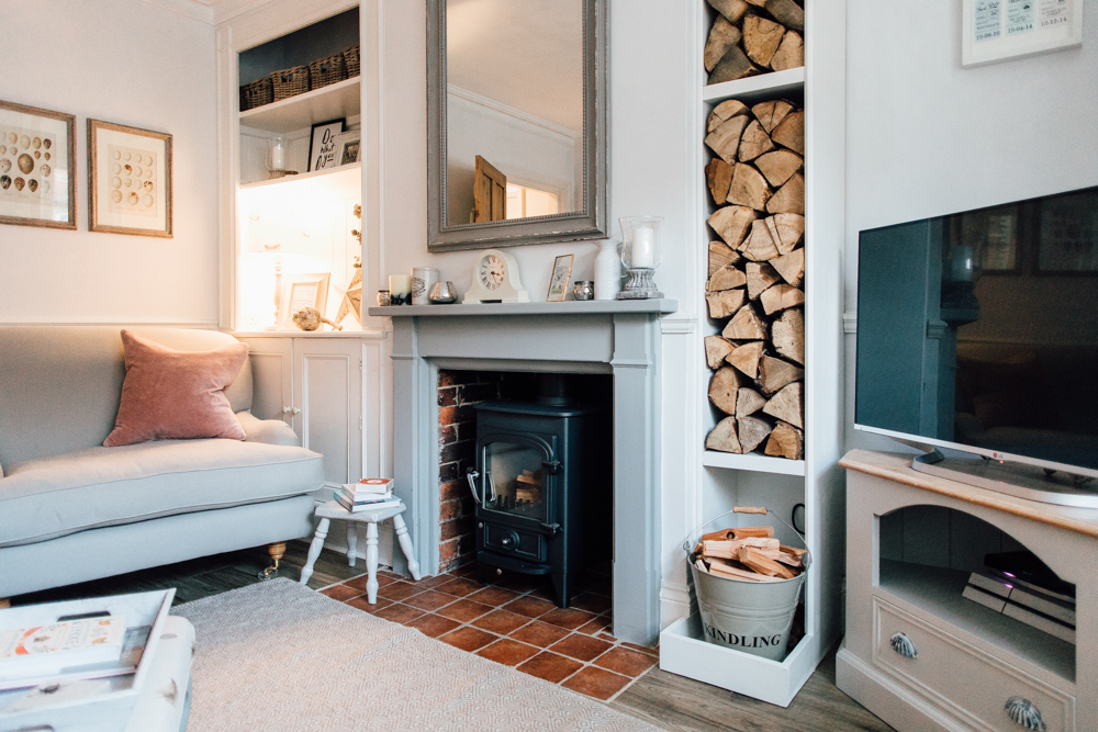
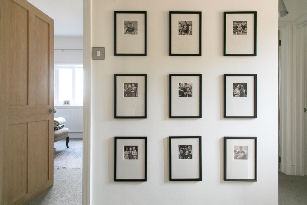
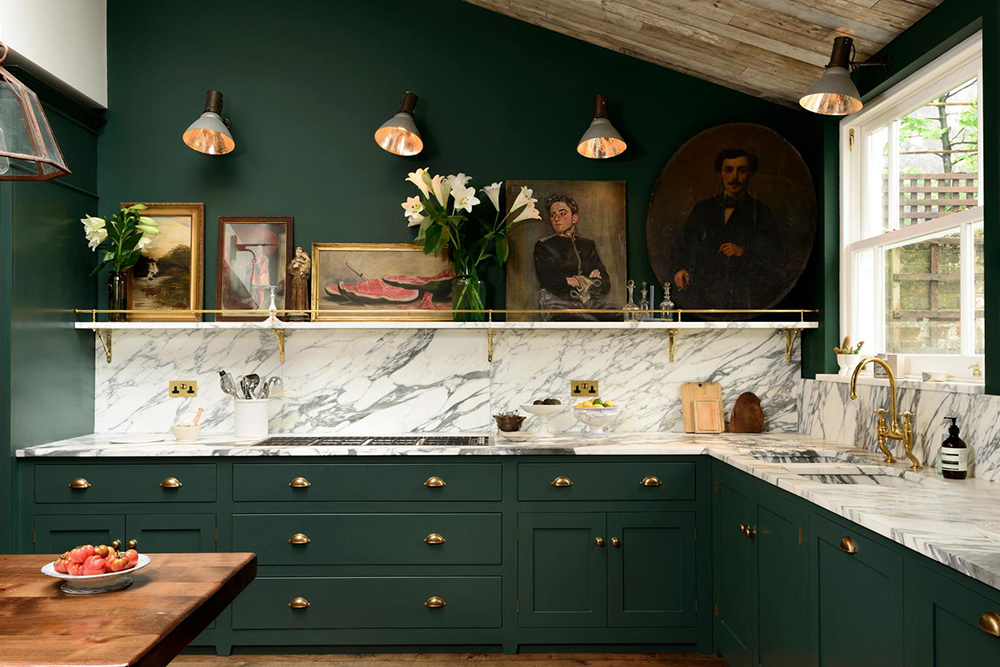
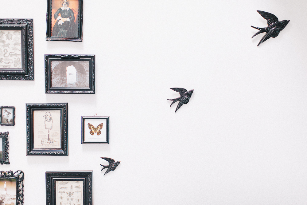
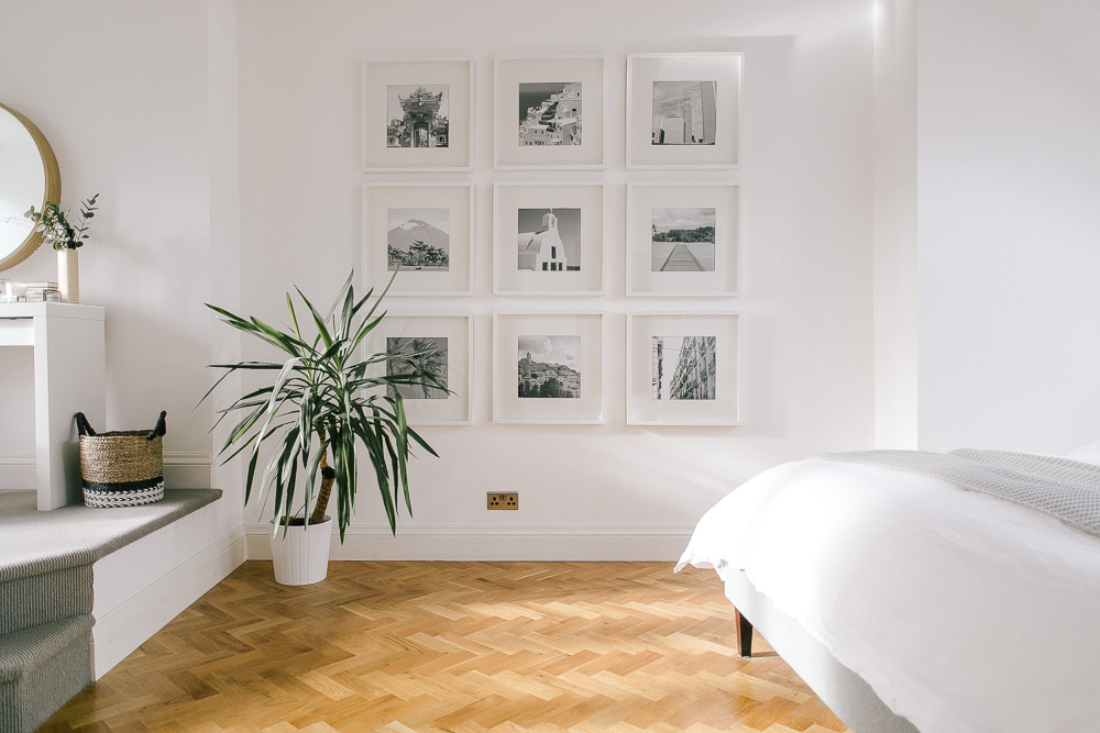
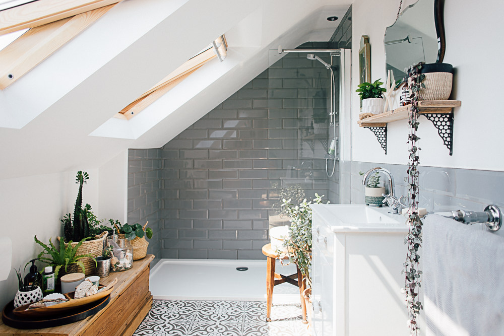
Oh I do love a Coleman before shot! I’m sure it’ll look fab whatever you come up with.
That mirror is fab. I’ve currently got my eye on this but need to find a bigger version https://www.amara.com/products/prisma-mirror-brass
X
Love, love, love the mirror and how it stands proud of the wall. You must track down a bigger one! x
Karen that mirror is super lush…might be worth saving the image on your laptop and uploading to google images to see if the interweb can find something similar for you!
What a cracking idea Lolly! I will report back x
I’m glad I’m not the only one who can’t leave the tool box and tins of paint alone! I love this room and I think it looks like a cosy, adaptable space. I really need a sewing/craft space in my house but a small Victorian terrace with fireplaces and wonky walls everywhere is not very accommodating. Can’t wait to see your finished room!
All hail the wonky wall! And fireplaces – so gorgeous but really restrict your furniture positioning don’t they. Hope you get to carve out a little space for yourself x
We have a snug-cum-office-cum-library (library sounds overly grand for what it actually is!) that we too found quite tricky to decorate and furnish. We live in a period house so we went for some inbuilt book-cases with lower cupboards over one entire wall that go all the way up to a high ceiling, then we have a small oak breakfast table, originally from Made.com, that we use as a desk and an oak M&S bureau for a second desk. We use table lamps rather than desk lamps on both these desks. We then went for a pink velvet sofa.com armchair for the reading area (husband horrified at the thought of pink, but its his favourite spot now!). I think these sorts of multi-tasking rooms evolve over time, we add bits and pieces as we find them. One thing we don’t yet have is a nice mirror and this post has inspired me to seek one out. Happy decorating, am in no doubt your space will look gorgeous once finished – lucky, lucky lady for having a log-burner in there 🙂
Nicola – this pink chair of yours? Oh my. Divine! x
Somewhat related… Can anyone recommend somewhere to source stylish filing cabinets?! We can’t do without one as our desk doesn’t have any inbuilt storage but all the ones I can find are so boring!! I love the mint green one in your pic but where does one find such a beauty?!!
What about buying a white filing cabinet and spray painting it mint green? X
I think the mint filing cabinet it from CB2 in the States – http://www.cb2.com/tps-mint-3-drawer-filing-cabinet/s482978 but they ship to the UK!
Failing that Lisa’s idea of whipping out the spray paint is a great one x
Lauren you can’t shamelessly copy your sister’s shield mirror! As I want to shamelessly copy it for our living room! 😀
Kitty, I’ll copy if you do 😉 x
Love a new #wip post from you lauren. Luckily we have the perfect box room (also with the best view ) which ive turned into an office. But i want to turn one of our attic rooms into a tv snug. Downstairs we have a huge living room which has kind of a dividing arch 2/3s of the way down (sounds nicer than it is) and in that end we’re going whisky & book library. (My husband makes whisky so our collection is growing fast) we have a beaut 1950s cocktail cabinet & there is an Edinburgh press which is now shelves for holding more bottles & photos. I was really keen for a new bookcase so looking at buying ikea VITTSJO & spraying copper or gold. We’ve two chesterfield chairs for the space too – small coffee table needed. Lots of pics of other parts of the house on #oldmanseproject hashtag on insta!
Lauren,
Love, love the double duty usage of your home! Living in an apartment I know the need too well.
You had a post this past year showing lovely mango wood? stools against a beautiful tile backdrop. I have been looking for those stools everywhere, with no luck! Can you help a girl find them? Thank you, lovely lady!
Best,
Ava
Hi Ava, thanks for your comment.
Any idea which post is was? If you can let me know the link I can look into it for you x
[…] comes together fairly organically. With the snug it was a bit different. If you remember from my initial ‘double duty’ post I was determined to create a multi-purpose space; one that was creative yet relaxing, for both work […]
Hi Lauren, where did you get those thick shiny white boards for your shelves and tables in the desk shot? I know Ikea has a lack floating shelf but I am not sure where to get the long bench/desk piece? It’s the middle bottom shot with the computer in it and the dark wooden chair that I’m talking about. Thank you!