
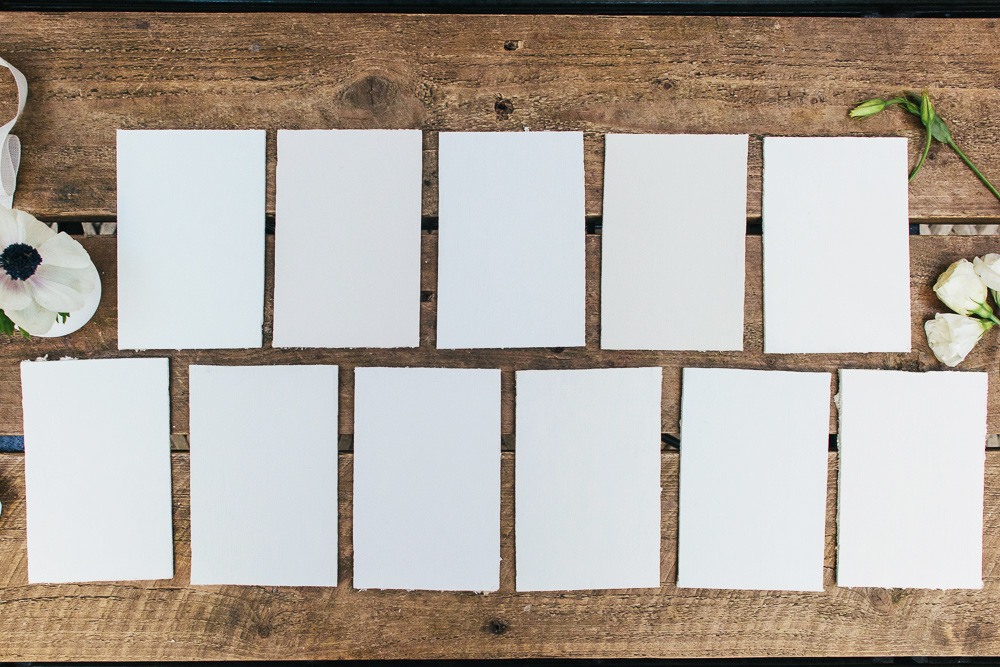
As most of you know, I shy away from colour on my walls. However white paint is far from a fail-safe option – with hundreds and hundreds of different whites it can be easy to end up with a shade that’s too yellow, too blue or something altogether different to the pin-worthy look you were going for.
As an update so our hugely popular ‘finding the right white’ post produced way back in the early days of RMS, today’s colour guide focuses on whites and neutrals, adding a few more new finds to the mix.
Crown Milk White
I used Milk White in my old bathroom and some may say it has the slightest mint green tint. It has a very fresh appearance but isn’t stark or clinical.
Dulux Almost Oyster
A very warm neutral with a slight pinkish, grey hue. Dulux Almost Oyster changes from the palest pink to grey throughout the day depending on the light.
Farrow and Ball Wevet
Cool and translucent, Farrow and Ball’s Wevet is another fresh, elegant neutral. With the slightest grey tinge this paint looks great paired with other greys.
Farrow & Ball Slipper Satin
I featured this in our recent grey guide too due to the soft grey stone colour. Farrow and Ball Slipper Satin has no cool undertones so really warms up a space.
B&Q Antique White
With a real vintage feel, B&Q Antique White is great for the creamy quintessential cottage look. I have to admit I didn’t get along with B&Q emulsion due to the poor coverage but was really pleased with the satinwood finish when I painted the furniture in my old spare room.
Dulux White Cotton
White Cotton is a very slight off-white which also looks great paired with grey. If you are after a warmer finish I’ve read Dulux Jasmine White is a good option.

Crown Sail White
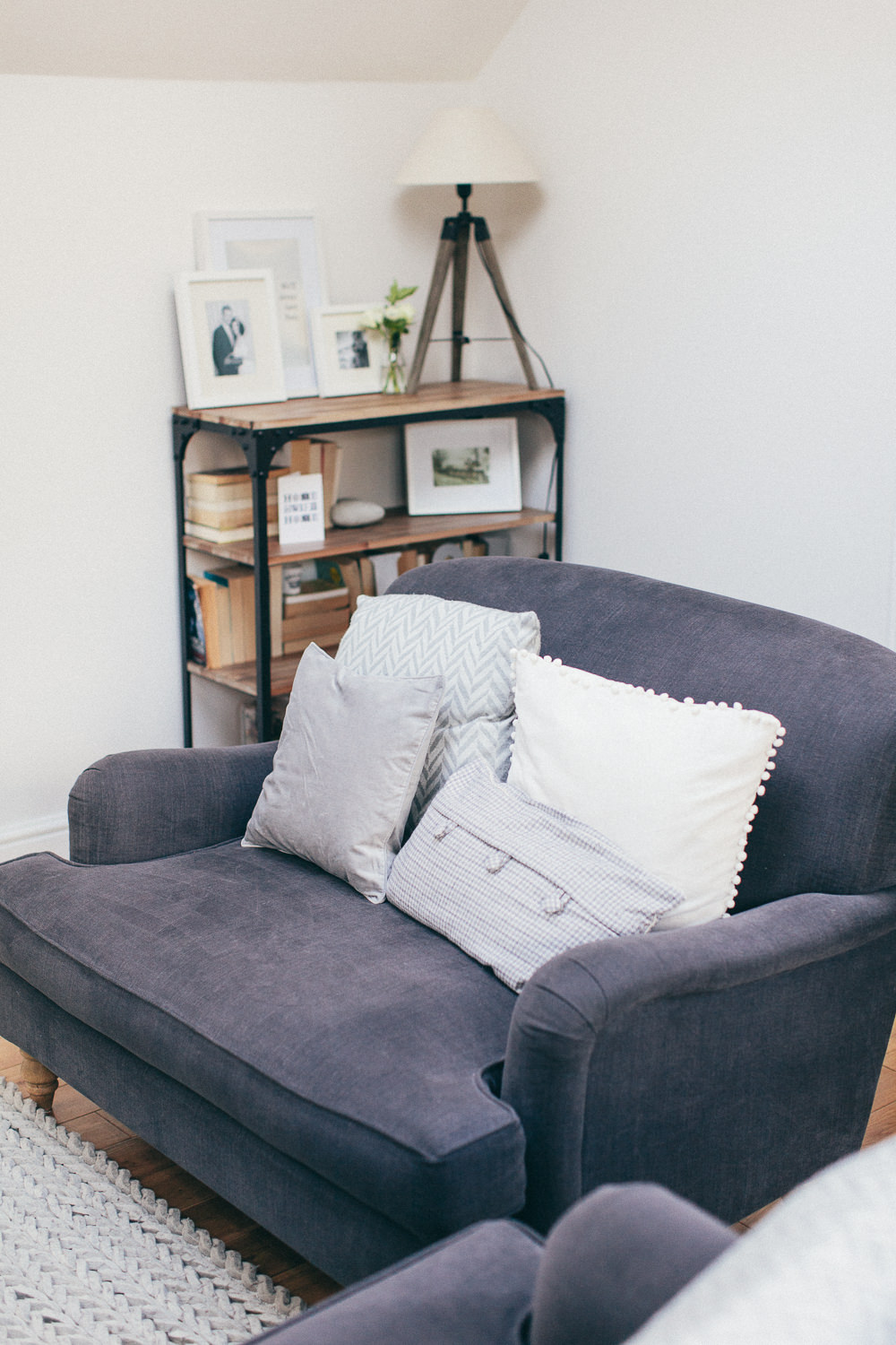
I’ve gone on and on about Sail White featuring it in our grey paint guide too. As you can see in this post there are plenty of whites now with a greyish base but this is my go-to and I love the finish in my recent living room makeover.
Dulux Chalk Blush 4
If griege is more your thing then consider the very contemporary Dulux Chalk Blush 4 (the lightest shade in this palette).
Dulux White Chiffon
I have a bit of a love-hate relationship with this paint and urge you to check the aspect of your room before you use it. In my old west-facing spare room White Chiffon was creamy and rich without any yellow tones however in my new north-facing room the dreaded yellow is prevalent. Best to avoid if it’s a room requiring a lot of artificial light.
Crown White Glove
White Glove is a flat matt heritage shade with some real depth.
Dulux Timeless
I discovered this a couple of years ago and have used it by the bucketload. Dulux Timeless manages to adapt to the colours surrounding it to perfectly compliment your decor. In my old house I used it in rooms with a quarry tile floor and a slate floor and it never clashed. An easy-to-use shade which I’ve always found to be a fail-safe neutral.
Dulux Trade Supermatt
Now I didn’t have a sample to show of this paint but if you’re after a true, pure white without the coldness of ‘brilliant white’ then this is the paint for you. Originally meant for application after plaster I’ve used Supermatt in White (not brilliant white) in my recent master bedroom makeover (more on that to follow soon) and for me it’s the perfect white. It’s not particularly hard-wearing though so better for lower traffic areas. I only wish I could find a satinwood in the same shade to paint my bedroom furniture. I would bite your hand off if you can make any suggestions.
What white is your favourite paint to use? What kind of neutrals do you use on the wall? If you’re a fan of other shades then you can find our colour guides to blush, grey and darks in our paint chart archives.

Always a small air-punch when i see a good paint chart post on RMS. Chats for days and days about shades of white paint?
Weve had the Chiffon v Cotton debate when doing our living room but thankfully its a big space and there’s lots of light so we get the best out of White Chiffon. It’s paired with Eau de Nil and Downpipe. Looks fab. We’re using the Cotton on the (ahem) nursery along with greys and this Scion paper http://johnlewis.scene7.com/is/image/JohnLewis/234936790?$prod_mob$&ttl=31d
I know we’ve said it before but I also love trade white. We go for Leyland which gives a really flat finish on the ceilings and used their vinyl matt in the Kitchen which is more hard-wearing. Leyland, is dirt cheap too so Lee has a weird habit of stockpiling it in the garage whenever he sees it on offer.
I’m sure I’ve said all of that before but I can’t remember :/ x
Oh the wallpaper – gorgeous! (and bloody exciting room for it too!)
Once we’ve finished the bedrooms (final coat on bed three tonight) we’re doing the snug/office. I’m trying to find something to go with Charcoal Sketch by Valspar but I keep dithering, maybe I need to go down the Cotton route too?
Must check out Leyland paint for the kitchen…. x
Still a big ‘?’ over that room so touching wood and keeping it neutral!
I think you’re right about Cotton going well with grey tones, definitely a good option. You’re going great guns on that house! We’re really lacking the motivation at the moment to get our last two bedrooms finished. The preparation is going to be a killer, we just cant face it. xx
Touching wood as I type for you 😉
There’s nothing like sleeping in a downstairs bedroom and a deadline looming for carpet fitters to really get you motivated. I think by the end of May I’ll have had enough. I’m knackered! x
We’ve just used Dulux light+space paint in Frosted Dawn in our flat – not the cheapest paint but it certainly brightens the room and is the perfect shade of ‘frothy milk’… My boyfriend though I was made when I used that description!
Always love these posts – the grey one had a massive impact on our swatch selection for our lounge and kitchen.
I love the idea of a ‘frothy milk’ paint Katie – I know exactly the shade you mean!
Glad we’ve been able to help with your lounge and kitchen Katie. Which paints did you go for?
I’ve just noticed the number of spelling errors in my first post – can I put that down to ‘renovation exhaustion’?
Our lounge now is Dulux Night Jewels 5 (a lighter shade of the Night Jewels featured in your post) and then after one massive paint fail in the kitchen (avoid Dulux Frosted Steel like the plague unless you want lilac), we ended up with Chic Shadow (compliments the pure white kitchen perfectly).
Keep up the great posts!
We’ve just painted our hall in B&Q Antique White and it is lovely! As someone who loves painting everything grey, it was tough to move away from that and I’m glad we did. Now just to get some bright paintings on the walls to balance it out! x
Such a rich shade Marianne, and sometimes it’s nice to move away from grey isn’t it? x
Hi Lauren, great post especially for a total novice like me when it comes to painting. Please could I ask which white you would recommend for a small box room which is being turned into a nursery – we are going for this http://www.nubie.co.uk/childrens-wallpaper/all-childrens-wallpapers/owl-print-wallpaper-ferm-living wallpaper on one wall so want a white for the others which will match. Blatant steal from Lottie’s amazing house tour! The background seems to have a blue ish tint which is why I am not sure what to go with… also the walls are currently painted maroon (thanks to the previous owners!) so is there any particular paint which is best served for painting over dark colours? Any advice would be greatly appreciated! Thank you x
Hi Laura, if we’re dramatically changing changing the colour than we whack on a coat of bog standard brilliant white emulsion before cracking open the proper colour.
Love that paper! I’ll ask Lottie which white she used on her walls and let you know x
Thank you! x
I was trawling the internet for a post like this just two weeks ago when painting our bedroom! White paints are a minefield – so many to choose from, who knew picking a white paint was so hard!?
I found lots of examples of whites with grey bases but I wanted something ever so slightly warmer…white with just the smallest hint of cream and definitely not too yellow! We went for Farrow and Ball Pointing in the end which I am really pleased with 🙂 x
Great choice Tish x
Hi Lauren,
This is the best post I have found on white paint so far! Well done! I need white paint for the whole house! I have samples of Timeless, Jasmine White, White Cotton and Rock Salt. Lots of people think the Rock Salt is white but im sure its a grey? I want a bright white but perhaps not the pure brilliant white that sometimes hurts the eyes! Help! House is 1978 and carpets will be a light beige, natural, neutral colour. Thx, Laura
Lauren, could you come and be a colour consultant in my home please?! These colour posts are great but now I have even more potential options lol We have painted our kitchen cabinets a lovely blueish grey (a variation on pavilion grey) and now I’m struggling to find a white which isn’t too cool but yet matches the grey.. I love slipper satin but it seems too yellow on our wall, I’m wondering is it the old magnolia shining through, maybe we need to try White Glove or White Cotton!
Ha ha Amy, after my disaster with the white chiffon I’m not sure I’m the best one to ask 😉
F&B suggest pairing pavilion grey with blackened or strong white – have you given them a whirl yet? x
I’ve tried ‘blackened’ in the past and loved it! Definitely considering giving it a whirl in the new house too…
I am scared of white!!! But seriously considering it for our new bedroom which is a sort of loft conversion……I can picture it perfectly as a glorious summer room but I’m just really worried that it will appear cold and stark in the winter. What are the best colours to team with a white room to make it cosier?
Sometimes it’s about the textiles and texture you pair it with Sarah rather than the colour. As long as you layer in loads of different cushions, throws and a few metallics you’ll find it still looks cosy x
F&B Pointing on the walls and Shaded White on all the woodwork, all through the cottage, call me boring but I love it! I’ve had to write the combination down for quite a few people, so it must look OK to others too.
Smashing combo Eileen. All this talk of Pointing makes me want to try it out myself.
I’m abit of a convert to pure and simple “brilliant white” (specifically, we use the Albany range of paints in our house). Due to a recent extension and house renovation I’d kind of run out of steam when deciding what colour to do one of my kids bedrooms. I keep reading interiors mags where people paint their entire house brilliant white and rave about how easy it is, especially when living with kids. I was dubious but it’s turned out an excellent choice for us. Granted, we’ve only done one bedroom and not the entire house – just can’t imagine that my 3 monkeys will not trash it in 5 seconds flat. But for our youngest’s bedroom we love it – clean, bright and literally any accessories can be added. Some other gorgeous choices here though…. Off for buy samples for our hallway.
A friend of mine was raving about Albany paint the other day Nicola!
So easy to cover up any marks when you’re dealing with brilliant white as you don’t seem to need to worry as much about tell-tale touch-ups.
Let us know what you end up going for in your hallway.
Why what perfect timing! I literally spent lots of time yesterday umming and ahing about Crown Milk white as enough is enough with our super grotty third bedroom. Let the belated rock my room makeover begin!
A definite vote for Timeless here! On your recommendation, Lauren (and for #rockmyroom!), we painted the majority of our dining room with Timeless (paired with a Crown City Break – a dark grey – feature wall). We’re really pleased with it – it’s north-facing so doesn’t get much direct light but Timeless is a sort of a very pale cream; definitely not a brilliant white. We’ve got brilliant white on the skirtings and you can see the difference (but they look really nice together!). One tip, though – don’t be seduced by the Once stuff, one coat may sound like a dream but in reality we needed two, and even then the brush strokes still showed through (the paint is really thick but also dries incredibly quickly) so we went out and bought a tin of the standard paint in the same colour to do a final coat! Still a fan of the colour itself though 🙂
Glad you like Timeless Katie. Yeah I’m not a fan of the one coat emulsion stuff either. We’re using the Endurance version at the moment as it’s super duper hard wearing x
Farrow and Ball – Strong White
A lovey white shade of grey, a tester is a must to appreciate the colour. In my opinion its named incorrectly.
Hi! I took your advice..went with crown white sail for the bedroom -LOVE IT!
Hi Lauren
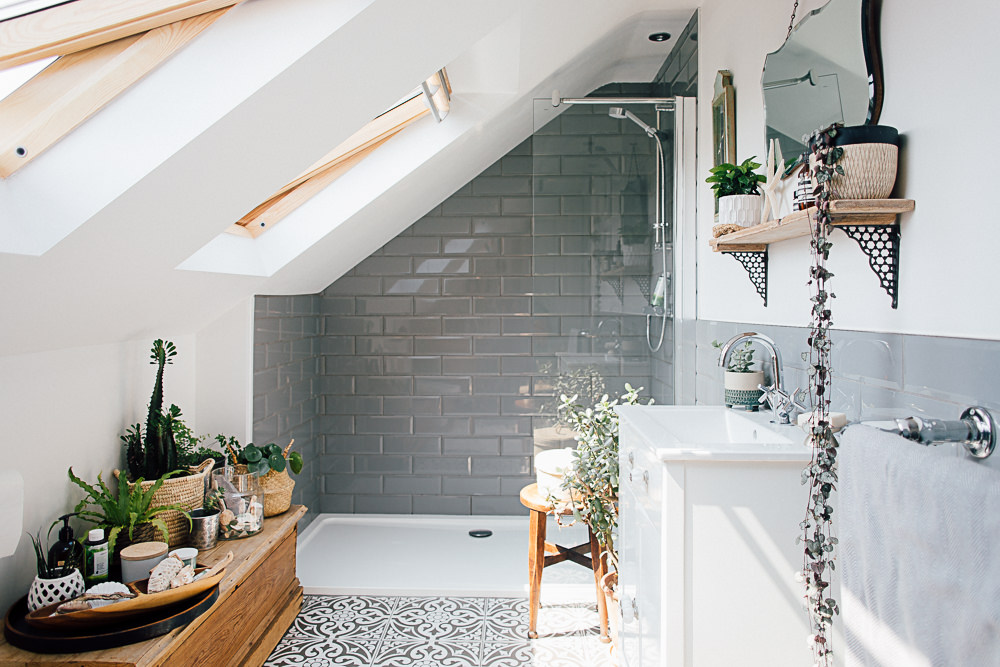
Could you please tell me where the chrome towel rail is from in the Crown Milk White picture?
Thanks!
Hi Abi, it was from Ikea but about five years ago now so not sure they still have them 🙁 x
Hi Lauren, love the post. Do you or any of your readers have any suggestions for an alternative to F&B Strong White? I’m painting my kitchen Inchyra Blue and floors Cornforth White and would love Strong White for the walls in the kitchen and adjoining living room but my budget won’t stretch to it. I so far haven’t found any good Dulux matches. Any advice appreciated!
Hi Jodie,
Nothing comes close to the F&B finish for me but if you’re after a colour match then you could consider getting the colour mixed at a Johnstones Trade counter. Hope this helps x
Hi
We are redoing hall stairs and landing over three floors, the light really changes as you go up the house with the ground floor not getting much natural light and the top floor being very bright due to a big roof light. We want a warm grey below the dado rail and an off white to complement it above, that will work over all 3 floors (difficult). So far all the greys we have tried have come out bright blue on the ground floor, apart from pebble shore, which we pinched from one of your previous blogs which showed somebody’s lovely master bedroom in it (thanks!). Definitely don’t want anything too Cream, beige, yellow, brown, pink, purple or blue. Can you recommend an off white that might work? And anything else similar to pebble shore for below the dado? Actually, while we are at it, is it a good idea to paint different colours above and below dado??
Hi,
We have just painted our bedroom with Chalk blush 3 and loving it.. Really need advise on which white to use on wardrobes. We have already tried FB great white – way too pink! Tried FB pointing – very yellow. Just need a cool white, which is not boring and not stark bright. Before I spend the fortune on testers ( which I have now fair few), please please can you suggest a lovely white? Please rescue! Thanks..
[…] are the most deliberated when it comes to interiors, as these posts on finding the perfect shade of white and grey demonstrate. There’s a lot of trial and error, but making sure the tone you’ve […]
Hi there!
I’ve been reading your great blog on Grey’s and whites and I love them. My problem is I suck to hell at picking colours and need ur stylish eye.iv stared at so many tester squares I’ve gave myself m?I desperately need your help I cry!!!! Right ,my situation is all my rooms in my flat are west or east facing and I need a very pale grey or off white/grey that suits those kind of rooms. I like the look of sail white but will it suit west and east facing rooms?Please help me!!!
Hi, Can you recommend a nice white paint for alcove shelving there are so many😱.
Hi , came across your website after hours of searching the web for answers to my problem.
I have a large traditional living room with high ceilings with traditional features and ceiling plaster decoration. I wanted a clean look and previously had putty on the walls but looks very dirty as it doesn’t have a great deal of light in the room . I have gone for White cotton and was having a grey on the feature fireplace wall? I have applied the white cotton to one of the walls and my problem is when i painted the plaster at the top of the wall white, they both look the same colour? I was looking for it to be slightly different so that the feature of the plaster at the top of the walls contrasted to the main colour. any suggestions please.. Or if you think that will work then happy to get your approval !!!
Hi at the end of May I will be having my lounge done was thinking Laura Ashley duck egg blue on a large wall and cannot decide on a beige or touch of white contrast emulsion. The furniture is a sand colour carpet beige, roman blinds are in duckegg with a bit of beige in? Love the almost oyster or the origins perfect oyster both dulux can you help please.
I’m really struggling, trying to find a warm white that doesn’t appear yellow in a living room that has large south and north facing windows.
Would really appreciate your comments or help!
Sarah ,I am the same.Dulux recommended white cotton so I am going to give it a try x
Such a helpful article, thank you!