
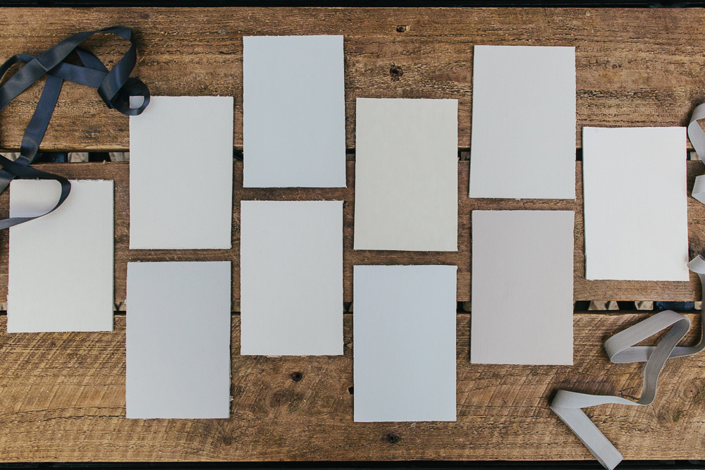
Please do not adjust your monitor. You may be fooled into thinking there are several splodges of grey paint above but if you look a little closer you’ll see there are very subtle differences between all these hues. As with our recent blush paint guide we’ve placed some of our favourite grey paint (or grays for our American friends) side-by-side to demonstrate their varied characteristics.
Back in 2014 we featured a post all about choosing greys in your interior decor and I can tell you know my love affair with this neutral is far from over. In fact my whole house is likely to be kitted out in the palest of greys. Equipped with a few more shades, today’s post is an update to the original colour guide to help anyone intent on decorating with this uber stylish colour.
Farrow and Ball Cornforth White
A neutral warm grey paint. I’ve used Cornforth White in my living room and adore the soft hue. In my own home (with a lot of natural light) it’s taken on a ‘mushroom tone’ but in rooms with less light it appears a ‘true grey’.
B&Q Grey Hints
I think you can imagine what I’m going to say here; yup Grey Hints has a subtle hint of blueish grey.
Farrow & Ball Slipper Satin
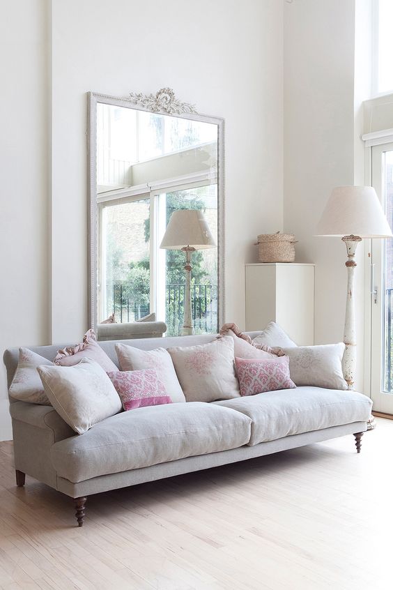
I had originally selected Slipper Satin for our recent blush paint feature as in lighter spaces this paint has a pinkish ballet slipper, however I felt it sat well in our pale grey paint guide too. As described by F&B, Slipper Satin is a soft grey stone colour with no cool undertones.
Johnstone’s Moonlit Sky
For a cool inexpensive grey paint give Moonlit Sky a whirl.
Laura Ashley Pale Dove Grey
I’ve have Pale Dove Grey earmarked for the furniture in the master bedroom makeover. A soft and delicate grey paint which looks spectacular partnered with a white.
Farrow and Ball Shadow White
You know the beautiful tone you get when a white wall goes into shade? You get that from F&B’s newest shade, Shadow White. More of a neutral than a grey (though pleasantly it avoids the yellow undertone of a beige), this shade is understated and looks fab in airy spaces.
Crown Gallery White
I’m very tempted to use Gallery White in our snug. A very rich white with a slightly bluish cooler undertone makes for a calm space.
Farrow and Ball Ammonite
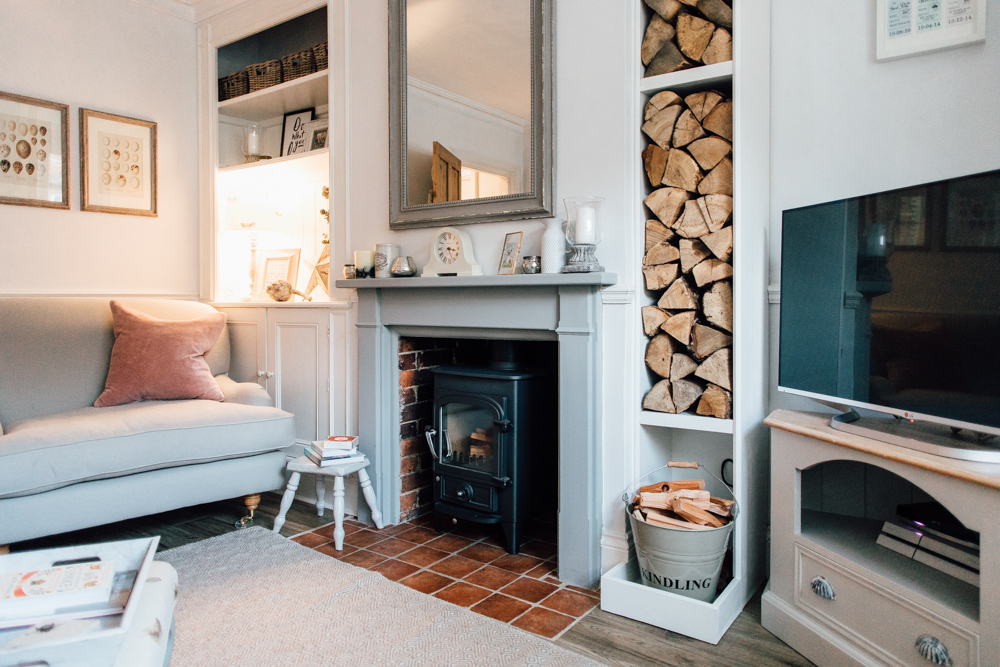
One shade lighter than Cornforth White, Ammonite is subtle refined grey which looks airy in light spaces but also really smart in areas with less natural light. If you want to pair it with a darker grey paint, it looks stunning with the moody F&B Mole’s Breath.
Dulux Perfectly Taupe
Good if you’re looking for a warmer grey paint to soften a space. With a red undertone you may find Perfectly Taupe takes on a very slight purplish tone in low light.
Crown Sail White
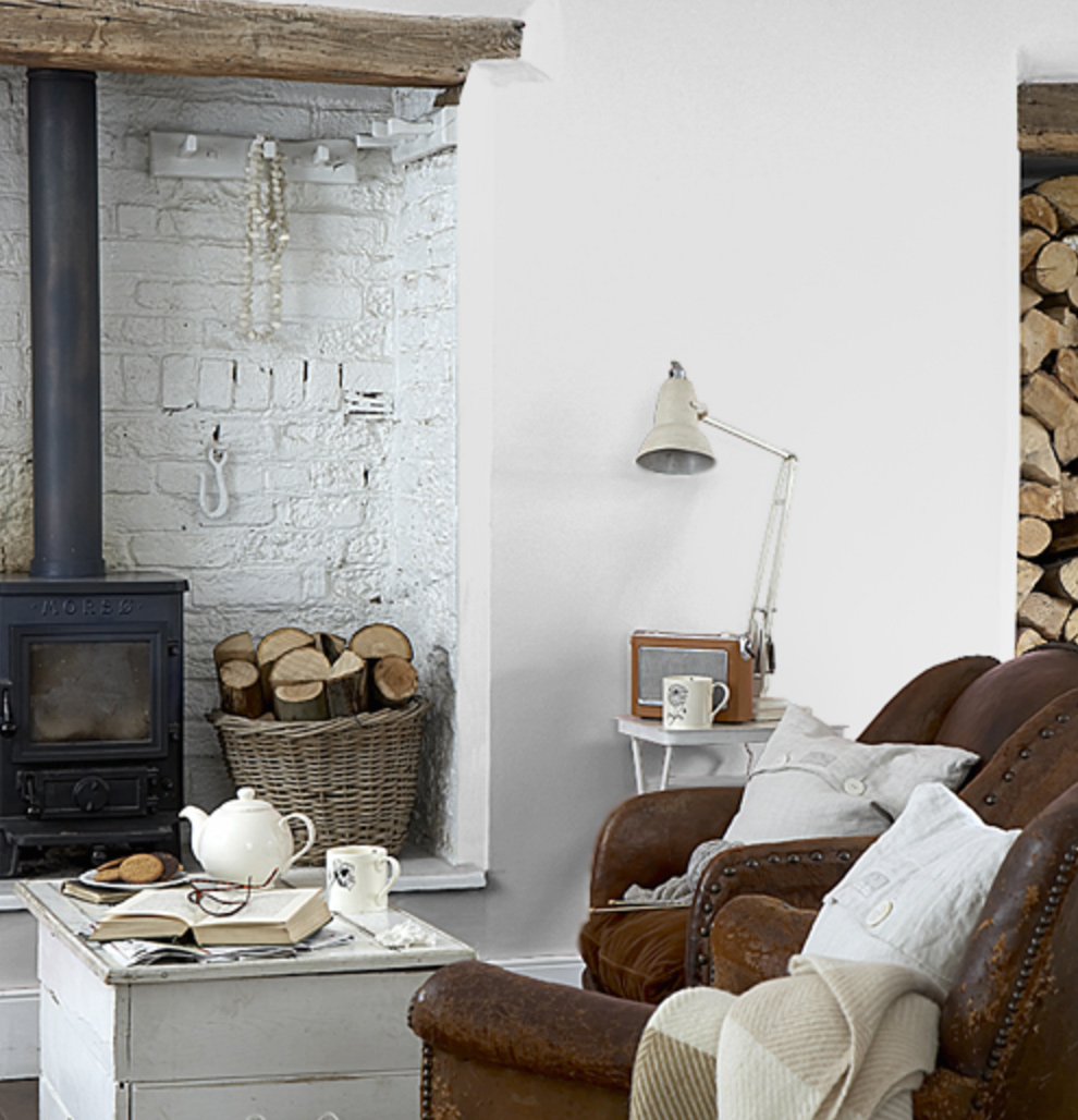
A chalky white with a whisper of grey. Sail White can be found on the walls of my new living room and my previous cottage lounge.
Over to you, what shades of grey paint do you favour on your own walls?

This post is perfecttt timing!! We get the keys to our new house on Tuesday and need to decide on paint colours pronto to get into action over the Easter weekend. I’m waiting for some tester pots though to look at them in the new house in the changing light. Xx
Yay Rebecca! Hope all goes well with the move.
Yep always good to see how they react to the light. I’ve been known to paint the inside of a shoe box before just to see how a colour behaves on a few different ‘walls’ x
I have just finished the transformation of my hallway from dingy ‘children’s finger print’ grey to far more sophisticated Cornforth White and I love it!
I’d love to use Cornforth white elsewhere Kirsty. Definitely a favourite now x
We’re just about to paint our bedroom and have gone for a Dulux colour called Enchanted Locket, which is a lovely pale grey – probably a bit darker than the ones listed above.
I also really liked the French Grey range from the Little Greene Paint company – it was a close second!
Hi Katie, I looked for Enchanted Locket when I was buying all the samples but couldn’t get hold of a tester! It looks beautiful on the paint chart x
Hi, I am just looking through this thread as I have the same dilemma. which paint did you choose in the end and how did it turn out?
We recently redecorated the bedrooms in our new cottage. I spent ages putting F&B samples against the wall but went for Wevet in our room and our daughter’s nursery and playroom. It’s a very pale grey, really restful and changes in the light. We teamed it in the master bedroom with a statement wall in Hague Blue (bravely branched out from my normal grey/sage green colour schemes after your navy post) which we love! Wevet was a great base for adding pops of colour to little one’s room too. We went for blush pink, grey and aqua.
Wevet is a stunner Charlotte. We have a white paint sample post coming up and it gets a mention.
Dark blue and mustard is a fab combo x
A great post but a month too late as I made these difficult grey paint decisions last month! ?
We actually painted our bedroom Perfectly Taupe! It has a lovely finish and changes throughout the day: a pinky/grey in bright light and purple/grey in evening. Really warm and cosy. We painted our lounge Dulux Chic Shadow which looks great against our cream sofa and mango wood furniture.
Ahh sorry Catherine!
I spent a lot of time and money looking for the perfect grey for our dining room. We nearly went for Gallery White, but in the end chose Crown’s Grey Lace. It’s from their Period collection so is an extra matt, slightly chalky texture. Its also a real, true grey- no undertones of other colours. I think it’s perfect!
Extra matt is my favourite type of texture for paint. Fab to hear you’ve found a ‘true’ grey.
Love a bit of grey on walls – my personal favourite is Polished Pebble (Dulux)! I’m admittedly a bit dull with my wall colour preferences, grey or white usually so I can mix it up with colour in the room – or add a funky wallpaper somewhere.
Maike, I’m the same – I always gravitate towards white or grey.
We’re just about to paint a fourth room in our house grey :S.
Definitely be careful with perfectly taupe. Our front room which gets a lot of sunshine made it look lilac. So prob best to reserve for a darker room.
Going for the palest grey with a splash of navy for the nursery.
Navy and grey – such a chic combination Clare
Love these posts – have already earmarked one of the blush colours for our hallway 🙂 After a grey-that-actually-turned-out-to-be-very-pale-blue colour in our spare room/study, we then chose Laura Ashley pale dove grey for our bedroom and I love it. It’s possibly the only paint colour I’ve ever used that is exactly as intended/imagined! It’s just enough of a hue to stand out against the white skirting boards/fireplace and looks great in all lights.
Fab to hear Siobhan. Definitely going to use Pale Dove grey on the bedroom furniture now x
Seriously… I spent last night searching for the perfect pale grey for our bedroom walls. How do you get into my brain with every perfectly timed post?
We’ve already got a lovely Borastapeter wallpaper to pop onto one wall (http://www.janeclayton.co.uk/product/gracefulsix/48181) but I dont want to go mental on the overall spend.
Wall paint-wise, I’ve narrowed it down to two Dulux shades – Rocksalt or Cornflower White.
I’m also planning on painting some GIANT Ikea wardrobes which we inherited. They’re not pretty but they are SO practical. They’re currently a dark piney wood (hideous) so I’m looking to lighten them with paint. Now, do I go white or another shade of grey?
If the RMS collective hive-mind have any thoughts on this I’m all ears 🙂 xx
Oooh so elegant on the wallpaper front.
On the wardrobes, if you’re trying to make them look less dominant best to paint them in the same (or similar) shade of the walls x
Good advice thanks love! Wasn’t sure if they should be different. It’s a shame they’re so ugly because they’re so practical… they’ll be perfelt once I’ve finished with them xx
What a timely post. We are starting our prep for our lounge overhaul this weekend so we can use Easter to paint. I’ve spent so much on tester pots I could have painted the whole room by now! Finally decided on Slipper Satin although would like a darker colour for the chimney breast and still al little undecided on that but it will be another shade of…grey! I really like Cornforth White. I am a little obsessed with grey, we’ve painted our bedroom in F&B Skimming Stone which is a soft grey very flat matt, very well stone like! I love it and we have a feature wall in Dove Tale which is darker and warmer. Also have painted my dressing room in Crown’s Sail White after seeing your earlier post on finding the perfect white. Love these posts!
So lovely to hear you’re enjoying the paint posts. Hope the decorating goes well over Easter x
We chose what we though was a grey from the Valspar range but it had a lilac tinge and I hated it! Went for F&B Ammonite in the bedroom and Cornforth White in the living room and we love the colours, so perfect! We got them colour matched from a Dulux decorating centre and it was so much cheaper and you literally can’t tell the difference, had so many comments from friends!
It’s so annoying when you end up with a completely different colour to what you think you are getting!
Ammonite and Cornforth White are such restful shades. Lovely choices.
We painted our lounge LA Pale Dove Grey and absolutely love it. No blue undertones, but not too warm either. I had read a few reviews online that said LA paint application was poor but we didn’t have any problems and were really pleased with the finish. Now to decide on the perfect moody dark grey for the bedroom…
That’s interesting Becs, I’ve only used LA paint on our old rolltop bath and as far as I remember it was fine to apply.
We need to do another post on dark greys!
I feel like an expert on grey paint after the amount of grey testers I tried last month. I was going to go for Cornforth White but the tester looked very mushroomy instead of grey in my living room. I settled on F&B Pavilion Gray in the end and I absolutely love it. I find it reflects light really well and doesn’t look too dark at all. My only gripe is that it took 5 coats of paint on every wall, over cream paint (it’s a good job I enjoy decorating!), but it has a lovely matt, chalky finish.
Yikes, 5 coats must have taken you ages. Like you say, it’s good you like a bit of DIY! Pavilion Grey is so sophisticated Claire.
Has anyone tried the wall paint by Annie Sloan? I’d be interested to know what Paris Grey is like on walls.
Polished pebble by dulux is also my fav. We’re currently doing our kitchen in this colour and it’s a colour that makes the kitchen look really light.
I need to check out polished pebble Becky!
We have Sanderson Turtle Dove in our living room which is a lovely grey. Would highly recommend, keeps the room light and airy!
What a pretty shade Bernadotte, so bright and light
I’m a Little Greene fan myself. Have french grey and french grey pale in our bedroom/lounge respectively and Rolling Fog pale in our kitchen diner and love them all, especially the French Grey x
Rolling fog is such a good name for a paint! So emotive x
Great post, as I am so indecisive when it comes to paint colours! The actual paint isn’t that expensive, but the time and effort it takes to apply it to the walls means that if I get it wrong I’m not likely to have the energy to change it again! I’ve had F&B Cornforth white pinned on my pinterest for a long time for our farmhouse hallway. I’m changing my mind a bit about it now, and think I might reserve this colour for our living room, and go for something warmer for the hall. See, indecisive!
There’s so much choice isn’t there M-J? Hope we’ve helped you a little on your decision.
Another vote for Polished Pebble here – it’s fab! Both the bedrooms in our flat are painted in it.
Ooh Ems I want to see your bedrooms! Looking for a good bedroom grey – will add it to the list of possibles. It’s definitely a popular choice xx
I’m about to decorate our bedroom as a surprise for my husband whilst he’s off on a stag party, and I was completely undecided about what shade of grey to go for. I then thought that as our curtains, blinds etc are all grey I should perhaps err on the side of caution and go for white. As soon as I read this post it reminded me of your recommendation for Crowns Sail White so I am now 100% decided that that is what I will use! It looks so beautiful in your home, and I’m sure it will be the perfect colour for ours too. Thanks so much for another fab home post, I love them! ?
Thanks Jane, love that you’re going to surprise your husband. Happy decorating x
Hi, I’ve been on the hunt for a pale grey for our lounge walls and I’ve came across Farrow and Ball, Strong white which is exactly what we are looking for from the paint sample.
Ahh it’s so hard choosing a grey! You actually shared my living room (Dulux Dusted Moss 2) in your last post and I was considering going the same in my dining room – but it turned out that it went very mushroom in the brighter Southwestern light of the space (my living room is Northeast facing and it reads a more true grey in there). Funny observation – I had also got Cornforth White to compare and the two colours are almost identical. So if someone is looking for a cheaper dupe to Cornforth White, then Dusted Moss 2 is the one!
In the end, we decided on F&B’s Blackened for the dining room which is a cooler grey with slight blue undertones which just glowed no matter what the lighting in the room. I’ll be painting next weekend so fingers crossed I love it as much as I have my little testers all over the walls 🙂
Great post!! xxx
Thanks Kimberly, Blackened will look stunning in your dining room. Really looking forward to seeing how your project unfolds x
Hi Lauren 🙂 Thought I’d use this space to message hehe
I am thinking Crown Corvette for my living room but stuck on either a slighter lighter or slightly darker grey to go with it. I have 2 walls in between my fireplace that I would like to be a different tone of grey. Some greys look creamy or too white…
Debs
x
Hi Debs, lovely to see you over here!
You’ll have to send me a link to Crown Corvette? I can’t seem to find it 🙁 x
I love the sofa in the picture for F&B Slipper Satin paint. Can you please tell me where I can purchase this? Many thanks, linda
This may be too late Linda, but that looks like a Loaf sofa to me.
I’ve just found this thread through desperate Googling. And it’s been interesting (& rather reassuring!) reading, thank you. Can anyone help please?! We’re in final stages of big kitchen/diner extension with lots of south west/natural light. Going for F&B Stiffkey blue on kitchen island and Purbeck Stone on base and wall cabinets, with oak floors. So we’d like F&B Ammonite on walls (with white on ceiling). But there is a huge area of wall to paint so can’t afford and want better quality paint than F&B. Frustratingly we can’t find a good (Dulux) match to Ammonite – all attempts so far have too much green or brown or blue/lilac. Decorator’s deadline is looming. Any suggestions please?! Thanks a million. x
This is a really excellent article on the shades of grey available on the UK market at the moment. I’ve spent the past four years searching for the perfect true greys that are neither green, blue or pink (it has become a bit of a sad obsession!) but I generally agree with Lauren’s comments. The ones I’ve found perfect are:
Crown: Sail White, which is a very light grey (almost white but with a softer tone) which I’ve painted my whole house in. Everyone who comes round says how lovely it is. It’s basically a modern substitute for cream.
Farrow and Ball: Cornforth White, which I am planning to try on one wall in the living room; it’s slightly darker than Crown’s Sail White but again a true grey (and still very light).
Designer’s Guild: Notting Hill Slate, which is a beautiful deep pigmented dark grey. I’ve used it on the downstairs interior doors and they look fantastic. Other dark greys I tried (such as F&B and Little Greene) have been too blue or beige. Notting Hill Slate is a warmer grey (verging on purple tones but don’t worry, not lilac!) and I think it looks great.
Farrow and Ball: Elephant’s Breath – This is a beige grey and it looks quite dark in light rooms. I’ve never been brave enough to try it on a whole wall, but it does look lovely on furniture. In my opinion, it suits a more country/shabby chic scheme, but would look great in a cosy guest room.
Farrow and Ball greys that have caused me problems are Slipper Satin, which was too pink, Skimming Stone, which looked almost khaki green in my light and airy bedroom and Blackened which looked lilac (again in the same light and airy bedroom). Of course, it depends on the light and personal preference, but I was surprised how much a subtle colour tone that you can see on a sample is amplified when put on four walls!
I also love the Snowdrop sofas in Lauren’s living room (I have the exact sofas in my living room!). A word of caution – the slate grey fabric is gorgeous (and I chose this colour) but it does look slightly purple in the light of my living room. Despite that, I really like it. If you want a deeper sofa, I’d recommend Loaf.
I hope someone can help me! I am decorating my bedroom and I love grey but I also like the idea of adding Mauve/light purple wallpaper and accessories, does anyone have any recommendations on which shade of grey would work best!
Hi Jocelyn,
I have painted one wall in my bedroom with Farrow and Ball Dove Tail, it’s a grey with purple hues not sure of the official description but sounds like it would work with your colour scheme, maybe worth a tester pot? I used skimming stone on the other walls.
Hi – choosing a grey is wearing me down !! I am decorating my kitchen, which gets a lot of daylight and my son’s room is about to be transformed from kids room to ‘young adult’ (he’s 12 – he likes this term !!). I’m veering towards Dulux ‘Warm Pewter’ for the kitchen and Dulux ‘Chic Shadow’ for my son’s room. His room has two dormer windows but is fairly dark and I’m really looking for something to ‘warm up’ the room a bit. I really don’t want blue undertones in any of these rooms. Has anyone used these colours or has any advice? I’m also thinking pops of yellow and maybe a light shade with a copper ‘inside’ may help in my quest to keep things cosy!
Hey, I’m a bit late to the party on this post but I have done the woodwork in moonlit sky but I’m still struggling to pair it with a wall colour.
I had opted with dulux rock salt but it just looks white when on.
Any suggestions please? Thanks in advance!
The decorators are coming tomorrow and I STILL CAN’T DECIDE which grey to paint the living room! It’s a Victorian double reception – floorboards will be painted white, as will the woodwork and fireplace surrounds.Polished Pebble is definitely one of my options but I’m worried it may appear too cold, and too pale. I don’t have a sample of Pebble Shore but apparently that one is a bit warmer… wondering if I should just go for it and find a darker shade – more like Warm Pewter – but worried the room will appear too cavey. Any last minute advice?? They will spend the day prepping so I can push the button tomorrow.
Again, very helpful! I would like the bedroom the lightest shade of grey, so am considering the Dulux shades that have been suggested. When I pick one I shall declare the verdict!
Hi, help needed please. I’m having a grey kitchen delivered and want a very very pale warm grey but I cannot find a shade suitable, all the testers are almost the same as the doors of cabinets and a little dark. Polished pebble too dark want lighter. was thinking of Rock Salt. Any suggestions
Hello Hayley,
I am having the exact same problem – I love the tone of polished Pebble but it’s too dark for my living room and I’m not convince that RockSalt will make much of a difference.. what did you decide on? Would really appreciate love your advice!
Currently having this issue! What did you go for?
Can definitely vouch for perfectly taupe coming up lilac!! Just painted our whole kitchen in it and now I’m changing it to B&Q chic cashmere which is just the most amazing greige (we have already done the bedrooms in it and seems a shame to leave it hidden away!) so elegant! Not the lightest but our kitchen is huge with loads of light.
Think that’s why perfectly taupe came up so purple – to be honest I couldn’t see grey at all!
Hi, I am looking for a very pale grey to go against our white windows and doors. I have purchased loads of testers but when they are on the walls have a bluey tone. They all look lovely in the tester pots but not on the walls! Please help as the decorators are in next week!
We have decided on Polished Pebble by Dulux. It has more brown in it than blue. Its not on the walls yet but is one of the better sample pots. Its not a lightY grey, but a dhade under white grey.
I decided on Dulux Moda French Mists after sampling so many other greys. Loving itcup on the walls and it doesn’t darken the room at all.
Thank goodness for this thread! Please help anybody??
I have a very dark hall, with no natural light but a lot of white wood. Want to paint it pale grey but have to be careful obviously to not make it look darker.
Anyone know of a pale grey paint that has warm tones/high reflective light value?
I am in the UK.
Many thanks
Louise x
Greys are so difficult!!
We’ve gone for Little Greene’s French Grey pale on both units and walls and it looks wonderful both soft and light…even Hubby who turned his nose up at the idea of grey loves it. In the hallway we have used Benjamin Moore Abalone which is a beautiful warm grey and compliments the antique oak stairs and doors … our painter recommended Benjamin Moore paint and though more expensive the coverage is so much better than Farrow and Ball as it’s so pigmented and still has the flat chalky finish.
Help! Currently decorating my sons room grey and white theme… bought cornflower white and it is pale blue… my son is so disappointed… I’m happy to paint over this, but can anyone recommend a pale grey paint or off white paint with grey undertones which will look nice next to white brick wallpaper?
Swansdown Dulux trade,pale grey. Painted south facing hall perfect no hint of blue or lilac.
Modern grey by valspar is a true grey
Hi,
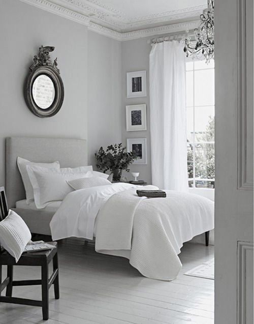
Can I ask whether the bedroom photo is definitely Pale Dove Grey by LA? When I look on the LA website, pale dove grey seems to be a completely different colour, like a salmon colour.