I imagine we all have at least one room in our homes which is a bit bleurgh. A space that lacks personality and needs a bit of life injecting into the walls. In our house, it’s the spare bedroom where we also store our clothes.
I’m usually a fan of a simple backdrop; white walls to let the accessories do the talking but in here it needs some va-va room. I know I need to invest in statement lighting but I also need to address the plain jane wall behind the bed. I feel the unique angle of the ceiling could be such a statement but at the moment it doesn’t float my boat. It’s a bit of asap. If this room was a person nobody would want to sit next to it a party.
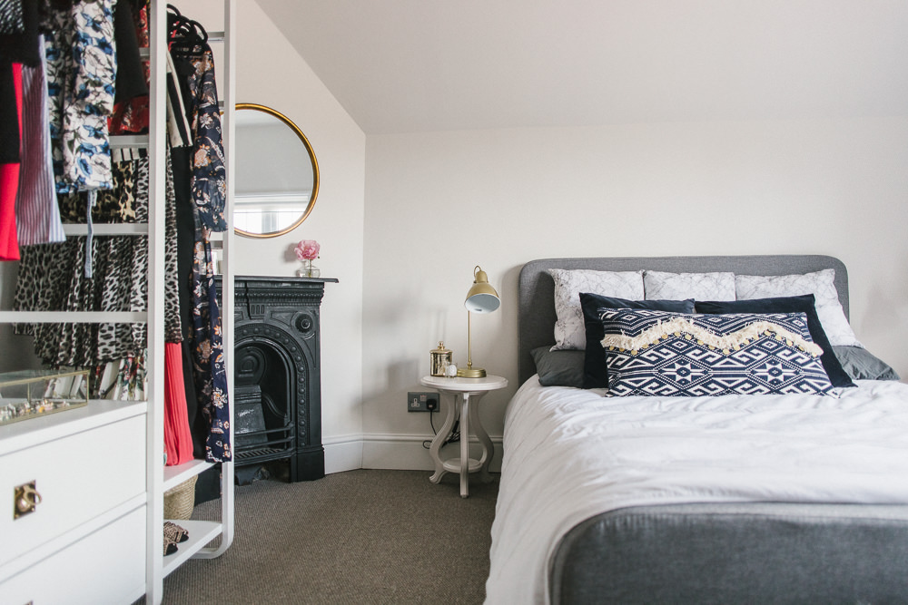
Wall Decoration Ideas
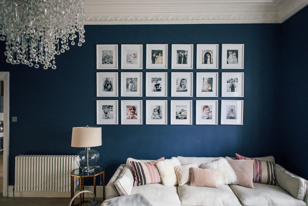
Gallery Wall
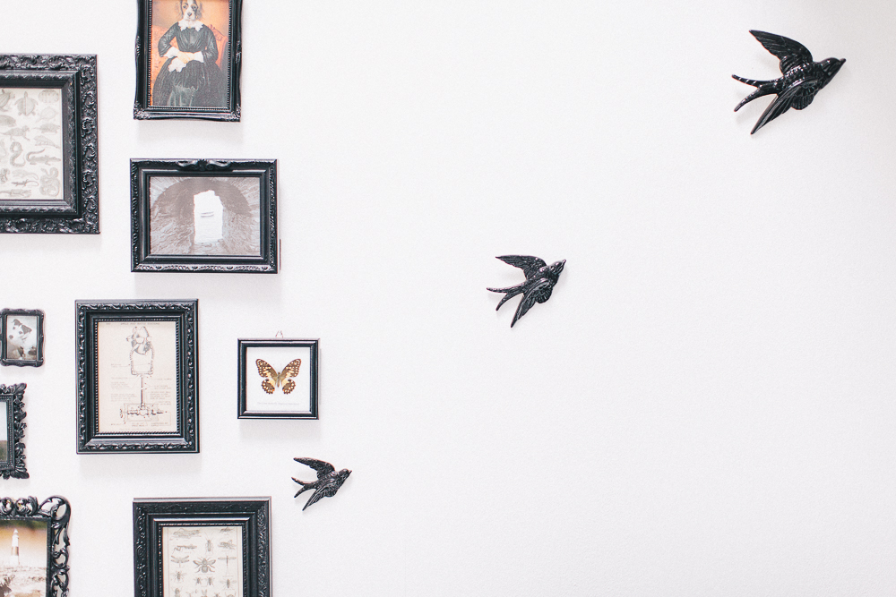
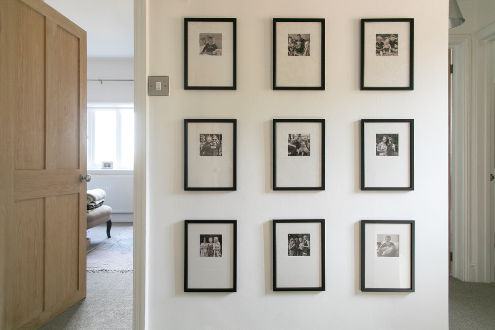
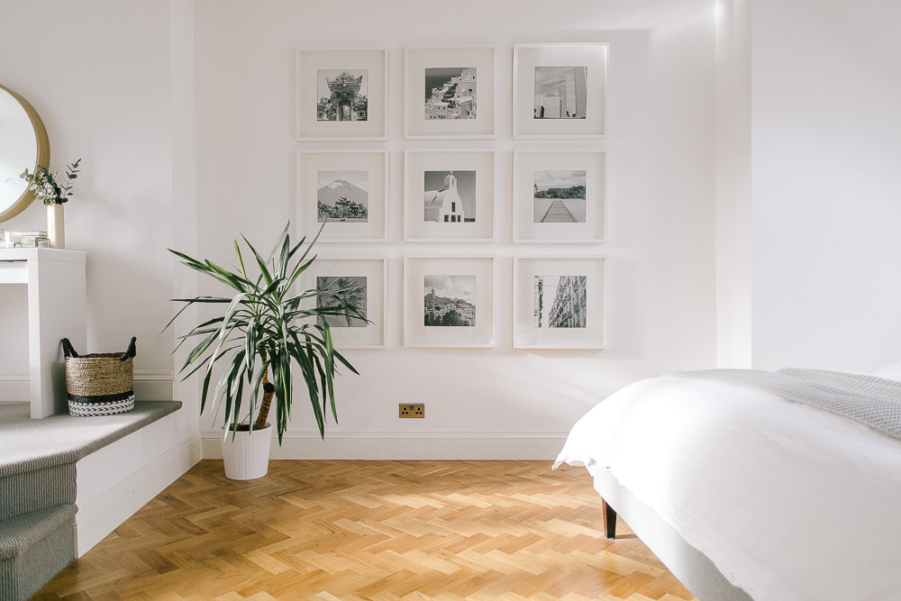
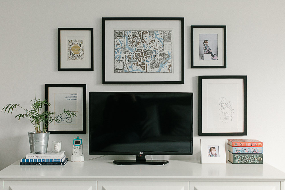
There isn’t enough space above the bed to create a jaw-dropping gallery wall like Leoma’s. If I had a spare wall though I’d love to replicate the grid style photo wall in oversized frames. It’s so impactful and creates such a statement.
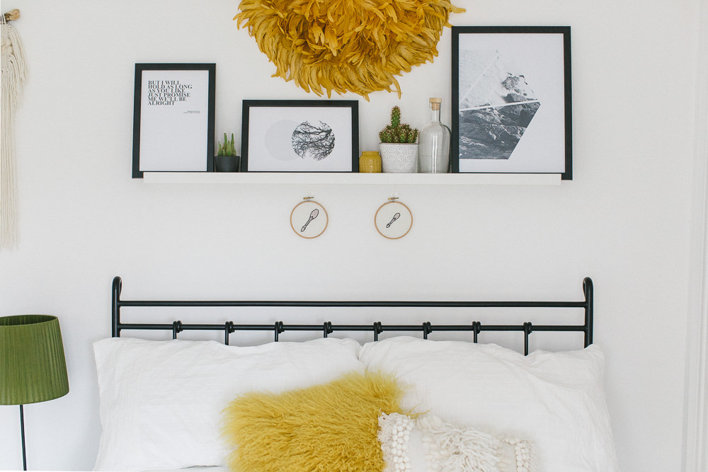
Shelving
A thin picture ledge above the bed was one of the first things I considered to dress up the blank wall. We’ve got several in our house from Ikea although we made our own for our hallway as needed a shallow depth. Elle’s boho bed shelf is a stylish way to finish off the wall and can be changed at the drop of a hat with new decor.
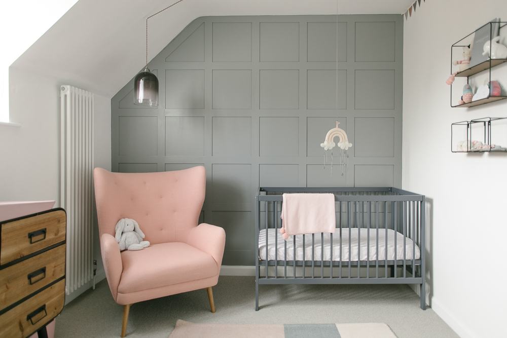
Panelling
I can’t get enough of the sloping feature wall in Iris’ nursery. I’ve written before about my love for wooden (or mdf) panelling. We’ve recently added tongue and groove to our downstairs bedroom (yes that room STILL isn’t finished) and I’m a big fan of how it adds subtle interest.
Wallpaper
I’m never quite sure how I feel about wallpaper. It seems a bit more permanent than a quick lick of paint, and a lot more expensive! Last year my dad wallpapered our upstairs landing after I debated for months over whether or not to splash out on a few rolls of paper. I must get a wriggle on and finish the rest of the area (story of my life) so I can share some snaps with you.
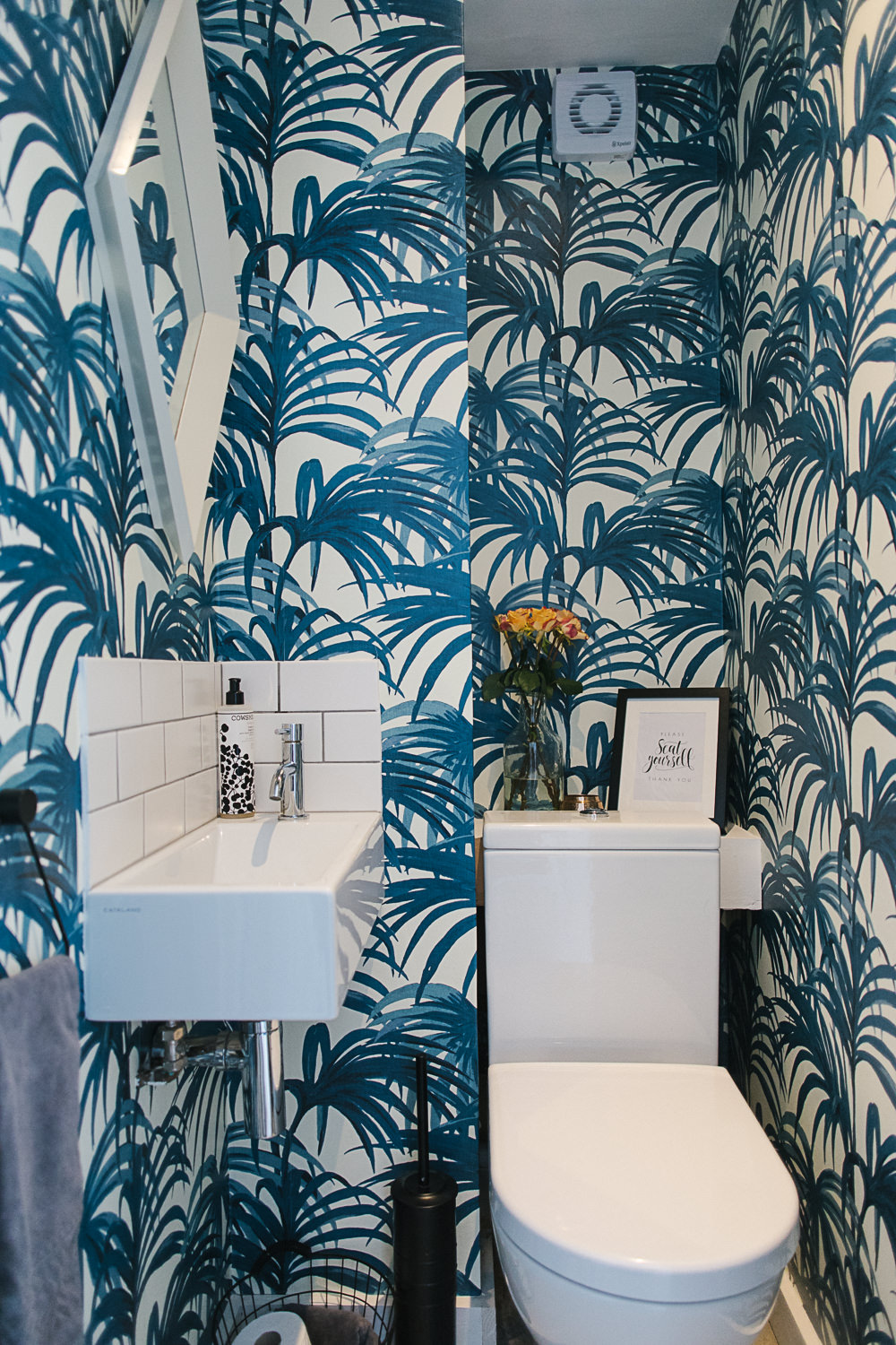
Charlene’s downstairs loo is flipping amazing though. In a small space wallpaper well and truly rocks, especially when it’s House of Hackney! I love the idea of guests opening the door to use the loo and being wowed by the decor. Thanks to a nineties style tiling job this doesn’t happen in mine.
Exposed Brick
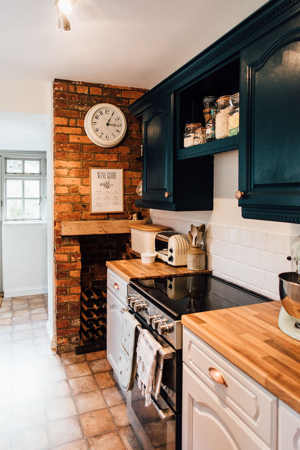
Every time I go anywhere with an exposed brick wall I’m inspired to rip off the plaster in my own house or order in a load of brick slips. I love how versatile and characterful it can be.
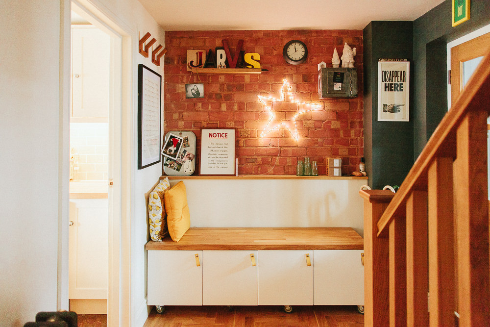 In Charlotte’s relaxed revamp it brings an industrial edge, while it gives the perfect modern country element to Elle’s old kitchen.
Paint
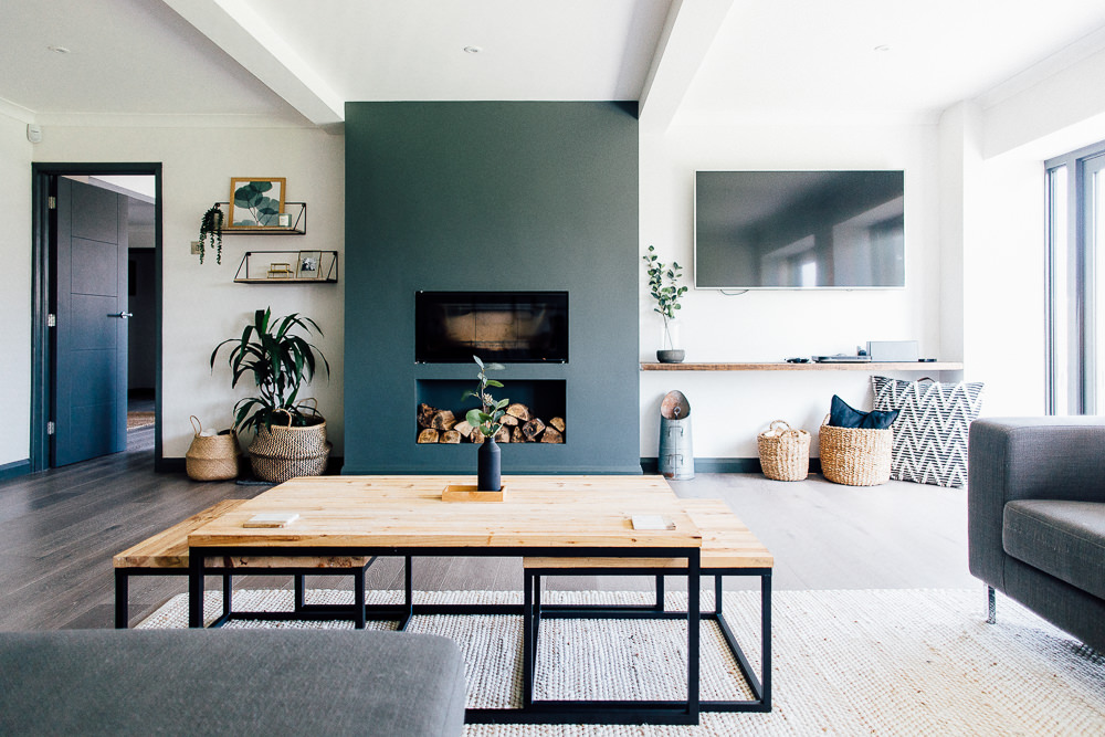
One of the simplest ways to add a bit of personality to the walls is to paint them. In this modern industrial home tour, Nat shows you that feature walls are definitely still in fashion.
Geometric Pattern
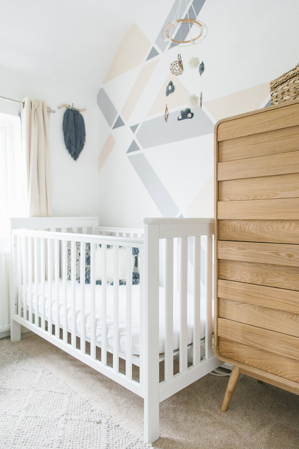
If I was feeling a little more creative I could break out the low tack masking tape and muster up a mural like the gorgeous one Elle created in her nursery using a few tester pots.
Blackboard
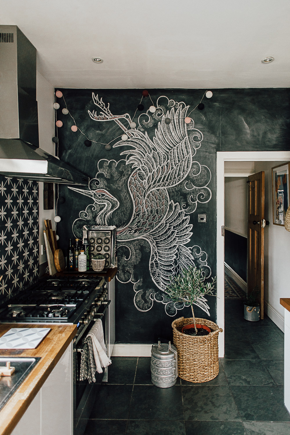
Maybe not one for behind the bed but a chalkboard always looks great in kitchens, home offices and playrooms. I’d need to up my game to draw anything as epic as the hand-drawn mural Theresa sketched on her kitchen wall.
Wall Decals
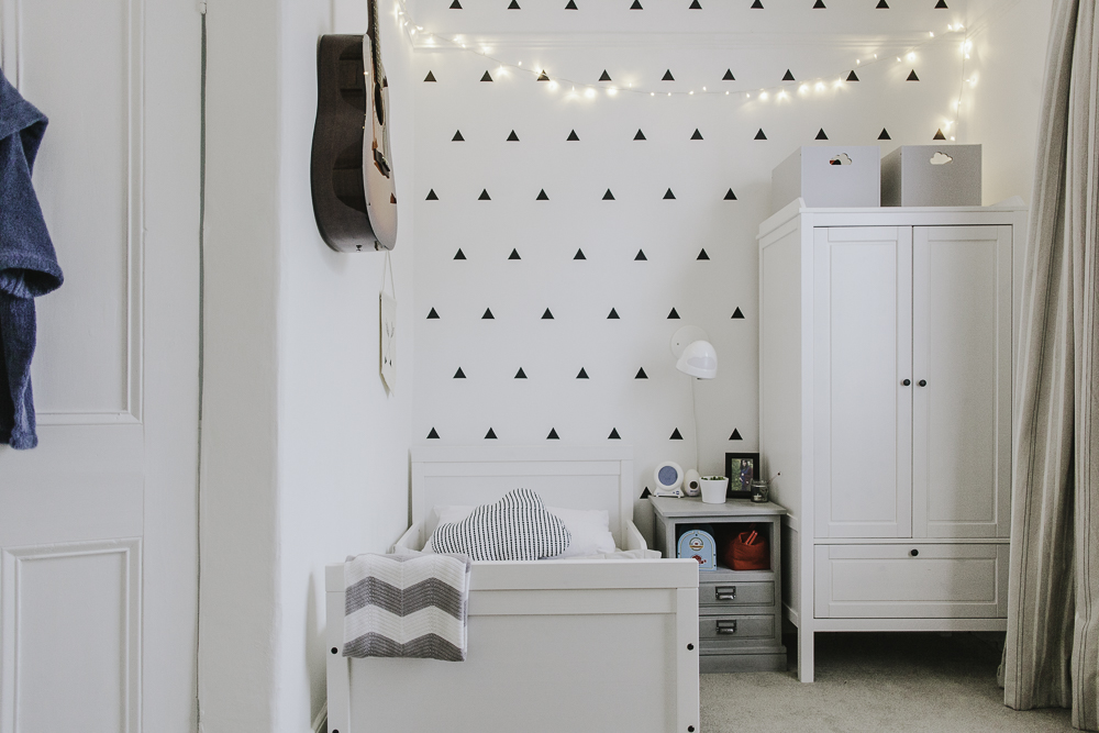
I haven’t found any wall decals that cut the mustard when it comes to adult designs. By that, I don’t mean anything pornographic (!) it’s just that wall stickers are usually in more child-friendly designs. Zachery’s geometric decals are great at lifting a plain space and the ideal option if you rent or are after something less permanent than wallpaper.
So there you have it, nine ways to jazz up a plain wall. Now which one do I choose for the spare room to ensure I can really call it a dressing room?

We’re currently debating a neon sign for the back wall of our kitchen… It’s quite a modern space so think it would just set it off perfectly. Love deals – have them in both the boys rooms 🙂 we have a wall in the lounge that is very sparse and I think the right colour paint will just set it off perfectly so paint is a great and very easy solution… I’m hoping 🙂
Absolutely love a neon sign in a kitchen Becky. Did you see the one Angel had made on Escape to the Chateau? It looked so good in situ!
Oh no! I will have tot ry and find it 🙂
This is completely unhelpful, but can i say i LOVE Leoma’s wall of photos .. she just needs to move the sofa over to the left and put the side table on the other side so it’s all in line!! Sorry :s