It turns out The O’Shea’s live a colour coordinated life. Or at least that was basically how I made our gallery wall “work”. I think. I’m only half joking!
Considering I had seen and admired so many versions of friends and online it was actually a really difficult job to try and make it not look like I had essentially just hung a load of stuff up at random. Or that we had tried too hard. I style entire shoots, yet this task left me completely flummoxed.
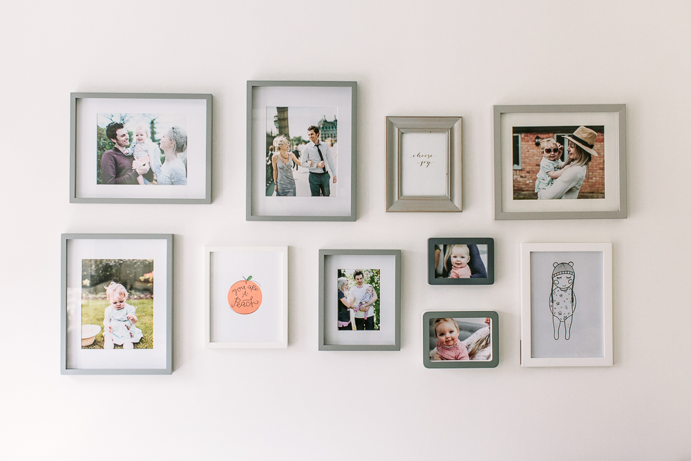
In the end I picked our very favourite photographs that represented different stages of James and I’s relationship, and of course her royal highness Mabel. It was almost impossible to decide actually, the colour aspect came into it when I realised everything we had chosen was varying shades of peach, blue, pink and grey (!) this just must be a coincidence of our wardrobe choices I’m sure. In terms of other lovely bits and bobs I chose the first ever “You’re A Peach” print I bought for Mabel’s nursery before she was born, a much treasured greetings card and a very thoughtful gift of a hand drawn sketch that I received for Mabel’s first birthday.
It was then a case of buying the right frames, I already had some from Ikea and as I mentioned in my Wall Art feature, my other go-to’s are the Croft range from John Lewis and Marks & Spencer. This “House” design by John Lewis is also good – a lovely thick frame and they come in such fun colours, only a fiver each too.
Once everything was framed I then set about creating what would eventually be on the wall by laying it out on the kitchen floor. I must have switched things up fifty times before I was happy with the result. I found working from the middle outwards helped. We only have ten hangings altogether, could you imagine if we had more?! I would have been there all day! I have no idea how Lauren manages to create multiple perfect galleries in her pretty cottage.
As we’ve centralised our gallery on the main kitchen wall above the table I’m hoping as we make the effort to print out more photographs we can add as we go. On another kitchen wall we have the large Ribba frame filled with instagram print outs of Mabel from when she was born until she was 12 months old – so much easier to put together than the gallery! You can see the details of the multiple frame and custom mount here.
I’ve concluded that actually, I spent far too much time worrying about it, because if it’s captured moments that are significant to you then your gallery will be special and lovely regardless.
Do you have a gallery wall?
What kinds of things does yours include?
Any tips on how to create one without over thinking the whole thing?

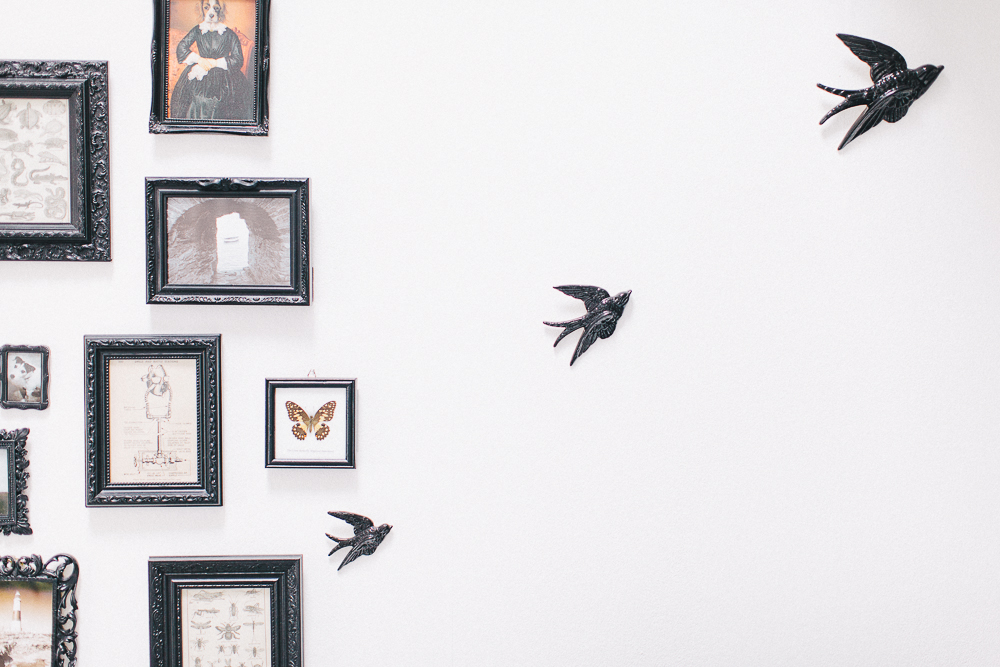
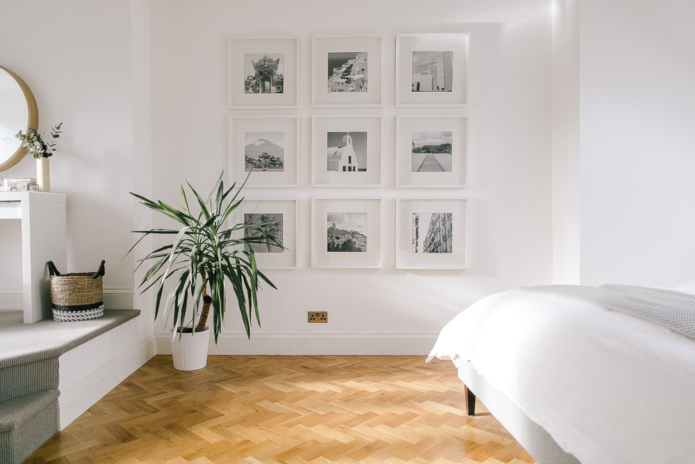
We have a photo wall that turns into a wall of achievement as you go up the stairs. It has photos from uni days, when andrew and I first got together, wedding photos and my beloved grandad bill. The achievements are mainly from scouts and guides ( we’re queens scouts and guides – the highest award you can work towards, go us) and Humphrey the wonder dogs bronze good citizen dog award! He got a rosette and everything!
Such a gorgeous collection of photos Charlotte. I’ve just created a gallery wall in my Mum’s bedroom so I’ve just completed my fifth so a few tips:
– I love the look of a huge mix and match of frames and styles but I’ve always found it easier to work with two or three similar frames in different sizes. Completely pinching your white and grey idea for my next one though!
– I use command strips rather than nails as it’s easier to reposition the frame
– Like you, I lay out on the floor beforehand
– A tip a learned from my wedding photographer when putting together my wedding album is to try and make the subjects of your photos point in to the centre of the wall; so if there’s a photo of someone looking to the left then position this to the right of the gallery, if someone’s looking down, position them at the top.
Or of course you could just go for it – hang the pieces you love however you like and it will still look like a gorgeous collection of loveliness! x
What is a command strip? Sounds exciting.
Another great tip is to draw round your frames on brown paper and cut out, then blu-tack them to your wall so you can see how various layouts work.
gorgeous pics Charlotte xx
Karen, they’ll change your life. Kind of.
http://www.amazon.co.uk/Command-Picture-Hanging-Strips-Value/dp/B000OF6X48
Claire your wall sounds wonderful! I was unfortunately chucked out of girl guides…too much back chat to brown owl 🙂 x
Looks lovely! We have a photo wall in our dining room, an enormous mix and match of pictures from friends to family in a wide range of frames. I think you either have to stick to a colour or material or go completely the other way! Luckily the room is fairly big so it doesn’t look crowded it too messy (I think 😉 )
I think huge and mix and match would look ace – send us a pic x
I can completely relate to how difficult this is – I currently have around 20 framed photos and pictures just waiting to be put up, because I can’t find a configuration I’m totally happy with. I keep thinking if I add in one more it might be perfect, so I put off putting any up! Clearly I need to bite the bullet and just get on with it 🙂
Lauren mentioned some super sounding command strips in her comment above?! I feel this may be the way forward to configuring gallery walls in the future!
This post has reminded me of how long it used to take my parents to put pictures up whenever we moved house. They would lay them against the wall they were going on and wouldn’t put them up until they were completely happy with where they were all going. It used to take them a few days to decide before they put them up.
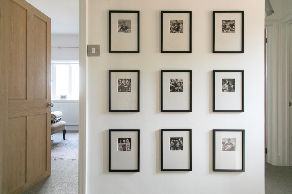
I like the idea of a multi framed gallery wall but in reality I’d need more structure (to satisfy my OCD tendencies) so we have two different alternatives. The first is two large multi aperture frames (from B&Q) side by side holding a total of 32 photos of our family (which I need to update) and three profressionally printed photo collages of multiple photos which go up the stairs containing photos from when my husband and I were kids, when we were going out and our wedding. The plan is to keep adding boards as we go.
I have considered the multi aperture frames Sarah, I think in a way they would also make you choose different sorts of images to fit – which is no bad thing, the more the merrier. Sometimes I look at the wedding photos we didn’t put in the album and wonder why? I over thought that as well I think! x
Love this post – we’ve just painted our living room and the thought of having to put multiple holes in our lovely smooth (but also large and empty) wall makes me seriously nervous! I’m indecisive anyway but having a picture framer in the family (and therefore lots of print, art and photo options available) makes it even worse, so I think we’re going doing the picture ledge route instead, it gives us the option to mix things up when I inevitably change my mind!
Rebecca I also have a picture ledge in my home office, I felt the same about the new walls! it also means I can change things up as often as I please x
I don’t care if they are a little bit over done, I LOVE a gallery wall.
Mines is mainly filled with A4 sized Ribba frames with some smaller fancy ones. I started with a handful of frames to begin with and it’s basically grown arms and legs. My house has lovely high ceilings so there’s plenty of wall space left for more ?
One of my favourite frames contains the sheet music from our first dance ??❤️?
Lynsey I don’t have sheet music (what a lovely idea!) but I do have the lyrics of our first dance song on a canvas in our upstairs hallway – my husband gave it to me a few months after the wedding x
Lovely to see the portrait I did a while back included in the gallery wall!
So nice to see where they end up too 🙂
Kayleigh / @handmadeheartshop
Kayleigh it is so gorgeous! x