Back in October I gave my prediction for the Pantone 2018 Color of the Year. Well, I was right about jewel tone, but wrong about which particular one.
My initial reaction was: why on earth have Pantone gone for Ultra Violet? When I think purple, I think of Cadbury’s, Tinky Winky, and the purple one from a tin of Quality Street. (You can probably guess the food category of Christmas leftover I’m nibbling on as I type). I DON’T think interiors. And when I’m pushed to think interiors, all that springs to mind is Laurence Llewelyn Bowen prancing around on a black and white chequerboard floor dotting gaudy, luminous purple vases on ornate gothic pillars.
That was, until, I started pinning.
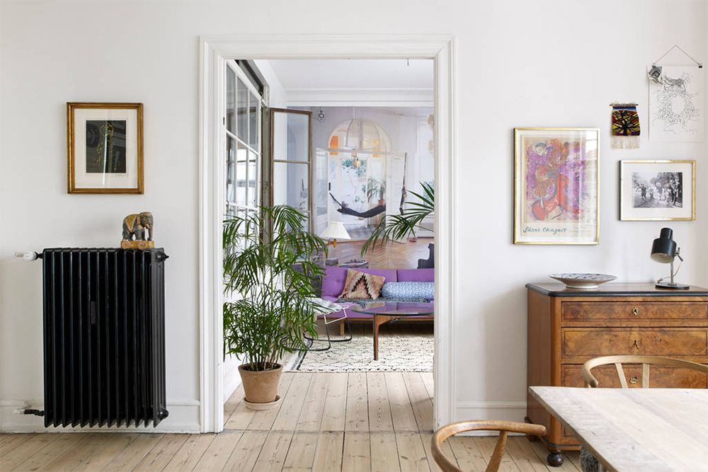
As you can see from the header above and the inspiration gallery below, I’ve since realised that it is possible to create a beautiful space using Ultra Violet.
How to make Ultra Violet work
Now don’t get me wrong. I’m not recommending that you should put all of the below suggestions into place. If you’re going to dip your toe into world of Ultra Violet then maybe choose just ONE of the following.
1. The image in the header from Another Ballroom shows exactly how I would weave a bit of Ultra Violet into my home. I’d aim to keep the rest of the space neutral and light and airy, and incorporate a hero piece – a special item that steals the show – such as a purple statement sofa or chair. I noticed this particular hero piece in a copy of The Scandinavian Home (the three seater Vittorio at made.com is similar). It just goes to show that purple can even work in a cool, contemporary, Nordic space.
2. … Or you could be brave and use a bold paint such as Farrow & Ball Pelt to create a feature wall. What’s the worst thing that can happen? If you don’t like it, you can just paint over it.
3. Purple and yellow are opposite each other on the colour wheel which explains why auberginey shades work so well with brass. However, a deep plum also looks chic when teamed with other colours such as copper, blush and light grey.
4. Pile up a load of sumptuous, inky, rich fabrics and cushions (I’m talking velvets, silks), to create a calming, elegant yet romantic space in the bedroom.
5. Last year’s Color of the Year translated through plants, this year I reckon it’ll be through flowers. And you can never have enough florals in your abode, right?
What do you make of Pantone’s Color of the Year?


Need that duvet set!!!
I’m a long time lover of purple. This exact purple. I had a purple fiesta for years. I drew the line at purple bridesmaid dresses – it would be dairy milk!
I’m pretty sure a couple of the Rock My team either were or had purple bridesmaids Claire! x
I hate purple and hate this particular shade. I could get on board with a more muted shade but not this. Definitely not going to prise me away from my beloved blues. I was much keener on the dulux colour of the year – think it was heartwood? It feels warmer and more comforting.
Yes the Dulux colour was more of a grey-pink-purple wasn’t it. I’m with you on blues – have always had shades of blue somewhere in my home. x
Not a fan of purple at all so the colour of the year was a disappointment.
Ahh boo. What would’ve been your choice Bunny?
If my daughter were interested in such things (she’s only four!) she’d be ecstatic! She LOVES purple. Her bedroom is currently a light duck egg blue with pink accents. She thinks its boring and wants each wall a different colour of pink, purple and orange… how am I ever going to make that work?!
LOVE this Sarah. Good luck with the decorating…😂 x
Purple is one of the few colours I don’t have in my home and don’t see that changing anytime soon. I can almost get on board eith the redder more burgundy tones but otherwise it makes me feel sick and goes with such few things it’s a no go.
I used to think this Rachel however the header image did sway me! X
I get the whole honouring of the suffragette centenary… but I really don’t like it! Your teal choice was much nicer!
But then I thought botanical green was rank too… and I was won over ik the end. Open mind I guess..