
Just as Charlotte was concerned that she had lost her summer style mojo, I’m feeling like I have recently had a crisis of confidence when it comes to my interior design choices. And it’s all because of one feature wall.
We’ve been in our new-build house for over a year now and we were lucky enough to be the first owners so when we moved in there were a lot of white walls and blank spaces to prettify. I’ve done so using Ikea ribba picture ledges (excellent moving-in present from Mrs O’Shea) and wallpaper. Oh how I love what wallpaper can do. Just one wall covered in the perfect wallpaper and ta-da, your room is transformed.
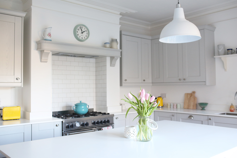
In the lounge I used Cole and Son’s ‘Woods and Pears’ wallpaper in charcoal/gold/linen which I love. It’s the iconic Woods design but with subtle gold pears. In our bedroom I went for Cole and Son again, this time their ‘Palm Jungle’ wallpaper in soft grey on white, as featured in my palm print post. Again, I adore it. It’s like snuggling down every night in a little slice of paradise. And for the downstairs cloakroom I used a flamingo print wallpaper by…yep you guessed it…Cole and Son. It’s quirky and fun and I don’t think I could get away with it any other room but for a downstairs loo it is perfection.
So when it came to creating a feature wall in the living-room-slash-dining-room-slash-open-plan-kitchen I thought I had this wallpaper malarkey downpat. It took me ages to pick a wallpaper because I wanted one that would go with a framed map of France that is on an adjacent wall, and also with our cream kitchen. I was torn between Albany’s ‘Geometric Wood Panelling’ and Sanderson’s ‘Swallows’.
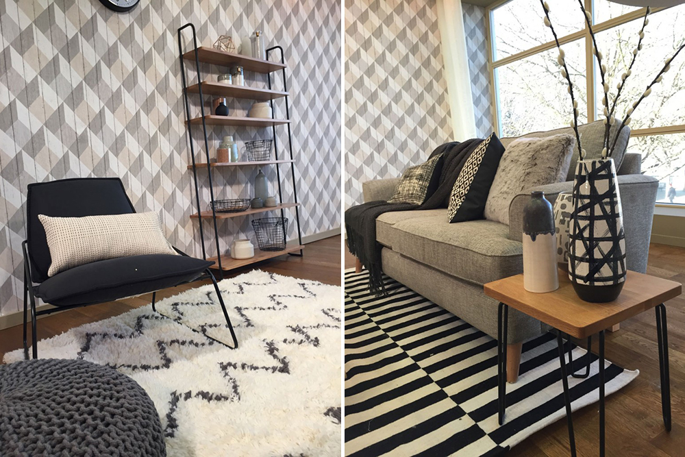
I finally decided on the Geometric Wood Panelling which was an absolute bargain at £I5.98 a roll. I was very much swayed by a room makeover by Sophie Robinson (the photographs from this are the ones in the header image above). I roped in my lovely father in law to give me a hand with the wallpapering and away we went. The finished result looks like this:

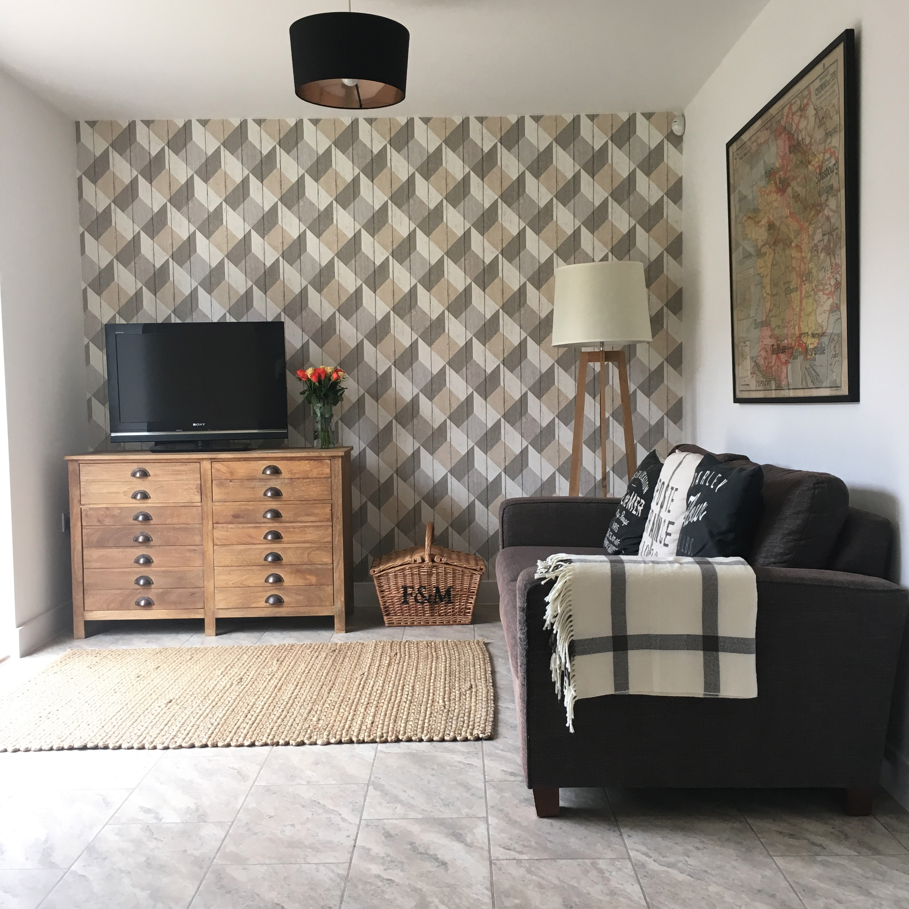
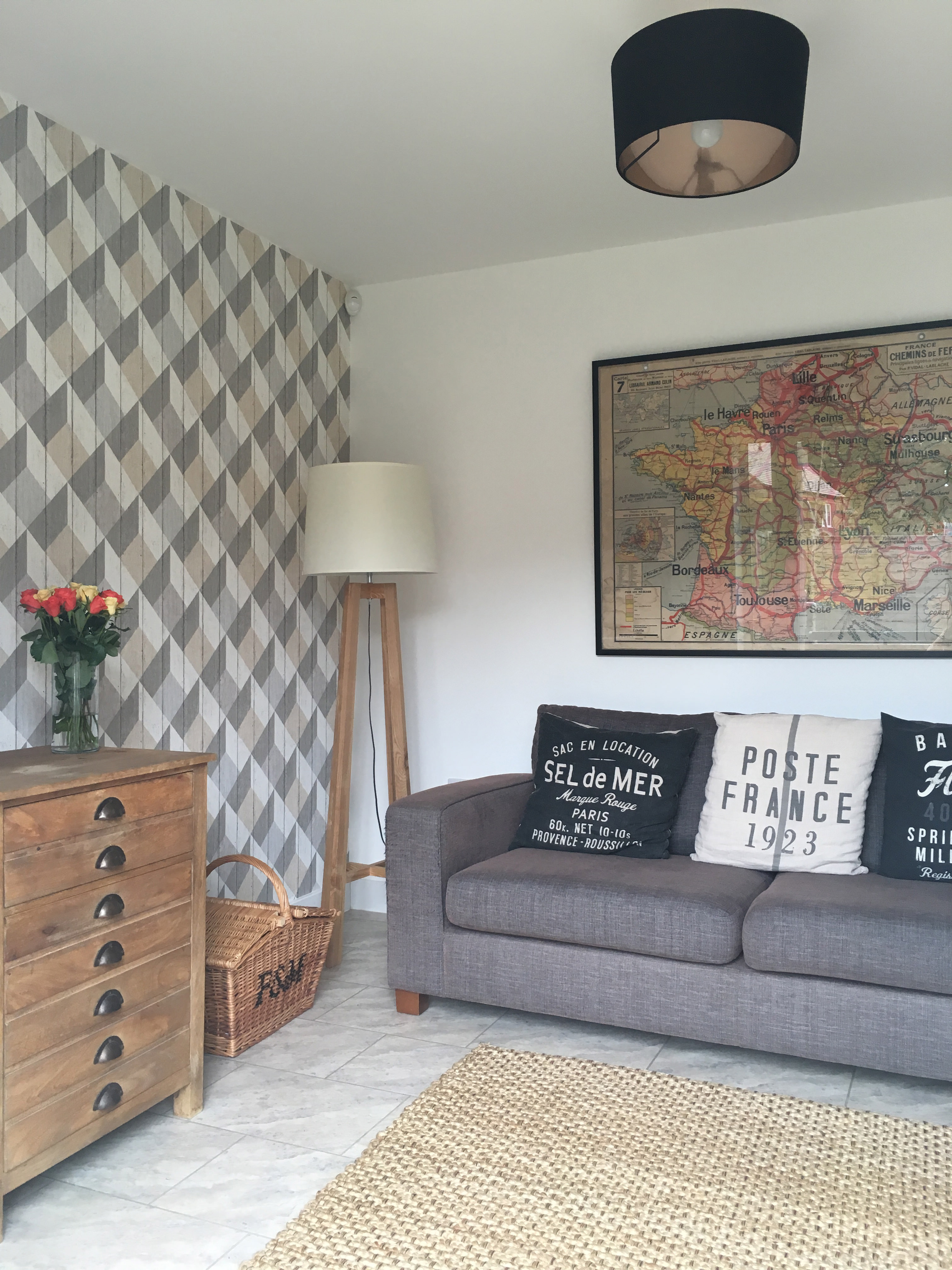
At first I liked it. But now I’m not so sure. I swear it has made the room darker and it just doesn’t go with the rest of the house. I think it looks great in other spaces such as the aforementioned room makeover, and with blush accents like the third image in the header above, but it just doesn’t work for me. I definitely haven’t mastered the rustic/industrial look I was hoping for – possibly because to do so I would need to bring in some more black and grey vases, prints and nick-nacks – and even if I was to do so, the other end of the room is a cream country kitchen with shaker style cupboards so it’s just a bit of a mish-mash of styles. I’m not a massive fan of using black or cream in the house – I much prefer greys and whites – so I’m not sure how this happened. HELP!
Am I being ridiculous? Should I just embrace the black and upcycle my tripod lamp so it looks a bit like this one, and maybe add in some more black framed prints and pictures to create a gallery wall around the vintage map? Or should I bite the bullet and strip it and start afresh? Has anyone ever stripped wallpaper before and is it an absolute nightmare?
Lisa I think it looks gorgeous! I like your tripod lamp as it works well with your basket and drawers but you could always change the lampshade to a dark one to tie in with the other dark elements?
In my first new build flat, I found wallpaper removing pretty easy with a hired steamer, it just peels off, but when I tried to do the same in a Victorian property half the wall came down! I think the plaster was so old it was only the wallpaper holding it up!
Oh Kirsty bless your heart, thank you.
Hadn’t even thought of just changing the shade of the floor lamp…doh!
Well it is good to hear that the wallpaper might be relatively easy to remove with a steamer. Xx
I can sort of see what you mean about possibly making the room darker. I don’t know if it would work but what about hanging a mirror so it breaks it up and reflects the space and light a bit more?
Also, where is your tripod lamp from? It is exactly what we are looking for! x
Ooh hadn’t thought of hanging a mirror.
The tripod lamp was from Dwell a couple of years ago and it looks like they don’t sell it any more but these are quite similar:
http://www.next.co.uk/x571240s11#684958
http://www.habitat.co.uk/dylan-ash-wooden-floor-lamp-base-339253
http://www.habitat.co.uk/tripod-ash-wooden-tripod-floor-lamp-base-23981
http://www.johnlewis.com/john-lewis-adriana-floor-lamp/p1891116?colour=White (pricey but pretty much identical) x
Fab thanks so much Lisa!x
I’m not a fan of geometric patterns (sucker for stripes though 🙂 ) but I think this looks gorgeous! Timeless and industrial at the same time. I love the tripod lamp you linked to get instead (I personally prefer that – but then I’m not big on white/creamy furniture or lights). I think some darker frames with prints or a long thin photo wall on the left might be an idea? Also like the suggestion of a mirror – you could always go for a more funky shape. I’ve seen some lovely ones in Oliver Bonas, and of course good old M&S.
I found both stripping and papering before quite therapeutic so if you’re really not happy with it, I’d say go for it!
I was a fan of geometric patterns until I wallpapered an entire wall in one! I think that may be the problem…the fact that it’s in a room that I’m in a LOT and the pattern is just a bit too jarring and in-your-face in that particular space. But thank you for your lovely comments x
Hi Lisa
Love the wallpaper, I’m wondering if its the map thats throwing it out & not the wallpaper!!! Just to throw a spanner in it all!! Sorry!!. Could you change the frame on the map & the ceiling shade? Plus if you prefer grey & white to black & cream it might be the way to go. Obviously can’t see the kitchen so not sure how all that works.
I guess the question you have to ask yourself is will you always look at it and be annoyed by it? If so, strip it off 😉
Hi Grainne! Thank you 🙂 Yes after discussing with the girls in my office I may try a new frame for the map/painting the frame for the map/moving the map to another room altogether! But if that doesn’t work I think the wallpaper is going to have to go… x
It’s the cream shade and the cream throw that don’t work with it. I’d embrace the buff/blush colour in the paper for those. Love the wallpaper
Thanks Victoria! When I put pink peonies or roses on the drawers they go really well with the wallpaper so bringing in more blush accents could be a plan x
I love it too Lisa, but I’m like you and I’m really not used to decorating with darker tones. I know a few people have suggested adding more black, but how about stripping away the existing black?
You could soften the look, keep it rustic/industrial and tie it in with the other end of the room – so, the ceiling light, the picture frame and maybe add some lighter cushions to the sofa?
I dont think you should rip it off, but if you do decide changing the paper is the way to go, then I’ve recently discovered Swedish brand Borastapeter (which incidentally is distributed in the UK by Cole and Son). Lots of their designs are bang on… always worth a cheeky look! xx
Karen I also recently discovered Borastapeter and I love love LOVE it. (It was probably mentioned on here by someone at Team RML or by one of the lovely readers). Didn’t know it was distributed by Cole and Son though.
With all these brill suggestions I think I am going to have a brainstorming session when I get home! Hee hee.
Am now going to spend my lunch perusing Borastapeter wallpapers…x
It was me! Haha. We’ve got their Graceful Living paper in grey for our bedroom.
When I say ‘recently’ that just means I bought it yonks ago and the other half still hasn’t put it up. I was chatting to a rep from Jane Clayton the other day about sourcing an extra roll from the same batch and she mentioned she was chatting to Cole and Son about it for me as they supply it.
I do love the paper you’ve chosen though it’s gorge xx
No way. Ha ha Karen you dirty enabler! X
I’m also a borastapeter fan, and used their hot air balloons in my son’s nursery, which look adorable.
Worth having a look around, as we initially saw the wallpaper on the Jane Clayton website, but managed to find the same wallpaper much cheaper on amazon (of all places!).
I noticed the hot air balloon print earlier, it’s gorgeous Lucy. Good tip re Amazon as well, thank you! X
I think with a few tweaks it could look really great. I think its the accessories in the room that don’t quite work which is easier than changing the wallpaper.
The accessories you have in your home are quite/neutral and rustic which whilst lovely don’t really go with the geometric print. In the header picture they have gone for more industrial/ funkier accessories, flashes of monochrome which compliment the pattern, I also think a statement rug would go great against this rather than your neutral one.
I don’t usually go for black and white either but I definitely think with the lovely wooden furniture you have this could work well and give you the industrial vibe you were after. Also just a new shade on the lamp would transform it!
Its hard to know what your kitchen is like at the other end but you could just add a few monochrome pieces in there to tie the 2 rooms together.
But saying all this if you don’t think you will ever be happy with it then get rid of it. You could even paint the wall a really deep colour and add the map to it to really make it stand out!
Would be great to see any update pictures if you do make some changes! Good luck
Aah thanks Carly. Yup I thought the images of the makeover were great which really swayed me, but I guess I am just not as brave as Mrs Robinson when it comes to monochrome and statement accessories. I have toyed with the idea of painting the wall too, but as the wallpaper has a slight texture to it I think it would have to be stripped first, and then what is the state of the wall underneath going to be like, etc etc. Decisions! Will definitely keep you updated though 🙂
I think it looks nice Lisa! But if you do want to change it I agree with a few of the comments already – I think the rug is a bit rustic for the wallpaper maybe so I would consider swapping that out and maybe painting the dresser blush or grey? Black could be a bit harsh next to a cream kitchen but greys and blush would work. And a few industrial accessories! A mirror would definitely help brighten the room. But if you aren’t sure about the wallpaper it’ll come off fairly easily it being a new build x
Thanks Fran 🙂 Would never have thought of painting it blush or grey which is silly because I think they’re lovely colours for the home. I have been umming and ahhing about adding industrial accessories but didn’t want to spend a fortune on nick nacks to bring it all together only to eventually decide that I still didn’t like it! X
I really like your the wallpaper and your room but to me something does feel just slightly off balance. I agree that the rug does look a bit too rustic. Instead of using more black I would soften the room with by using some metallic accessories like a picture frame in for the map in a light gold tone to bring out the gold in the wallpaper.
I have stripped so much wall paper in my house and not had a problem. I would recommend using a steamer.
I love the Sanderson swallows and am considering using it in my bedroom later this year.
That’s it Claire B…it’s like there’s something missing or something not quite right in there! And I reckon you ladies might be right about the rug however this one is just so practical considering it has a toddler and a cat trampling over it every day 🙂
The Swallows wallpaper is gorgeous isn’t it…would love to see pics once you’ve finished decorating. Got any other wallpapers in mind? (I might steal your ideas!) x
The wallpaper is gorgeous, but I would paint the rest of the walls a light grey to match better with it. It might make the room feel a bit darker, but I’d embrace that :). Also agree with adding blush touches. It really is beautiful paper!
Ooh interesting idea Ali. However do you reckon light grey walls would go with the cream kitchen cupboards…?
I’m kicking myself now that I didn’t just buy the blush version of the wallpaper (http://www.wallpaperdirect.com/mobile/products/albany/geometric-wood-panelling/128764)! X
I like the wallpaper but I’m wondering if it actually clashes with the pattern on the tiles, it might be a bit busy. But I don’t think it’s a big deal, it looks lovely.
You’re right Gayle! Hadn’t even considered that it could be the clash with the tiles. But thank you 🙂
I like the wallpaper but I think you should paint the walls a different colour. They seem too white for the wallpaper and make it stand out too much. Personally I think you need a much bigger rug in there and I think you should embrace the black white much more. I’ve got that exact same tripod lamp and I didn’t like the shade so made my own using the great kits from Dannells http://www.dannells.com/lampshade-making-kits-41-c.asp. I went for a large 40cm drum shade in a black and cream print and it looked so much better, so you could always do that and find some fabric with the blush shade in to match the map more or go for black and cream in a slightly different geometric print. I do like your cushions but don’t think they work with the wallpaper – they don’t seem the right style. Again if you want to bring some blush in why not find some new cushion covers or make your own? Hope you manage to sort it. It would be great to see photos of the room when you have. If it’s any consolation, I painted our living room 3 times last year before I finally liked the colour!!! 🙂
Gosh that’s a lot of painting Kate! It is nice to know that there is someone as indecisive as me when it comes to decorating 😉 Glad you found a colour you liked third time lucky.
Thanks for the brilliant tips. I particularly like the sound of those Dannells kits x
Just had a quick look at the Dannells kits. They are so reasonably priced! X
Yes and very, very easy to make too!
[…] to make it homely but had no idea what shape or style to go for. And then following my post about wallpaper woes, a couple of you clever readers suggested that the jute rug might have been the issue, so I moved […]