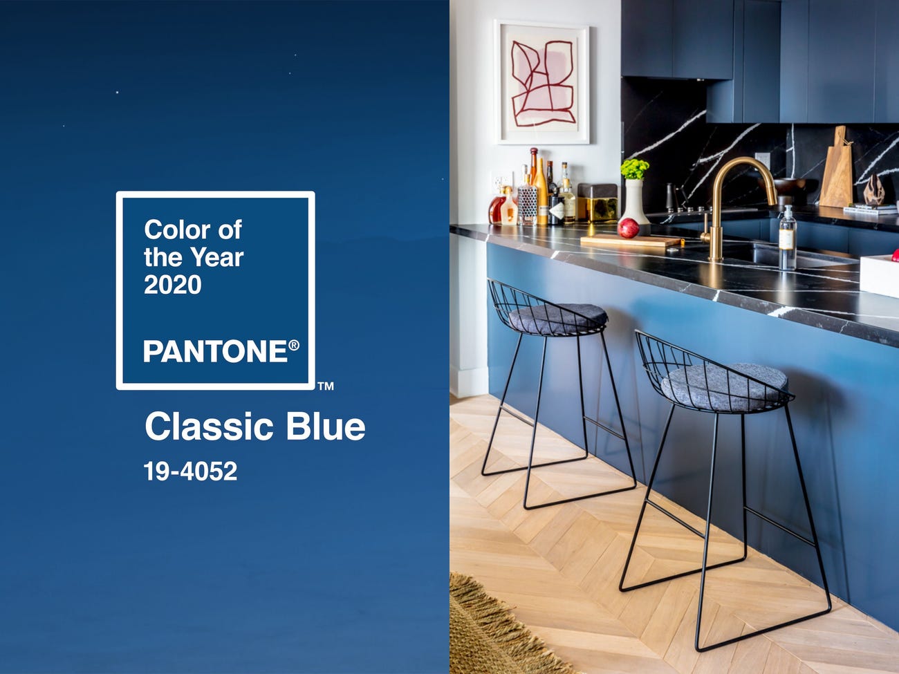
It’s official, Pantone Colour Of The Year 2020 is ‘Classic Blue’.
I have always had mixed thoughts on these colour of the year things. On one hand, I’m intrigued about what the colour is and how it will filter through style and culture in the year following. On the other hand, it all seems a bit arbitrary and pointless. But if you’ll allow me to indulge in the intrigued side of myself, let’s have a wee chat about my thoughts on this years COTY.
I thought it was going to be forest green.
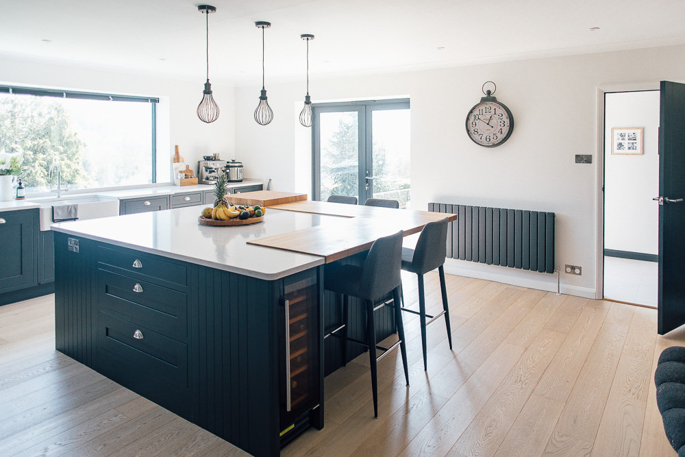
Honestly, if we had to take a bet, I would have been a big ole loser, because I would have sworn down that a deep green would have been it. Lauren was also thinking along the same lines last year. Blue has been doing the rounds for a while now in the interiors world. There are some really impressive dark blues sweeping through my Instagram feed. Namely, cobalt sofas, navy walls, petrol blue panelling, the deeper, rich and luxurious shades of blue have definitely been a gorgeous colour of choice over the last 12 months.
The Pantone Colour Of The Year for 2019 was Living Coral. Which is not a colour I have noticed being applied in swathes to interiors this last year. However, I will say that since the team here also operate in the world of weddings, we have been inundated with real weddings featuring coral in all its vibrant hues. It’s definitely having a moment there.
The Classic Blue choice for 2020 is an interesting one. Pantone state that it’s been chosen for “Instilling calm, confidence, and connection, this enduring blue hue highlights our desire for a dependable and stable foundation on which to build as we cross the threshold into a new era”. Pretty poignant and relevant to the cultural happenings of today. However, if we’re going to step away from the fact that Classic Blue is no doubt a beautiful colour in general and look at the (well, my) connotations of this particular hue of blue, I can’t help but feel that it’s a bit stately, governing and well… Facebook. None of which have my trust, confidence or connection at this moment in time.
But Pantone went one level deeper into driving home the idea of Classic Blue as a comforting, solid colour for our times with an immersive sensory experience:
A song: “a nostalgic song that takes us to a place of comfort and familiarity”
A fabric: “a soft, velvety texture to print on”
A tea: “a wellness-oriented, elegant and expansive berry melange with subtle citrus notes”
A signature scent: “a fragrant contemplation of where sky and sea meet”
So what are your thoughts on Classic Blue as the colour for 2020? Does it give you a sense of a stable foundation? What connotations does it drum up for you?
And finally, just for fun, if you could choose your own colour of the year, what would it be?
I’d agree with you on “a bit stately, governing and well… Facebook”. I realise this is partly because we’re deep in General Election territory and Pantone, being American, doesn’t have the same associations with that shade of blue, but it’s all a bit establishment, a bit Tory to my eyes. Most of their previous years options all seemed much fresher.
Previous years were much fresher Kat, you’re right. That kind of blue kind of makes me think of the political system as a whole though, even more so than red. Don’t know why. But yeah, I was hoping for a lush deep green. Such a hilariously insignificant thing to have an opinion on, but there it is. 🤷🏼♀️
It’s definitely Facebook isn’t it. For me it is SUCH a safe colour. I have endless clients talk to me about their want of this sort of shade of blue for their brand identities. It. Is. So. Safe. and lacking personality in my eyes. It’s used so much to symbolise reliability and stability but that can be represented in so many other ways. BUT, in interiors I can see it working really well and as you say, we already see hues of it almost everywhere.
Yep, pretty safe. Which is what’s disappointing to me about it. Not the colour itself, I actually really like it. Just the fact that Pantone are in essence supposed to lead the way, but in actual fact, we’ve been seeing this in interiors for over a year now. Seems reactive at best.
Underwhelmed by the choice. It’s as you say, Facebook blue. Which is not a good thing currently trust wise…
Underwhelmed is a good way to put it Nicola.
It’s boring. Just say it. Someone in the office forgot to pick a colour and last minute just went with a primary colour. 😀
Safe, boring, not a colour I can see in interiors or fashion. But I am willing to be proved wrong.
But I do like the suggestion of changing the name to Facebook blue…
Haha!! “Someone in the office forgot to pick a colour and last minute just went with a primary colour.” The best Stef 😂
Blue is the colour of the sea, the sky, cornflowers, it’s the colour the daylight turns just before the sun rises or after it sets. My favourite colour.
And as I don’t give anything about the COTY thing I am perfectly happy if the world turns blue. 🙂
Aw nice to hear a positive view on it Katrin. I actually like the colour itself. I wore a dress to a wedding once that was this colour and it still remains one of my favourites. I think I just expected Pantone to set a trend rather than follow on from one.
Boring, boring, boring. It’s not even an interesting or complex shade. Just a bog standard primary blue… Reminds me of a crayon.
And who on earth came up with the “immersive sensory experience”. I loved it – so pretentious 😂 It’s primary blue!
I haven’t been enamoured with any of the other colours but at least they were a bit more interesting and sparked discussion. Not much to say about this one.
We painted one wall in our living room blue and we absolutely love it!
Sorry if i’m being boring, safe and lacking personality!
We just liked the colour 🙂
I’d love to see a picture of it 🙂
(When I moved into my flat one wall in my sleeping room had this colour and it’s so calming to be in there.)
Aww, I don’t think anybody means that *you* personally are boring, lacking personality etc if you have used this colour. I mean, who hasn’t used this colour in some way. It’s a great colour for interiors – there’s a reason why it’s called classic! I haven’t been brave enough to use this much colour in my own home, though I do have plenty of clothing in this colour.
It’s more that I sort of expect something new and exciting… and horrendous… for colour of the year. The fact that you are saying you’ve already got this in your living room, along with many other people if Instagram is anything to go by, just shows that we all already know about and use this colour. I certainly wouldn’t walk into somebody’s home and start pointing at the walls shouting “boring, boring, boring”, because I wouldn’t be thinking about the colour in that way (and it would be extremely rude!). I am a saddo so I would be thinking about how it worked within the room and how it makes me feel. I just think it is a boring choice in the context of Pantone colour of the year.
Echoing Jade’s wonderfully put point Katie, there is not a single thing wrong with blue paint. I currently have a tub of it waiting to slather my bathroom in. It’s a beautiful colour. I too was just expecting Pantone to think outside the box a bit and give us something interesting (or ‘horrendous’ as Jade put it!). I felt like they were just being reactive to an already established trend this year, rather than setting a new one.
I love blue. It’s my favourite colour. We have gone down the interiors blue road in a big way – we have a blue bathroom (Hague Blue), a blue nursery (Borrowed Light) and a blue living room (Inchyra Blue). So I’m totally in favour of blue.
But this shade feels a bit ‘strong and stable’ to me, with all the connotations that has, and that’s not a good thing. It’s not dark enough to be moody and stormy, there are no undercurrents of grey to make it a bit ‘dirty’ and it’s not light enough to give off those seaside, summer sky, light and airy vibes. It’s just a bit primary school polyester jumper.
It also feels like blue was a really fresh idea a couple of years ago, and now it’s moved to classic territory.
I too, would have had my money on green. We’re contemplating painting the kitchen a dark green, and it definitely feels more of a bold decision than blue did.