I’ll start this post by saying I’m no trend predictor and I don’t have a crystal ball. In fact you’ll probably notice a lot of the images I’m sharing with you today have been around for a while. Therefore this feature consists of interior design elements I’d like to add or enhance in my own home this year, rather than any great predictions.
Mix and Match
The trend for mixing and matching dining chairs in contrasting styles is going absolutely nowhere. As demonstrated in Emily Henderson’s living room, you can mix and match in your lounge area too; fusing mid century leather chairs and sofas in different colours with upholstered ottomans and boho moroccan pouffes. I have always been a fan of an evolving space rather than buying a whole suite of furniture from one place. However this was more due to budget than a design choice!
I suppose the easiest way to create this look without looking like a hotchpotch jumble is to aim to keep one thing consistent; whether it be the types of wood, the height of the furniture, or alternatively pick up the colour of the furnishings in other accessories too to create a more coherent space.
Crystal, Agate and Quartz
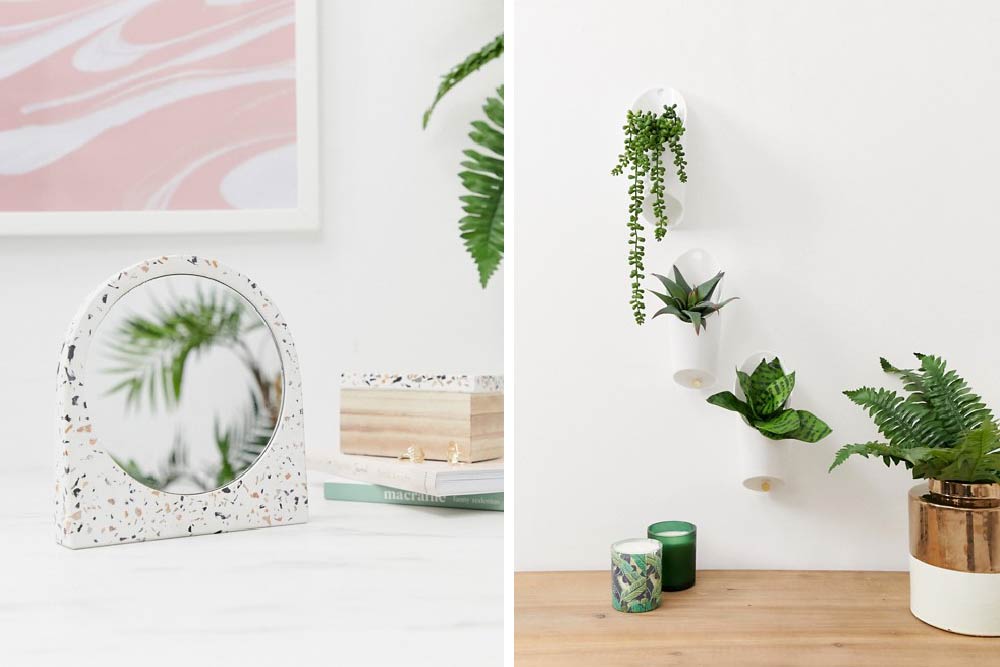
Semi precious gemstones and minerals are also having their moment. Agate, crystal and quartz are perfect materials to create the ‘hard glam look’.
With their unique textures and captivating colours you can easily add into your own home in the form of bookends, coasters and cupboard knobs. Anthropologie are always a good retailer to check out for this look.
Marble
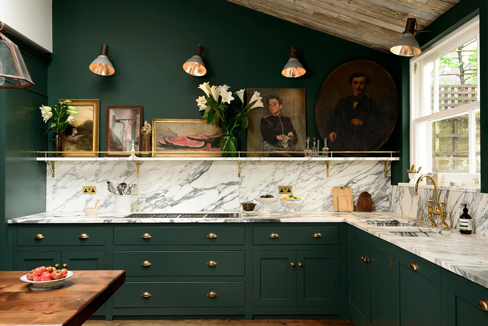
Marble has also been around for a couple of years but as yet I haven’t got round to including it in my house other than in a cheese dome. As a very sophisticated natural stone, marble looks superb with a back and white colour scheme, and decadent when combined with copper or brass. I’m on the look out for a marble tray of some description to add into my spare room. I’m pretty sure H&M had a marble collection but I think it’s all out of stock. I’m all ears if you have any suggestions?
Marsala
Pantone named this rich and full bodied shade as their colour of the year. Marsala is a really welcoming shade and would make a huge style statement if used to paint a room.
If going the whole hog and applying such a plush colour to your walls is a bit much then try incorporating into accents such as rugs or cushions. The strong brick hue looks great combined with earthier pinks and neutrals.
Whether or not this colour takes off remains to be seen but I prefer Pantone’s choice more than the emeralds and orchids of previous years.
Geometric patterns
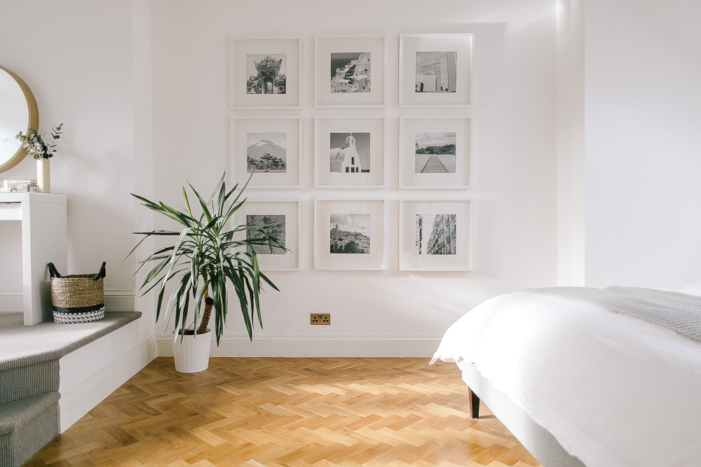
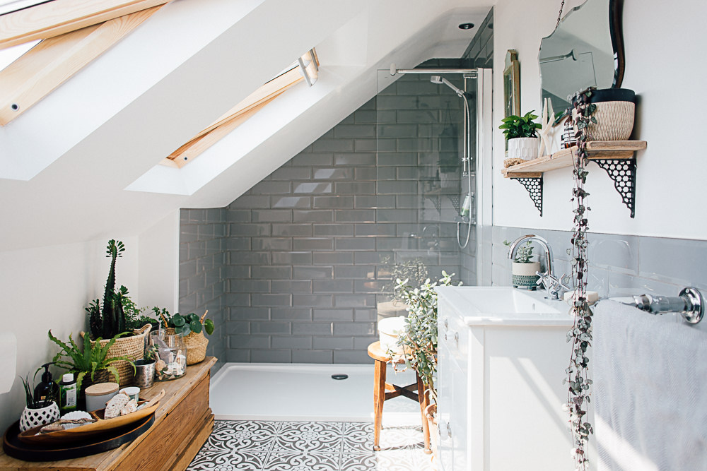
Personally I can’t get enough herringbone in my life and I have a sample honeycomb tile I’m itching to find a home for. Geometric patterns on floors, walls and soft furnishings are all the rage right now. I adore the bathroom we featured above from Sarah Sherman Samuel’s house as it puts a new spin on the usual running bond pattern you usually see with metro tiles.
What interiors styles have you seen emerging? What do you love and what do you wish would go away?!
Images sources | Mix and Match Lounge | Contrasting chairs | Crystal platter with accessories | Bar area with agate handles | Marble tray | Marble kitchen | Marsala sofa | Marsala chair | Subway tiles in geometric pattern | Herringbone chevron floor.


My aim for this year is to try get more of the mix and match look into my house! I love the look but somehow I always end up playing it safe and everything is looking a little matchy matchy and boring… I need to be braver and dare to mix patterns and inject colour! x
Go for it Sarah! This is your year for being braver 🙂 x
I’m definitely a mix and match girl but like you mainly due to budget! I tend to just buy what I like and then fingers crossed it works so old and new, mismatched colours etc are all scattered about my house. I then try and tie it together with some accessories and cushions so am currently sewing and knitting lots of new cushions for my lounge to try and bring all the colours together. My aim this year is to finish off all the bits so love some of these trends from an accessories point of view. After years of boring work on the house I can now spend the money on nice things. Then again my lounge was decorated 3 years ago so may be time for a change…… x
I love how you are such a crafter Charlotte. Make sure you instagram a pic of your cushions when they’re done x
My aim for this year is to buy some more cushions for the ruddy sofa. It sounds random but we have the hugest sofa and our living room is very dark (old cottage, small windows, low beamed ceilings!) and I’m convinced that a huge pile of different but coordinating cushions is the way forward.
That and sorting out the lighting and doing a gallery wall in the downstairs loo 🙂
Hi Claire, my cottage sounds the same; small windows and low ceilings. When it was first decorated I went completely down the grey and neutral route and it felt so cold. Adding an accent colour through millions of cushions really helped. You really never can have enough cushions, though my husband would disagree.
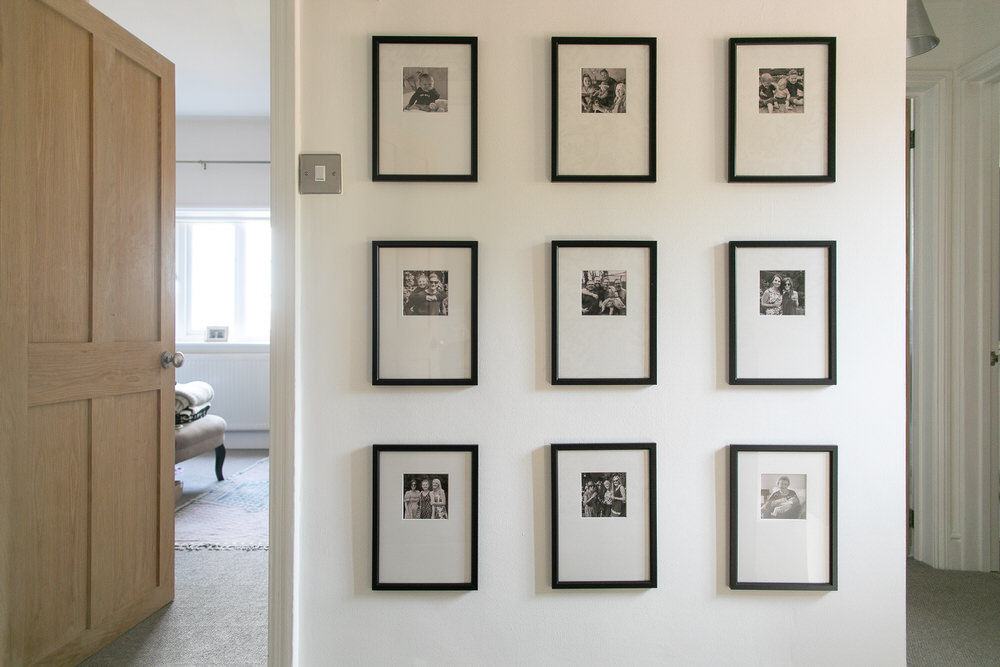
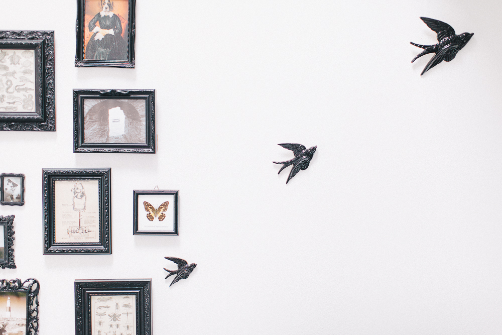
Love the Marsala colour, it looks very heritage but so exotic too. I’m kind of over the feature wall in terms of it being a block colour or being a dramatic wallpaper. I like the use of accessories creating features in rooms such as using photo frames covering whole walls or clever ways of displaying belongings so they are what you notice when you first step into a room.
Me too Claire. I still can’t get enough of a good gallery wall x
Farrow & Ball have done a nice piece on colour trends for 2015, Breakfast Room Green & Pink Ground among them. Can’t link to it here for some reason but it’s on their homepage.
I’ve got my eye on Pink Ground for my en suite this year. Had a fit last year & painted my whole bedroom dark navy so need something soft. & girlie to offset the masculinity.
Do so love your interiors posts, Lauren. Keep ’em coming. Accessible inspiration!
Nikki I adore Pink Ground. It would look incredible with navy blue (in fact, I had a very similar palette for my wedding colours as I wanted to warm up the masculine blue!). What shade of navy did you paint your bedroom?
Oooh, what a beautiful wedding palette. Bedroom is Drawing Room Blue on the walls & Pointing on the woodwork & shutters. Was worried it would feel cold but in actual fact, it feels lovely & crisp in summer & cosy & atmospheric in winter. The reaction of the lovely Polish guy who painted it was hilarious: “ah, navy & white – like sailor?”. “Yes, just like a sailor.”