If you caught my last post (Designing a Kitchen – Part 1), then you’ll know that Gavin and I are embarking upon a kitchen renovation project that involves a redesign and knocking through into our dining room. Jump back to that post if you want an idea of what our plans are and how much it’s likely to cost. I’ve also listed out the main things you should consider before you launch into your design. But for now, let’s get on with the rest of the things you’re going to want to think about when designing a kitchen.
Think Dining
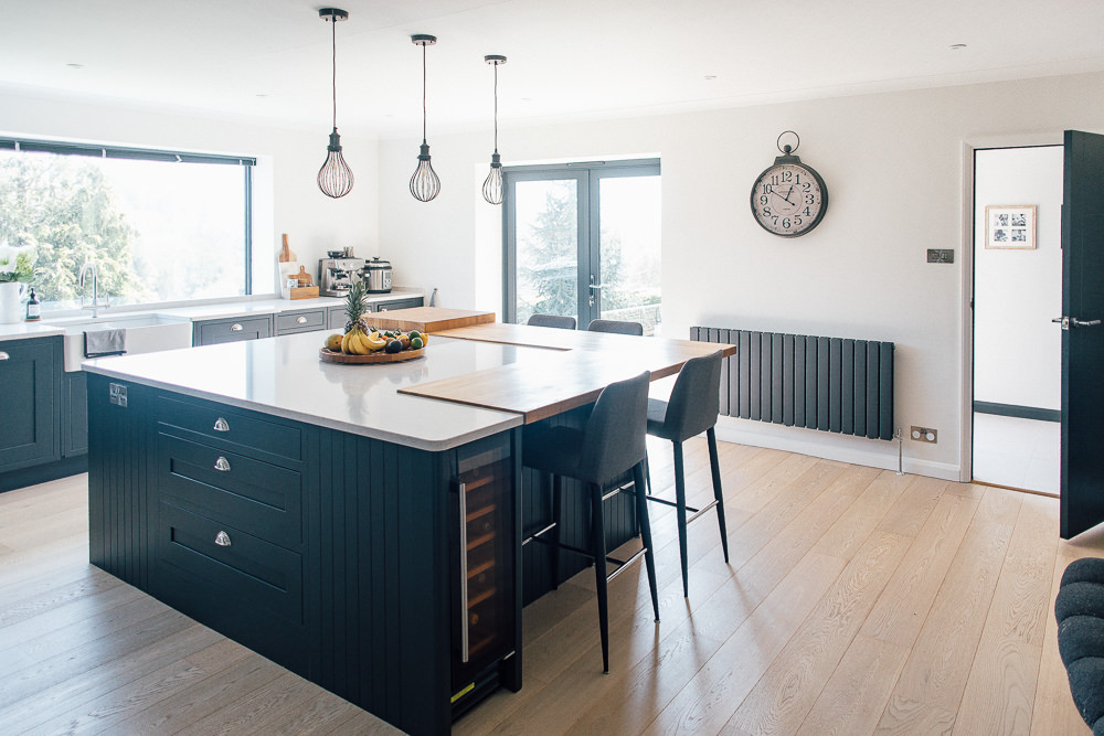
Our dining table is staying put. I love that thing. So easy to clean, kid-friendly and looks great in our space. And it was only £150. By nature of knocking through to our dining room, we just need to be mindful of the size of our current table (it’s pretty long). Some people in our area keep a dining table in the kitchen (as well as having a separate dining space), so if you’re a fan of having a casual eating area and a more formal dining table, then think about how that will work with your new design? It could come in the form of a breakfast bar or island. We’ve chosen to stick with our well-used dining table in the dining area and decided against putting a breakfast bar in. Once again, it helps to think about your family’s current habits and preferences.
Think Worktops
Any kind of home design is such a personal choice, isn’t it? And it’s worth thinking about what space you like to be in, not just one you like to look at. We had a very big kitchen in a previous rental property, but this taught me that I prefer to have a more compact kitchen space to move around in. In light of this, we’re adding a peninsula because I would rather have a large, uninterrupted working space than large uninterrupted floor space. If you enjoy cooking or baking, have a think about how much surface you want for those activities. Also, consider just how much counter space you’ll be left with, once you factor in your appliances. On a similar note, think of where you will serve up your food. In my current counter situation, this task is a bit of a juggle, which is why I’m keen on having a big clear counter space in the design.
Choice of material for a worktop is a big topic. So big, in fact, that we have written about it a few times before. This cost breakdown and round up of worktop types written by Adam is a great starting point. Lisa also caused a debate about oak worktops in this post. Honestly, the comments on both of these posts are a gold mine of experiences if you’re looking for testimonials on each worktop type. We’re choosing a quartz top for ours and our currently trying to decide whether to waterfall or not to waterfall (which Lisa also talked about over here).
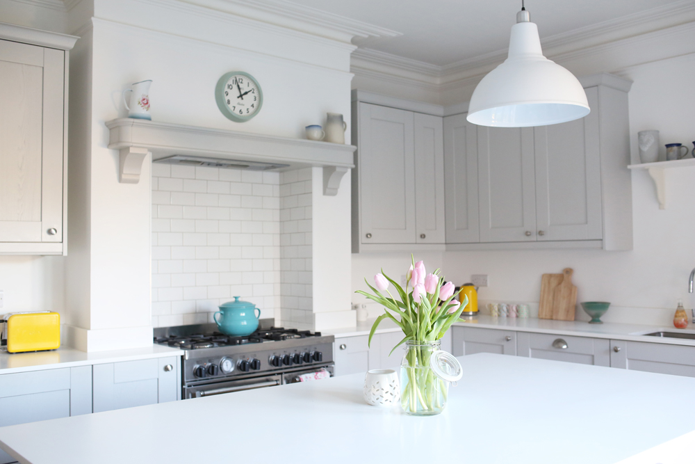
So now that you have some further reading about worktops, let’s talk about the extension of those… Backsplashes. You have a few choices here, tile your walls, return the worktop up the wall for a plinth backsplash or buy dedicated backsplash panels. Regardless of your choice, it is a good thing to think about how your walls will cope with any haphazard curry making skills. Wipeable is always going to be a win.
Think Heating & Ventilation
We live in Scotland. Which means that heating is a major consideration when redesigning a space. Our two current options are to relocate the existing radiator OR since we’re ripping up all the flooring anyway, to install underfloor heating. After doing some research, the underfloor heating costs were coming it at around £75 per sqm (including labour) which was a bit outside of our budget, so we’re going with a radiator instead. Which is obviously something you want to factor into your design as much as cabinet space. It takes up a wall after all.
As for ventilation, in our initial IKEA consultation, we asked the designer if you absolutely need an extractor fan. The answer was no. You don’t. However, given that our living situation is going to be rather open plan, I feel we should. There are two main types of extractor ventilation, one that pushes the steam and air outside, which needs plumbed in. And one that uses a filtration system, which can just simply be wall or ceiling mounted. We’re going for the latter to save on labour costs.
Think Flooring
The main requirements for a kitchen floor in my book are, it must be easy to clean. With two children who love a bit of messy play in the kitchen (and my previously mentioned haphazard curry making skills) being able to wipe up spills is paramount. Your flooring choice should also be able to deal with varying temperatures and moisture levels that inevitably happen in a kitchen. Which is why hard, nonporous surfaces like tiles and vinyl are so popular in kitchens. We’ve decided to go a bit left-field with our flooring and have opted for rubber. I’ve had a few sideways looks at this choice, but the pale grey studded rubber floor we’ve chosen is going to fulfil all the above criteria and also work nicely with our chosen quartz tops while bringing a bit of a cool, industrial style. That’s how I see it in my head anyway. Here’s hoping it works out as I imagined.
Another thing to think about when you’re planning your floor space (and actually potentially your cabinetry) are your bins. We all need them. So where will they live?
Think Lighting
Kitchen lighting seems a tricky subject at first because it’s never quite as simple as whacking up a few ceiling spotlights. But actually, there is a bit of a formula for getting your kitchen lighting right. Ambient, task and accent lighting. For ambient, you want to think about how you will generally light the entire space on the many dark evenings of winter. It should be bright and even enough to be able to clean your countertops well or find a missing earring on the floor, but be without glare.
Task lighting, on the other hand, is usually centralised over your countertops to provide… Task lighting… for the task at hand. Undercabinet lights are good for this, but since we aren’t having any top cabinets, we need to think carefully about this one. Accent lighting is lighting that creates a sense of style and ambience in the space. The lights you would leave on if you were sitting down to dinner with friends lets say.
It’s worth mentioning that light sources can be multipurpose. For instance, we’re considering a few pendant lights over the peninsula countertop, which will serve as both task lighting and accent lighting.
Think Powerpoints
Never to the underestimated in how this detail can make or break the enjoyment and functionality of your space, you need to give decent consideration to your powerpoints. Big appliances come first, make sure you have enough power and the right locations for cookers, fridge, dishwasher etc. Then have a think about tasks in your zones, where will your kettle live? Where are you likely to use a hand mixer or stick blender? Plan out what height your countertops will be, because your power points will need to be 10-15cm above the working surface. If you want to keep your toaster in your pantry, think about installing a powerpoint in there. If you charge your devices in the kitchen, it’s worth considering where the most likely charging point will be and use some USB sockets in that area. I cannot stress how useful a USB socket is! Some electricians are willing to give you a hand in deciding where’s best to place powerpoints, but equally, some like to leave it entirely up to you. So plan and be prepared.
And Then There’s The Decor
And lastly, in these two massive kitchen planning posts, we’ve come to the decor. Whilst planning things like your cabinets, flooring and worktops all create the main look and feel of your kitchen, how you decorate and style your space will tie it all together. So as a parting gift, I thought I’d leave you with a handful of links to some kitchen features from the archives.
And of course, if I’ve missed anything, you have some thoughts on planning a kitchen in general or even if you’re currently just weighing up wood vs quartz worktops and want some input, do leave a comment and we can have a good old chat about it.
Happy tab opening!

Thanks so much for these posts, they’re so helpful! As we’re planning on moving into a house that basically needs gutting and redoing, it’s really useful to have a starting point for thinking it all through.
Ah I’m so glad you’re finding them useful Kat. I’ll be sure to share all my experiences of these renovations as I go along. We won’t be gutting ours as such (and good on you for taking that on!) but hopefully some of it will prove useful.
This is super useful and I’m bookmarking for future kitchen extension 🙂
Could you link to where you’re thinking about getting your rubber floors from?
We’re going here Lydia… https://www.harveymaria.com/category/rubber/ Thinking of the ice grey. So happy you’ve found it useful.
Where do the bins go! Such an important one.
My friend has just had a new kitchen with cork floors. Sounds strange but they look beaut and are eco-friendly.
Lovely to see you all yesterday! X
Oh I really like the sound of cork floors! Had never even thought of that. It was so nice to see you too xo
I love the look of cork floor, I don’t know why I’ve never considered using it, such a good idea. We went for a cheaper brand of LVT and I just love it. It has scratched a bit but because of the parquet laying pattern and the pretend wood grain, you can’t really tell unless the sun shines on it in just the right way. It’s hard wearing, easy to clean and if one is damaged I can replace just that one. I love it so much I’m going to do all of downstairs in it. We also put the bins in a cupboard. I love not having bins on display. I had all of the appliances fitted in too so it all matches and looks neat. We have a very easy recycling system here so I only need one bin for rubbish and one for all recycling. I know it’s a bit more difficult if you need to have lots of different boxes. And we keep a compost caddy under the sink for food waste.
As for splash backs, we went for a plinth (with tiles behind hob) and I was a bit worried about the walls being filthy, but we used the dulux scrubbable kitchen paint and it wipes off very easily, so I can recommend that.
I’ve seriously considered using the dulux scrubbable paint on my hall wall (why do all kids feel the need to trail their grubby hands up the wall when running up the stairs?), but it has that slight satin sheen that looks great in a kitchen/bathroom. But wondering if I could get away with it in the hall?…
Good point on the compost caddy too! I’ll need to think of a clever place to put that!
Hi Jade – would you mind linking to your LVT tiles? I’m thinking of having same flooring throughout ground floor but can’t decide what would work – but your herringbone wood style sounds good!!
Of course, these are the ones we went for https://www.floorbay.co.uk/product/uncategorized/cambridge-parquet/
I found them slightly cheaper with a deal so they were a real bargain. I think they probably scratch more than the higher end brands, maybe a thinner wear layer, so look into that. But I think they are very good value and have held up well in our kitchen with spillages and bikes/general kid stuff being dragged across them.
How funny Jade – I could have written this exact comment. We’ve even used the same LVT as you. And I too keep a food bin under the sink. We’ve used Valspar scrubbable paint instead of tiles by the sink. After 3 months I have noticed a few marks – not sure what from exactly as we don’t tend to lean anything against the wall. The usual splash marks wipe off pretty easily so I am going to wait to see how well it copes for the next six months or so and then make a call on whether we need to add tiles by the sink.
Brilliant, thank you – they look lovely! x