Maybe it’s the nerves of sharing my style and taste on the internet, but I feel I should preface this post by saying… I do not pretend to be a stylist. I have no real idea of what I’m talking about. But I have one rule: to curate, not decorate. I want every little thing to be in my space because I love it, not because ‘it’s what you put there’ or because circular mirrors are ‘in’. Yes, there are trends that I get all lustful over, I’m definitely not a trend dodger. Nor am I a trend follower, I just like what I like. So some of my plans might be bang on trend. Some might be weird or unfashionable, but I’m just going to tell you all anyway because we’re all friends here.
And if this is the uncool house, I reckon it’s ok for me to be uncool about it.
We are currently only focusing on the decor. We eventually want to do a garage conversion and replace the kitchen amongst a heap of other things, but that heap requires many pennies. So I plan to save a bit of money where possible on the decor so we can syphon it off into savings for the longer term goals. I’ve splashed out on a few things, but most pieces are going to be budget-friendly buys.
The Backdrop
ALL of our walls are currently magnolia. It has to be said that I’m not a fan of magnolia. The back garden is south facing and the front windows are huge, which means we’re bathed in glorious light most of the time and that warmth just makes the walls look a very… Ick. I’m thinking of painting most walls some kind of variation of white and/or grey. I know that’s not groundbreaking and I would love to venture into colour, but I feel like until we make changes to things like the kitchen, bathroom etc. I just want to live in the house with a neutral backdrop to really get a feel for seasons, light and how we use the space. Then I might get my adventurous painting clothes on. The only colours we’ve chosen (I think) so far are Little Greene’s Shirting for the living room and Welcome Deep for the dining space (as you can see in my shoddy move-in phone photos, it’s a joint space separated by an archway). The jury is still out on other room colour choices, but I’ll keep you all posted.
Dark Woods
The very first piece of furniture we bought for the house was an unnecessary one. After a long day of shopping for the furniture we ‘actually’ needed, we came across this reclaimed wood beauty in Sterling Furniture (for all you Scots reading) and fell in love. It was pretty spendy for a sideboard, but we bought it there and then, (even though we really needed, you know, beds and a sofa etc.). With dark, brooding wooden furniture in mahogany, teak and walnut all finding its way back in, I guess I’m embracing the trend. But I will be keeping a hold of my Scandi style ash dining table too. Contrast and balance. We’ve all heard of mixed metals being a thing, maybe mixed woods can be too?
Smoked Glass
When I was a little girl I had a favourite cup at my Nanny’s house. It was a smoked glass cup I used to eat beat up eggs out of. And I don’t think I’ve ever really fallen out of love with smoked glass since. We can all admit it’s *very* 70’s, and whilst I have no intention of giving the house a full 70’s vibe, I think a little nod to it would go down a treat. So when we spotted this bargain light fitting in Ikea, I was all over it. We’ve hung it in the corner in our living room on a black cord and it’s currently one of my favourite nooks of the house. I’m now thinking of other ways to incorporate smoked glass. It would be a beautiful bathroom accessories material. Very Aesop and medicinal looking. With white walls and leafy dark green plants? It could also be useful on my plastic reducing quest… I’m getting unnecessarily excited.
Brass
I was never really on the rose gold and copper train. It’s a stunning metal and I do love looking at it in other people’s homes (and my best friend’s corker of a wedding ring) but I kind of like my metals with a bit more grit and grunge. Brushed steel, nickel and brass. Especially brass. It’s like gold, but not gold (I warn you, my descriptions are excellent). We had very dated wall lights in our entrance hallway and decided they were one of the first things to go. We replaced them with these brass, crystal cut sconces, which I adore. I will definitely Instagram these and other details in place once the dreaded magnolia paint is gone.
Bohemian Textures
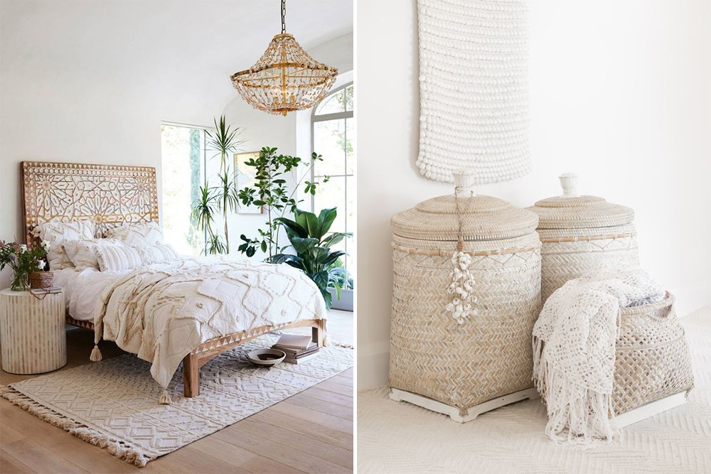
While I love clean lines and structured spaces, I’m rather Stevie Nicks at heart. I’d like to have a minimal look overall and bring warmth and comfort into the space with some bohemian elements, big textures and handmade vibes (all within a relatively neutral colour palette to keep the space calm and restorative). Spending most of my working week staring at computer screens has me gasping for handmade, tactile finds. I’m currently on the hunt for a white but heavily embellished bohemian style basket. I’m also in the market for a stone or shell chandelier for our bedroom, similar to this one but without the eye-watering price tag. If you’ve seen anything like this on your travels, I want to hear about it!
Yin and yang
I promise I’m not going to get all feng shui on you (a la 1999, although I confess to having Japanese wallpaper and a water feature in my bedroom as a teenager!), but I think there’s a lot to be said for balancing the masculine (yang) energy and feminine (yin) energy in a space. By this, I mean playing with contrast. Like at the moment, I love the harsh, dark, industrial look of our console, but I feel like we now need to balance it with a voluptuous, soft armchair, quite possibly with a pastel colour. I’m not really into all-out industrial spaces, but the full-on chintzy cottage vibe doesn’t work for me either. So I’m figuring, why not play around with a little of both?
So that’s it so far. That’s my springboard of ideas. I’m happy to keep you all updated on room changes and purchases here or via Instagram. There’s a lot to be done and it’s going to take time, but I’m kind of excited to share the progress.
Any trends or not-so-trends you lot are lusting after? I’d love to hear about your own ideas (or that-thing-you’re-trying-to-find-that-you-totally-made-up-in-your-head-but-you-hope-is-in-a-shop-somewhere – like my stone/shell bedroom chandelier).

Loved reading this Naomi! M&S do a similar chandelier to the Graham and Green one. (It’s still £299 though 😢)
https://www.awin1.com/cread.php?awinmid=1402&awinaffid=195689&clickref=&p=http%3A%2F%2Fwww.marksandspencer.com%2Fmila-ii-pendant%2Fp%2Fp60110744%3FprevPage%3Dsrp%26pdpredirect
Thanks Lisa! I love that one! Very similar indeed. I also like this one:
http://www.marksandspencer.com/mila-chandelier/p/p22465265?mfPartNumber=T808999&carousel=FUNV_RR&pdpredirect
Better start saving some pennies… Or get to the bead shop and fashion one myself! 🤔
Naomi – did you see the lovely Hayley Stuart who featured on RMS last year? She made her own. Very clever indeed!
This vaguely rings a bell… I’m off to investigate. But how to find the time?!
I have the other M&S version of this- the quality is not v good but it does look great hanging on my landing
I couldn’t agree more about painting it white and LIVING the space for a while. I mean, I’d totally leave mine white because, you know, I’m the anti-colour police.
I think this is going to be totes exciting. Its very different from the usual rock my style stuff (although that’s actually what I like in practice). I’m living vicariously.
How the F do you find time to find stuff like that lamp though? I don’t feel like I have time to look for anything?
Hahaha! Anti-colour police. I think this is the term my husband would use to describe me too Rebecca. Last night he suggested we use blue, yellow and green textiles in the living room. I was like 🙅🏼♀️. Stop right there.
As for time… I spend too much time on my phone in bed. To be honest…
Incidentally you should totally check out simply the nest’s Instagram. She had a brilliant post of her room and it was Ikea wardrobes with Indian screens. Totally like the image above that she had DIY-ed.
Noted. I am off for a hunt to find this post!
We’ve just moved into a newly refurbished 1960’s semi and I want to say yes to everything you’ve written!
All our walls are white with the exception of one that I took the plunge and painted dark navy. I intend for them to stay like that until – as you said – we’ve lived in the house for a while and know how we use the spaces.
And yes to curating instead of decorating, and balancing and contrast and all of your other inspiration! I’m really looking forward to seeing your progress and will probably (definitely) be poaching some ideas x x
P.s currently looking for the perfect black and white (more white than black), textured, slighty boho throw to go on the bed in our spare room…
Sian glad you liked the post! I’ll be on the lookout for textiles in the next few weeks so will keep my peepers peeled for a throw that matches your imagined one.
I like how you have a vision. We have no overall vision, just going room by room. I’m sure interiors people would say it could have better ‘flow’, but each one is linked by the abundance of toddler toys, books and fingerprints that end up in there so definitely a continuous theme going on 🙂 Most of the rooms we’ve redone are light, except our bedroom that’s just been painted dark teal. I love it!
We still have loads to do but I’m trying to take time to make decisions instead of wasting money on expensive mistakes. We had to buy sofas at short notice when we moved in as we sold our other ones, and I’m already keen to replace one as I don’t think it works particularly well in the place we have it. But we took forever to choose our dining table and chairs, but we love it so happy we took our time.
If you like mid century modern then Vintage and Retro furniture in Glasgow is amazing but there a few other Scottish sellers I follow on IG too.
Ohh I am very much up for a hit list of scottish sellers on Insta. I’m also with you on the whole taking time thing. I would love to do a quick ‘voila’ turnaround especially to share with all of you, but I guess the reality is that hunting, finding, placing and liking these things takes a lot of time and serious thought.
Otherwise I would end up with a house full of cheap ‘that will do for now’ things that I’d never get around to replacing. We had years of that renting and I’ve sworn I won’t do it again.
So on Insta, @bananasandjam @kingsantiques, @florrieandbill (not Scottish but lovely stuff), @habiibhome, @turnstyle13, @salvation_glasgow. On Facebook there is Love Vintage, Victorias Antiquities, Household Vintage (Kirkintilloch). All quite mid century but have other stuff too. Sure there’s more
Thank you thank you thank you! I didn’t know of any of these!
Its great to have someone based in Scotland writing interiors posts- hurrah! I live in central Scotland and am very slowly redecorating our home- 1 room a year is the goal. I am a full on colour lover though and the entire house was painted cream so year by year i am bringing in more bold colour and slowly building a collection of prints by local artists to hang on the walls. If you are looking for any other timber furniture then i would highly recommend you google reborn in a barn- based on the outskirts of Edinburgh- its a small company and they make dining tables, shelving and sideboards from reclaimed timber- we got our dining table from them 2 years ago and hoping it lasts a lifetime- the prices are so reasonable also- i dont work for them- just a big supporter of small business!
Look forward to following your progress 🙂
Rachel I think one room a year is a very sensible and reasonable way to tackle it. I’m trying to do all the rooms at the same time and it’s turning my brain to scrambled egg. I haven’t heard of reborn in a barn – thank you! I’ll definitely be looking them up. Sounds right up my street!
I love this! And the house has so so much potential. I’m so jealous of the downstairs utility bit with a sink by the back door it looks like??? So useful! My friend has a shower in her downstairs loo just off the back door and it seems genius for washing wet dogs and muddy children.
With our barn Phil is Mr Minimalist. Trade white, wood, stone. Pops of colour at best. And I’m ok with it! Maybe hit up the trade white base coats and see how you feel?
And ah, statement lighting. If you haven’t found Tom Raffield already go torture yourself looking at his amazing bent wood creations. He has this hanging chair that is so incredible too but I need a lottery win first. And not a £2.00 one…
Hey Naomi – just a note on the colour Welcome. I tested Welcome in huge patches on every wall of my bedroom and checked in various types of light and was really happy with it as a warm grey. But when we’d painted the whole room it looked completely lavender. I couldn’t get away from it being purple and had to repaint with French Grey pale – which looks awesome.
Loving your posts on the Uncool House and look forward to more!xx