Gosh it’s hard work trying to keep a house clean and tidy when you’ve got a two year old trampling mud in from the garden and flinging books everywhere! That really sums up what I’ve tried to achieve in my home – making it comfortable and pretty yet practical and toddler-proof.
At the back of the house is an open plan kitchen/dining room/playroom. In my post a few months ago I talked about the second thoughts I was having about the feature wall that I had created using wallpaper in this room. You lovely readers came up with some excellent suggestions which I took on board. I moved the jute rug into the hallway and replaced it with this grey pebble wool one. I also relocated the black lampshade and cushions – it’s not the brightest room in the house and the black accessories were just making it even darker. I swapped them for pastel pink and grey ones – the cushions were H&M bargains, the concrete apple and pear were from Cox & Cox, and the lampshade was a Tesco special.
And I’m now much happier with the space, however I’m still not keen on the wallpaper. I reckon at some point it’s gonna have to go. Adam has done a good job of making it look halfway decent though!
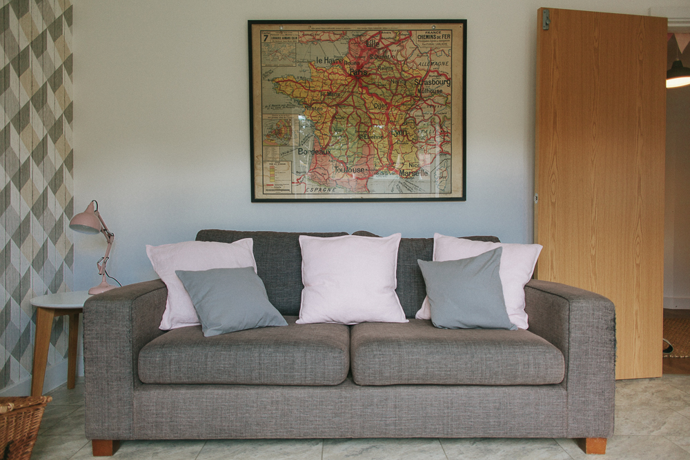
In terms of the furniture, my beloved sideboard was from John Lewis (they don’t stock it any more but Maisons Du Monde do a similar one), the sofa was from M&S (bought circa 2007 and still going strong, despite the fact that our cat Millie uses it as a scratching post), the dining table was from Habitat and the chairs were from Ikea.
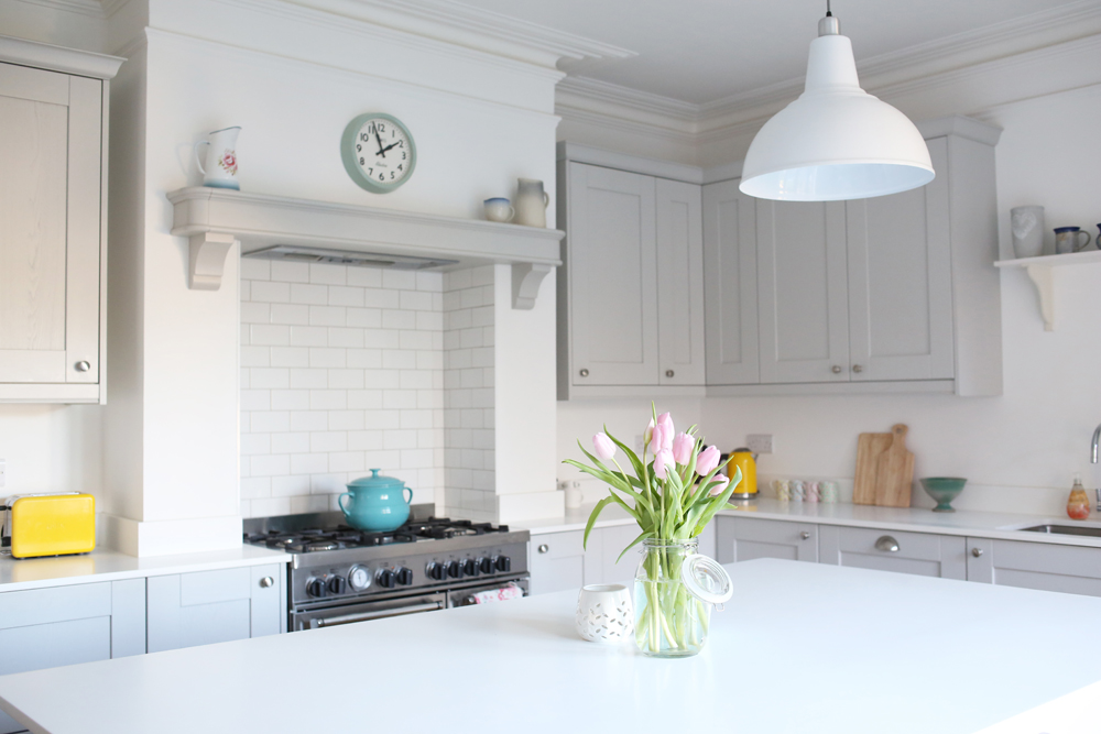
Although it’s a new build house, we didn’t get to choose the kitchen which I was a bit sad about because I would have preferred simple, modern white cabinets to the cream shaker style ones that were here when we moved in. However I have added a few pastel accents – the porcelain vases, bamboo tea and coffee canisters, and lamp (idea stolen from Lauren’s master bedroom), and I like the way the muted tones work with the cream. Having spotted this recent post over on Coco Kelley I am also tempted to swap the existing silver hardware on the kitchen units for some brushed brass pieces.
Other next-steps for the kitchen are to tile the walls and hunt down some blinds or I’m even considering shutters. I love-but-hate the fact that my house isn’t finished…although I want it to be perfect NOW, I also enjoy the journey of making it look nice.
And now I would massively appreciate your advice again. Do you have any tips on the colour or style of tiles that I should go for in the kitchen? I’m thinking perhaps matt grey metro tiles…?

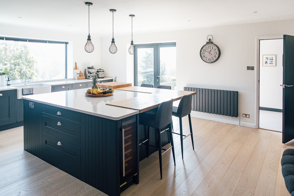
I’ve just had my kitchen done, white units and a solid oak worktop. I’m at a loss now with the tiles. Our kitchen in west facing, so doesn’t get the sun until the afternoon and a lot of it is blocked out by some huge trees, which we will eventually chop down (I’m the same as you – I want everything done right now!). We had chosen some pale sage green tiles, but they look really dark and I want to keep it light and bright. Now considering just plain matt White tiles but having them in a herringbone pattern with grey grout. I just can’t decide! Your styling looks great, change the wallpaper if you don’t like it, there’s nothing worse than living with something you don’t like, even if others tell you it’s great!!
Oh Claire I have a huge case of the green eyed monster now, I wish I had white units and oak worktops!
I’ve also wondered whether to go with sage green but decided against it for the same reasons. Matt white tiles in a herringbone pattern sounds great – very classy. Would love to see pics when you’re done. X
Hi Lisa,
Same issue as you, new build house with uninspiring shaker kitchen. We’ve just had tiling done and removed granite upstand and bit behind hob and had tiling in herringbone pattern installed. Topps Tiles Lustrum Electra in ivory with bright white grout. Thought darker grout could just look grubby. It has totally transformed the whole kitchen and I’m in love.
Have you thought about glass rather than tiles? We’re doing our kitchen currently and going for a quartz worktop with a navy shaker so keeping it simple with white glass but there are so many shades and finishes and hopefully easier to keep clean compared to tiles!!
I hadn’t seriously considered glass because I didn’t think there would be much choice but definitely will now! If it’s going to be easy to keep clean it’s a winner. Thanks Emma x
Hi Lisa – definitely look at glass! Decoglaze is a company stocked by many places in the UK, and it has a whole kaleidoscope of colours and different finishes. You can see a whole load of samples at kitchen companies, our local Magnet for example has tonnes to look at. Good luck!!
Brilliant – thanks for the tip Annie x
No problem – thanks for an awesome post. You’ve inspired me to cancel the handles we’ve got on our current kitchen order and be a bit more adventurous! X
How about these? I have them in the blue which looks stunning but I think the beige or grey would look better in your kitchen.
https://goo.gl/images/HmqbqA
My friend has those in her bathroom, they look fab. However I’m not sure whether I should be adding another pattern into the mix seeing as I’m not keen on the geometric craziness that is going on on the opposite wall! I am very much a minimalist at heart! X
What a boss post for to come back to after my brief RMS hiatus.
Lisa, that space is transformed, it looks fabulous! (not that it didn’t before) the accessories are perfect and really bring it all together. Great work.
I’d say go for it too on changing the kitchen handles. I did the same from silver modern ones to cast iron (rather than brass but now you’ve said that I want to change again!) and it made all the difference.
Xx
Karen, you’re lovely and I’ve missed you!
I reckon cast iron might actually work better than brass in my kitchen seeing as there’s more greys in there than golds…you’ve got me thinking now 🙂 x
Hi Lisa
I love your map of France, its gorgeous. Where is it from?
Laura x
Hi Laura! Rich brought it back from France for me – I think it was from an antiques market over there. However I have spotted them for sale in a little shop in Brighton before as well. Sorry, not much help! x
I love your house Lisa, it looks very cosy and I keep looking at similar houses on Rightmove at the moment – the hubby isn’t getting the hint though. The small changes you have made to the living look to have made a real difference and softened the feel of the space. It’s amazing the difference a few accessories make! I think I’m with you on the grey tiles for the kitchen as they grey will complement the floor tiles too. I’d love to see the finished result.
Btw I am ordering the Sanderson swallows wallpaper in green this weekend and hopefully it will be put up in my bedroom in mid-October. I’m excited!
Thanks Claire B, what a lovely compliment x
Rightmove is addictive isn’t it!
It IS amazing what accessories can do – the blush and grey ones work so much better than the black.
I do wonder whether I would bit a bit more in love with the space if I had gone with the swallows wallpaper. Send us some photos of your bedroom once it’s done! x
Hi Lisa, love your house and I *may* just be on Dunelm looking at your rug now! Bit of a random question but did you get your cat flap put in to the doors by a specialist? we recently moved into a house with bi-fold doors and wondering how to go about this. Currently keeping a window ajar which is not ideal!
Thanks so much in advance
Gabi
Hi Gabi, my neighbour asked me about this the other day! We did get a specialist to do it, it was this company: http://www.wefitforyou.com and it was eyewateringly expensive – around £250 – but so worth it x