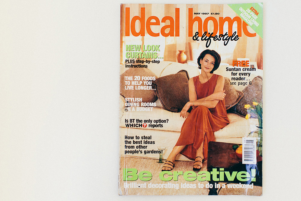
A few weeks ago when Mr Coleman went to have some work done on his car, I received a photo message of the magazine selection in our local garage. Like a shining beacon amongst the Readers Digests was a ‘vintage’ edition of Ideal Home. A few hours later he appeared home with the said magazine. (He didn’t steal it I hasten to add, it was negotiated with the cost of four spanking new tyres). I have a rather large selection of interiors magazines and so was thrilled by my 1997 version.
Scanning through the pages the concept of the interiors magazine still holds true, showcases of peoples homes, lifestyle articles, how-to’s and the odd celebrity peppered amongst the pages. In fact on one page there’s a how-to for creating a floral arrangements with single stems just like our own RMS feature from our first week. (I must get some more creative ideas…)
Thankfully styling techniques have moved on from the thoroughly entertaining ‘desk top publishing’ article. Here we see Ian Rankin sprawled on the floor and the lovely Madeline Wickham (now known to us all as Sophie Kinsella) straddle her desk. Check out that state of the art AppleMac in the background! Lolly and I have discussed at length if we can use this tactic in the next Rock My Wedding shoot and perhaps have a bride propped across a table. We think not.
Back in 1997 my room was painted a very pale blue shade with a Daisy border from the Next Directory. I had checked curtains and duvet cover and a penchant for ‘Bang on the Door’ postcards that were blu-tacked to the wall. I spent every last bit of my pocket money having photos of my friends printed in my local ‘Klick’ and then proceeded to cut them all out to make collages in clip frames. As my Dad was a Decorator, my Sister and I were allowed to have our bedrooms decorated every couple of years. I think around this time she had a whole moon, sun and stars thing going on in her room that I was particularly envious of.
There does seem to have been a distinct change in the pace of interior trends in the last few years, with things coming in and out of fashion as quickly as you can say ‘shabby chic’. Stick with what you love I say, but perhaps think twice about whether it’s wise to bring back the curtain pelmet. (I have it on good authority they are on their way…)
So now it’s time to cast your mind back to 1997. It was the year the world lost Princess Diana, the year Leo and Kate took to the waves in Titanic and the year that All Saints made combats cool. What was your bedroom or house decor like back then? What was taking pride of place on your walls? Any interior design features you’d love to bring back?

It was 1998 so cheating a bit but whilst my parents were on holiday (I know – what a horrendous daughter!) my then boyfriend kindly painted my entire bedroom hot pink and my (wooden) furniture silver. I hung a mosquito net thing from my ceiling over the bed and had handbags hanging from nails and magazine advertorial cut outs to accessorise various walls.
It was like some tragic (amateur) attempt at a boudoir. Every time I looked in the mirror my skin was a weird reddish shade due to the surrounding colour and guess what? my parents hit the roof when they returned (!)
In 1997 I’m pretty sure I had the “man with baby” black and white Athena poster…..
I would have been so envious of you. I always wanted a mosquito net thing!
God, I’d forgotten about the mosquito net craze. I reeeeeeeeeeeeeeeaaaaaaaally wanted one of those 🙂
Oh my god, I love this!!! Its hilarious but makes me feel very old that the 90’s now looks that dated! I think in 1997 I was in to rather bright colours too Charlotte. I seem to remember convincing my mum that painting my walls different colours would be a good idea. Some sort of baby blue and mint green number accessorised with lime green and yellow floral bedding and a squished cuddly cow rug. Hmmm, sounds distincly odd now that I think about it!! Slightly concerned that my plans for my forthcoming bedroom redecoration also incldue a spot of mint green, yellow and pale blue, albeit against a backdrop of white and soft grey but now thinking I may need to reconsider! x
The rug sounds amazing!
I had moons and stars!! Remember my mum going mad when I pulled up my carpet to expose wooden floorboards which (luckily for mum) I never got round to sanding and painting gold. Shame…
I blame Changing Rooms for making us all have the desire to paint everything gold!
I know – strangely enough, when it came to my wedding I took roughly the same approach, 20 years on…
I had a whole wall covered in posters of male models and cute animals from Sugar magazine. My wallpaper was floral (chosen by my mum in 1993) with matching bedding, green carpet, pink satin curtains and cushions made by my auntie. I also had tiny straw hats with pot pourri inside hanging on the wall! When we finally got round to decorating my room a couple of years later I had cream carpet and bedding and cream walls with a gold Aztec design stencilled close to the ceiling which I thought was really sophisticated!
Sugar magazine!!! I remember that?! Do they still do it?!
I think I may also have had pot pourri…..um, do they still do that?
Oh the 90s were the best for (bad) home decor!! I had mid blue walls done in that ‘ragging’ technique so it kind of looked like the sea with a dolphin sticky border around the middle. I LOVED it until my lifesize Leo poster took up the wall opposite my bed, I thought that was much nicer…. I seem to remember most rooms in our house getting that ragging paint and I think it came from the gem that was changing rooms.
Oh yes the ragged paint effect! My Parent’s had a big thing for stencilling in our house that I’m sure must have been inspired by Changing Rooms. And a thing for MDF too. Did someone say fret work?!
Oh my… I had lime green walls with orange accessories!! The bang on the wall character ‘groovy chick’ also featured a lot! There was also pine… Lots of pine!
Ah yes ‘groovy chick’, I knew her well!
One of my school friends had lime green and lilac walls, so I decided on the very same (lime green ceiling to dado rail and lilac under the dado), with a purple carpet and groovy chick curtains and bedding. My Dad painted over the green a few years later and it took 3 coats of cream to stop the green showing through!!
Ooooh that reminds me of the time I had a turquoise ceiling, white walls and lilac woodwork. I thought it was immense.
I wonder if we’ll all look back in a few years and think that we’re crazy for having plain white walls now?
I had the Next daisy stripe bedroom too – only in green. Primrose yellow walls, the daisy border, grass green carpet and daisy stripe curtains and linens. I loved it.
These days I get bored quickly and am too lazy to decorate so I prefer to keep the fixed decor totally neutral and just bring in colour and interest in the textiles and objet d’art….
Me too Philippa, so much easier than a full on redecoration project.
I LOVED bang on the door! My room was a lovely shade of pale yellow with a blue checked border, why I thought this was a good combo I am not sure. Unfortunately my parents have decided not to re-decorate it and my daughter now benefits from the 90’s decor when she stays over! Rene x
We need to see photo evidence of this Rene!
I actually love a good blue and yellow combo x
I’m not sure what year it was but I was going through my ‘ethnic gypsy’ bedroom phase. Cue sarongs slung over curtain rails and a lot of mirrored cushions thrown against a blood red wall. Nice! Xx