Do you remember the dilemma I had over my newly wallpapered feature wall last summer? I only had myself to blame…I chose the goddamn stuff! Well after a few months of living with it but cringing and dying a little bit inside every time I walked into the room, I decided that the geometric wallpaper had to go. And this also gave me a good excuse to makeover the whole living room, the inspiration for which I’m going to share with you today.
The Brief
I set myself two main requirements. Firstly, to make the space a lot lighter and brighter. It has a low ceiling and doesn’t get much sun so I knew I’d have to think carefully about the colour scheme, lighting and furniture. And secondly, it had to go with the cream shaker-style kitchen and floor that was here when we moved in, because it’s the lounge part of the open–plan kitchen and lounge. I am dying to rip up the floor, tile the kitchen, paint the kitchen cupboards or replace and reconfigure the kitchen in its entirety, however our budget and the fact that we are soon to become a family-of-four (Yikes! How did that happen?) means that a kitchen makeover will have to be put on the backburner for now.
The Colour Scheme
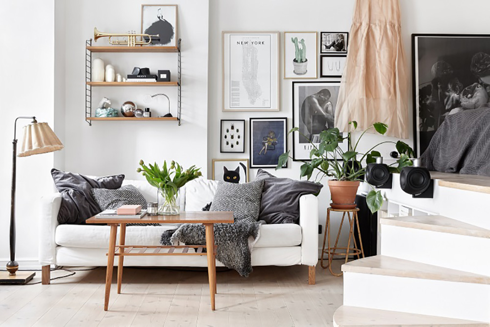
I decided to do what I do best and stick to a crisp white as a basis for the colour scheme. Rich always takes the piss out of me and says my love of white interiors is very sterile and stark, but the clean, simple, airy feel of an all-white room just makes my OCD heart happy. To add warmth, and prove Rich wrong, I thought I would add in lots of natural hues and elements such as wood, hessian and jute.
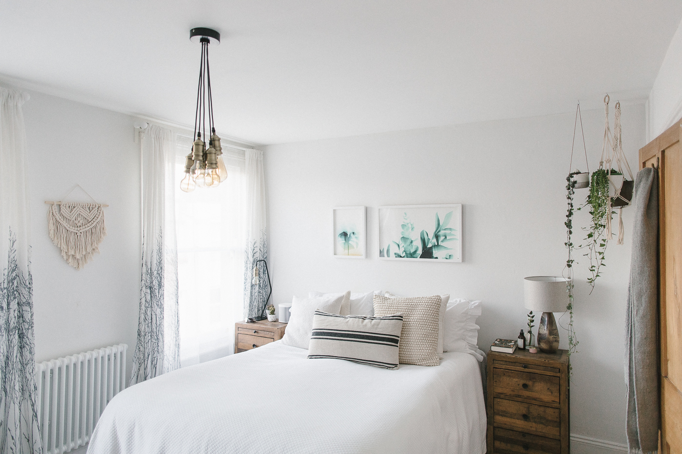
I’ve also injected the space with some moody tones and textures – black picture frames and cushions, and vases of varying shades of grey. And I have jumped right onto the Pantone Color of the Year bandwagon by adding in greenery through a mix of real and faux plants. I never thought I’d embrace green but it is amazing what a pop of palm can do to a room, and it looks so good with white.
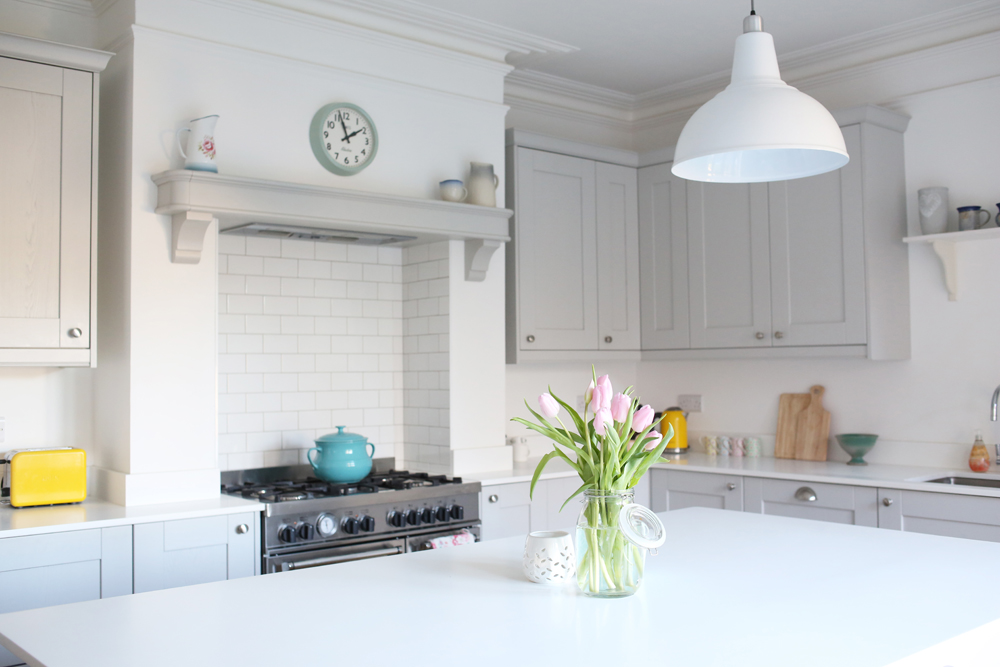
I’ve included in the header above and the gallery below some of the Pinterest images that helped me figure out the look I was going for.
Can I Get a Shelfie
Yes, I have dedicated a whole section to shelves.
I knew I wanted shelves on at least two of the walls to display our pics of Lyra and other pretty nick-nacks. The shelf behind the sofa was a no-brainer – I needed a super thin one so we didn’t bash our heads against it every time we sat down. I went for a couple of these photo ledges from B&Q. The shelves for the wall behind the TV were a trickier decision – I wanted to make a feature of the wall, but could not for the life of me decide between leather strap shelves, string shelves like those in the header, felt strap shelves, a circular shelf, plain white shelves…the list went on. One night I even dreamt about shelves. I know what you’re thinking: Lisa, you need to get a life. Ha ha. Find out in a couple of weeks which one I went for.
Are you in the process of decorating a living room? I would love to hear about it. And if you would like to see the finished result then pop back in a couple of weeks.


Yes! Our living room is now decorated but this half term my goal is to “finish it off” with all the knick knacks, storage, pictures on walls etc.
What I am REALLY struggling with is the blank, large expanse of grey wall behind our TV. How do you make that look interesting?! Do I leave it blank or do shelves? A gallery wall? What other options are there? Would love to hear others thoughts.
As you’ll see in a couple of weeks, I’ve gone for a mix of shelves, a mini gallery wall of sorts along the B&Q picture ledge, hanging planters and macrame on our living room walls. You need to get pinning Charlotte! X
Yes I do don’t I?! Pinterest session planned for this evening then.
I look forward to seeing your transformation Lisa. It will look fabulous I am sure. Also nice to know that you have changed your mind; after all decoration is only temporary even if it is a pesky dark paint or a wall paper. Reminds me not to take it too seriously and have fun with what we are doing.
Our shutters will be fitted two weeks today and then it will feel like that room is DONE! ✅
Finally, I enjoy how yours is a modern house. Mine is a seventies house and whilst I adore period properties, I do like seeing how the interiors styles and trends translate into a more modern home.
Wise words Charlotte! Yes I think one of the reasons I was fine with stripping the wallpaper was that it wasn’t an expensive one.
Envious that you are getting shutters… they ALWAYS look great.
Enjoy your pinning session and finishing off your lounge x
Lisa I’m going through exactly the same! We’ve been in our new build for just over a year and I too am working to add character to it – I’m really happy with our kitchen, utility and downstairs toilet…but the living room is one that I’ve been slow to move on and scandi style is exactly what I’m after. Thanks for the inspo – I’ll be coming back to this at the weekend!
It’s a pleasure Louisa! I don’t think you can go wrong with scandi.
And yey a fellow new-build-er! How have you decorated your kitchen, utility and downstairs toilet? X
Kind of industrial style meets country kitchen if that makes sense at all! Lots shelving with exposed pipes and reclaimed wood. Mixed with a touch of John Lewis haha…and lovely tiled floor throughout that looks like wooden floorboards. Lots still to do though..I find i get a burst of inspiration then lose interest for a little while.
Makes perfect sense and sounds gorgeous. And naturally you’ve gotta have some John Lewis in there ?
Love the look you are going for Lisa!
Excited to see how it turns out x
Thanks Kate! x
The felt shelves ??????
Uh oh! Lovely images and I totally agree about white. And the pops of green! I saw somewhere that having full on mini trees as house plants will soon be a thing- which I kind of love.
Also so glad you decided to make the change- if you aren’t happy with the room, it’s got to be done!
The felt shelves are lush aren’t they Lucy. I considered trying to make some however I don’t know how safe my DIY effort would have been!
Do you follow Emily Henderson? She had a full on tree in her living room!
https://stylebyemilyhenderson.com/blog/styled-living-room-sell
SO many gorgeous things here Lisa!! Can’t wait to see the finished look xxx
I know, I could quite easily keep on spending money on pretty bits and bobs for this room! x
Stunning inspo Lis! Can’t wait to see final unveiling! I’m having the same shelf issues for our kitchen lounge and above my desk! Need to catch up xx
Let’s talk shelves soon Aim xx
Looking forward to seeing how it turns out – I love while and natural materials. I also can’t wait to see what you do above the TV, like Charlotte I have no idea how to tackle ours.
It is a tricky one Pips. Watch this space x
Lisa,
I love so much of this! I have ordered photo ledges from amazon for behind one of the sofas at ours. Now I want the felt and the leather shelves too but have no where to put them.
The ‘tv wall’ is such a pain! I have tried a couple of things, including the wallpaper-esque things I have up now (and hate). I’m hoping that the wallpaper by itself will be enough to stop me hating that wall, but have been thinking I might need to add a console table/dresser too – will give me a chance to collect more pretty bits to put on it…
excited to see your big reveal!
Susan
Susan…I am now trying to find spots for random shelves throughout the house! YES to more spaces for pretty x
Lots of nice ideas, will definitely be back to see the finished thing. I’m also suffering from new build blank white wall syndrome at the minute and have been seriously lacking in inspiration. The Mister is after a big mirror. I am not. Maybe we compromise with some of the above mirror/picture combos although i do like that wire round shelfy thing.
Oh Steph I would’ve loved a big circular mirror but couldn’t find one that was reasonably priced!
For the wire shelfy thing, THIS is currently sitting in my Trouva online basket. It’s under £16 and I reckon it would be mega easy to spray paint as I’m not keen on the blue:
https://www.trouva.com/boutique/after-noah-in-n11qp/circular-teal-and-wood-wire-shelves
Lisa, you absolute star and I really hope they had more than one because I’ve just ordered it! It’ll go in the kitchen as I’ve already deleted one white wall there with a major spalsh of dark turquoise blue so this is just perfect. And if it’s not right, I’ll give the spray paint a go. I’m quite fancying these now for the living room
http://www.ebay.co.uk/itm/like/371664139770?lpid=122&chn=ps&adgroupid=40208487538&rlsatarget=aud-133395220866%3Apla-470339043512&adtype=pla&poi=&googleloc=1007377&device=c&campaignid=738085096&crdt=0
Yey ? Happy to help! X
Gorgeous – loving all the inspiration, thanks Lisa!
Keep an eye on Flying Tiger for the circular wire shelf – I’ve seen them in white and black in there for about £10 and am now kicking myself that I didn’t pick one up. Very guilty of having random shelves, frames etc lying around waiting for a home so I was trying to be good at the time… darn it! x
Ooh I will be interested to see your reveal – we are currently in the process of re-doing our new build lounge (I can’t take the magnolia anymore!) and it sounds like we are planning something very similar. I’ve just managed to convince the hubby to replace our brown leather sofas with lovely grey fabric ones! x
Can’t wait to see the reveal Lisa as love all those pics! Although I have a feeling it’s going to make me want to repaint our duck egg blue lounge white. I’ve been thinking about it for a while but the thing stopping me is the reaction of my husband ? Xx
I say just go for it Ella! (He might not notice…? Hee hee) x
Cannot wait to see what you did with your own space!
I’m looking for a white paint for my lounge. To change it from a mid grey to white. i love the white light reflective look. I have used Crown Sail White for my lounge after a recommendation on here. Would you recommend as a good white for my lounge or do you usually use something else?