We know you can’t get enough of the Rock My Style Home Tours and so we’re sure you’re going to love today’s mini house with mega style. Helen’s one-bed is pocket-sized but clearly demonstrates how you can live stylishly in small space. Making the most of the square footage Helen and her boyfriend have chosen a simple colour scheme and stamped their personality all over their teeny home. Over to the Lady of the House…
[ezcol_2third id=”” class=”” style=””]
I bought my one-bed cluster home back in 2010 originally as a solo-dwelling. Since then the house has had to miraculously stretch to accommodate my boyfriend, two fishtanks and a rescue African Pygmy hedgehog, with various rescue wild hedgehogs in the garden.
It is an unusual design with a mezzanine bedroom over-looking the lounge. It is open-plan and what it lacks in floor space it makes up for with a high ceiling so it doesn’t tend to feel cramped. It is fairly bright in here, there is a huge velux skylight which lets in a lot of light – I like this in the morning because it helps wake us up! You can see the stars and the tree too. I love the tension wire lighting from Ikea although it wasn’t easy to get up there. We had to put up a scaffold tower to install them when I moved in so it won’t be easy when a bulb goes.
I chose the dark grey (Night Jewels 3 from Dulux) in the bedroom as I wanted a colour that tied in with the rest of the house. It is a really nice colour and is matt which works really well as there is quite a lot of light coming in, so doesn’t show up any imperfections in the wall.
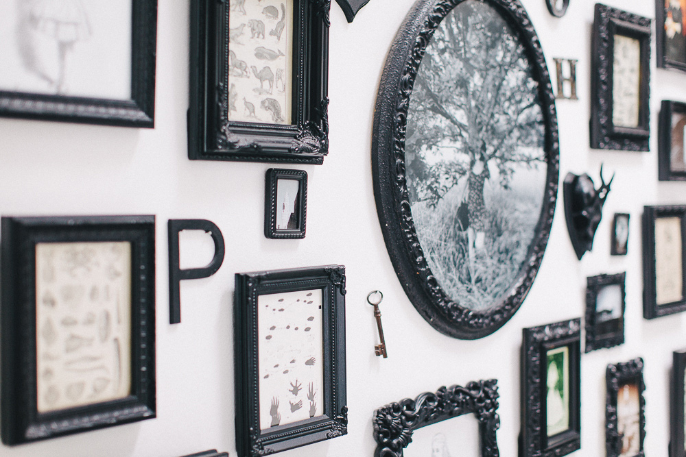
I chose to decorate my open-plan home white to give an illusion of space adding accents of black and grey scheme throughout, it is open plan so I wanted to have a theme running all through the house. I softened up the monochrome with different textures, metal, leather, cozy blankets, ornate frames – It could easily look cold and bare otherwise. My favourite feature has to be the gallery wall. I used some ornate frames for the display which I painted with a matt black acrylic graffiti paint – it was a great way to add some decorative impact to the room without taking up any valuable space. I also incorporated keys, letters, skulls which were either already black or I painted to match the frames. The pictures in the frames are sentimental photos or pages from books such as Alice in Wonderland.
Lots of my little knick knacks are gifts or sentimental items that find their way to me. I volunteer at Animals in Need at the weekends caring for wildlife, so I try to incorporate my love of nature into my home. I also collect lots of odd little items, like the Lego figures. I made those as a present for my boyfriend collecting all the bits in the Lego shop.
Storage is tight with two people here now, but we use boxes from Ikea and try to fill every cupboard. We both have lots of books and the shelves here only really have my books on – we will need a library wall in our next house! The shelves in the kitchen were less a style choice and more of a kitchen necessity, but we thought they went well with the wallpaper.
I added a colourful replica Hang it All rack in the porch because my nan had one when I was little and I spent my childhood thinking the colourful balls on it were great.
My bathroom wallpaper is called “Bleeding Heart” from Lars Contzen. It has a strange pattern with weeping hearts and bitten apples – I couldn’t buy anything normal!
I have wild hedgehogs in my garden that I rehabiliate and release or provide long term care for. Indoors I have Samson the African Pygmy hedgehog who is around four years old. He was rescued and handed in when his owners didn’t want him anymore. He was overweight and grumpy, but after putting him on a diet and giving him lots of attention he has settled in very well.
[/ezcol_2third]
[ezcol_1third_end id=”” class=”” style=””]
{The Particulars}
- Who: Helen, the other half and the hedgehogs (it’s a tight squeeze)
- What: 1980′s 1 Bed Cluster Home
- Where: Northampton
- Style: Monochrome, Scandinavian, Modern with Woodland and Ornate Accents
{Key Features}
- White metal low cabinet | Ikea
- White Flooring | Quickstep Vogue in Oak White Passionata
- PizzaCobra table lamp | Ron Arad for iGuzzini
- Paint for Gallery Wall Items | Montana Gold Acrylic Spray Paint in Shock Black
- Flying Ceramic Birds | Notonthehighstreet
- Deer Plaques| Ebay, antique from 1890
- Kitchen wallpaper | Holden – Egg and Soldiers
- Hop Cushion | Habitat
- Hare Heads | Graham and Green (sanded down and compressor sprayed with white car paint)
- Replica Eames Hang it All | Lakeland Furniture
[/ezcol_1third_end]
[ezcol_divider]
I think my favourite element of this pad has to be the awesome gallery wall, very closely followed by the hare heads. I want them all over my house. Helen has very kindly listed lots of her sources in our fancy grey box but if there’s anything that you want to know about in more detail then please drop her a comment.

Wow Helen, your house looks absolutely amazing! It could easily be taken from an interior design magazine! I really love how you made black and white still look so comfy. It is a beautiful, stylish and light home!
Thanks 🙂 I wanted it to still look homely, some days it looks more lived in than others… 🙂
Oh wow, Helen your home is absolutely gorgeous. There is so much I like! Who needs oodles of space when you can make this so pretty? This is perfect timing, as we’re about to move into our first (very little) home and I can’t wait to decorate and this has given me so many ideas for small spaces. I really like the details – like the extra bits on the gallery wall such as the key and the letters, and also the natural history prints in the room. I have a question that will definitely expose me as a complete decorator novice but I really like the wallpaper in the bathroom and hadn’t thought about that before, it’s something I would like to put in when we move in – do you have to buy a special wallpaper for a bathroom to deal with all the moisture etc?
Thank you for sharing this! xx
Also, I’m completely in love with Samson – what a cutie! I have a soft spot for hedgehogs, when I was little I made a ‘hedgehog hotel’ in my parents back garden when we found an injured hedgehog once. He stayed for a little while before he toddled off when he was recovered!
Thank you, such a nice comment. No, it is just regular wallpaper – although I think it is suitable for bathrooms – “Bleeding Heart” from Lars Contzen. I do leave a window slightly open after showers to make sure the condensation goes away.
Actually I think it is called Forbidden Fruit – http://www.ukwallpaper.co.uk/products/lars-contzen-very-retro–and-jardins-des-plantes-wallpaper.htm
Thank you!!
I love love love the black & white and the gallery is AMAZING. Helen has done soo much with her compact space, what great inspiration. We’ve just moved into our new house and have managed to get the ‘basics’, e.g. dining table, sofa, beds but we haven’t focused yet on any of the decor apart from what we brought with us. I’d love to know where the bathroom wallpaper is from?!
Samson is soooo cute. I discovered the other day that baby hedgehogs are called hedgehoglets – adorable!
You can buy it here – http://www.ukwallpaper.co.uk/products/lars-contzen-very-retro–and-jardins-des-plantes-wallpaper.htm
Fab, thanks Helen!
You’re welcome, thanks for your lovely comments
I love the picture wall and am honored to have made a contribution to it.
As always Helen is a girl of great style, worth rocking.
Haha thanks, you are indeed one of my many weird and wonderful resources…
Delightful little place. I had somewhere this sort of size but it was much more boxy and brooding, and although I made the best of it, it was do limiting.
Well done to the architect here for doing something a little different, and huge congratulations to Helen for being so imaginative with the space. I love the gallery and I really like the bedroom overlooking the lounge.
Question on the kitchen though – is the wall at the end adjoining with next door? Am guessing if it was an outside wall there would be a window there? It’s all such a unique shape and layout that I can’t really picture the building from the outside.
Yes, it joins next door, it’s hard to describe but it’s like a quarter of the whole block. You are right, they can be boxy and dark if you don’t encourage light.
[…] manages to have a intimate persona rather than a cold one. Helen used this in her bedroom in her One-Bed Cluster Home and it looks stunning with white […]
Your place is lovely and bright! What white paint did you use? I love the gallery wall!
Hi Natasha, it was actually just a trade white from wickes, often find they are the best to use, especially in those sort of quantities.
It’s nice to see the pics again, we’ve moved now, this was my little place I bought on my own just for me. Needed a bigger place. We’ve bought 1930s house together and are currently renovating it 🙂
Thanks for replying 🙂
Hope you are enjoying your new place!!