If you tuned in to my inspiration post a couple of weeks ago then you will know that I was on a mission to transform my living room. Little did I know that the makeover would bring with it bucketloads of blood, sweat and tears. (Ok so maybe not bucketloads, and no actual blood was shed, but my lovely boyfriend Rich did ensure that the process was pretty stressful. Find out more below).
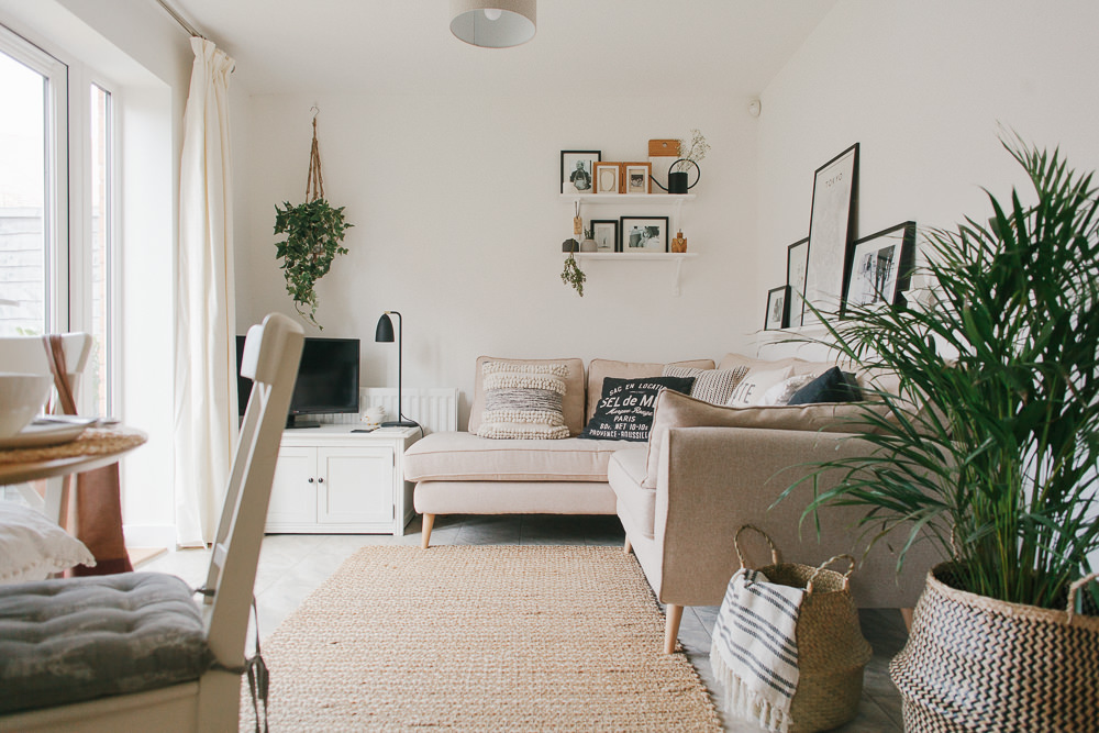
The look I was going for was a contemporary, Nordic feel with lots of texture and greenery, loosely based on a vintage Vogue cover which Adam has captured in one of the images below. I knew I wanted a crisp, white base, and to add in some natural elements, soft texture and delicate pattern, whilst keeping it minimalist because the room isn’t very big.
The Space
The area in question is the lounge part of an open plan kitchen/lounge. It’s a funny old shape – well I say funny but it’s actually just a long rectangle – and for that reason it has been a pain in the bum to find furniture that works with the way we wanted to use the room. Rich would love to have a big old rectangular dining table – this one from John Lewis was top of his list – however we also wanted a sofa to sit on so we could look out over the garden/watch TV/have an area for Lyra to read books on whilst one of us is cooking dinner. So we compromised and bought a circular dining table which doesn’t intrude into the space and leaves loads of room for the sofa.
The Sofa
Our last sofa was a deep grey which, although hellish practical, seemed to make the room a whole lot darker. As the room doesn’t get much light I knew that a beige or pale grey sofa would work much better. So when an email dropped in from the lovely people at DFS asking if we could collaborate I jumped at the chance to pick a complimentary sofa. (Love my job). The Zinc sofa from the French Connection range has been blimming perfect. I agonised over which colour to choose – I was torn between cream and light grey – and after much consultation via Whatsapp with Lauren I decided to go for the cream fabric sofa. I know, I know, I’m an idiot to go for a beige sofa with a muddy-pawed cat, a nearly-three-year-old and a new baby on the way, but how much better does it look than our last one which just seemed to suck all light from the room? Plus, it gives me an excuse to buy more blankets.
The fact that it’s a corner sofa also works so much better in the space than the last sofa. I love curling up in the corner with a magazine/Lyra on my lap, and it sounds silly but it’s made the room much more sociable. When we’ve got friends over they can sit and chat whilst I’m getting them a cup of tea without having to perch at an awkward angle.
The Accessories
When we stripped the wallpaper from the wall behind the TV and took it back to white I knew that I would need to incorporate lots of greenery, texture and wooden accessories to add warmth. Step in Rich and his drill-happy ways. I asked him to hang some curtains…he managed to drill through an electric cable. Cue a Saturday evening with no power and an expensive call out to an emergency electrician. Just what you want when you are trying to cook a tired two year old their dinner!
The following weekend I asked Rich to hang the plain white shelves (which he’d sawn and I’d painted so they are nice and narrow and you don’t bang your head on them) and planters. He did a fab job with the shelves and the first hanging planter which you can see above the TV. However, when drilling a hole for a second planter which I had wanted to put next to the ivy, he hit a water pipe. Cue a snowy Sunday evening and Monday morning with no heating or hot water! And this was all a mere three days before Adam was due to come and take photos. Thank God for plumbers, parents-in-law and Rich’s mate Matt, a plasterer who is going to get a big crate of beer the next time we see him.
Anyway, enough about the stress, and more about the pretty bits…
I’m a big fan of macramé and picked up the wall hanging that’s behind the dining table from The People Shop. You can find similar here. I am also a proud crazy cushion lady and would quite happily spend most of my wages on cushions if I had the chance. I love the way they can bring in layers of textures and warmth. This bobbly one was from John Lewis and is possibly my favourite thing in the house, and the others are from Dunelm and H&M. Another H&M find was the watering can (how cute?)…they also sell it in gold.
The planter and the lamp were from Liv Furniture, a gorgeous interiors shop in Solihull. They don’t seem to sell the lamp online but John Lewis do a similar floor lamp which I’m considering buying and putting behind the belly baskets.
The Tokyo print is by David Ehrenstrahle and the bike print, which was previously in our bedroom, is from Yellowstone Art Boutique. I’ve tried to follow a monochrome, white and wood palette and printing off a load of black and white photos of Lyra was an easy and budget-friendly way of sticking to this colour scheme and adding interest and a bit of art.
So there you have it, my living room makeover reveal. I know I’m biased but I’m pretty happy with the transformation. And I’ll never admit it to Rich but all the stress of his DIY disasters were worth it. What do you reckon and how are your Rock My Room challenges going?
I received my DFS sofa free of charge but you know me, I only talk about the things I like. Opinions are all mine.


Looks lovely!!!! Styling is really fresh and clean. I struggle in a thin rectangle new build lounge too (why do they do it!?) what dimensions were you dealing with? Ours is less than 3m wide with a window, door and walk opening on 3 of the walls! Most of my neighbours have blocked off one of the doors! It angers me why new builds are built with silly proportions! You could have an party on my kitchen and swing two cats in my hallway!!
Thanks Lisa! Why DO they do it? The lounge bit is about 4m long x 3m wide. And yes I do love having a big hallway but I kind of wish they’d just made the open plan kitchen/lounge a bit bigger instead! x
Oh Lisa, the electric cable/water pipe drama is the exact reason we have shelves and coat hooks scattered about the house and NOT on the walls.
I think Lee is secretly terrified of it happening so hanging them keeps falling tout the bottom of the to-do list.
You’ve spurred me on to get it done!
How good is H&M Home at the moment btw??
Loving the transformation, I did a bit of a double take that it was actually the same space as your previous wallpaper post from a few months back. It’s not only lovely and fresh but looks twice the size!
And, yay… free sofa ??x
Ha ha Karen! I’m currently got scattered around me 3 picture ledges, a cloud shaped shelf and some wall hooks. I have told Rich that I am going to learn how to put this stuff up myself and then I can’t blame him 🙂
H&M home…SO good at the moment. It’s so reasonable but there’s so many lovely things that you could easily spend a fortune x
Yes! I hung a curtain track in the nursery by myself this week… we can do it! xx
Get you!
Curtains in the nursery are another on the to-do list here. I will let you know how we get on… x
Oh Lisa I LOVE it. I want it all. The soft is quite simply amazing. I definitely need to buy a new house to fit it in though!
Ahh thanks Karen.
It is a lovely sofa…I feel extremely lucky. And they do sell them in smaller sizes…just sayin’ 🙂 x
Oh no, don’t go enabling me like this!! ? Onviously off to check the website now…who knew DFS did such chic sofas!
I LOVE it lisa! It looks so different. It feels like such a calm space full of loads of happy memories. Great great space x
Thanks Becky! You are so right about the happy memories! Baby boy’s scan picture even made an appearance. And it’s not obvious from the photos because it’s white on white but in the wooden frame on the shelf is one of those clay footprint kits that I did with Lyra when she was tiny x
What a difference Lisa it looks so much better! The space looks much bigger and you have accessorised it to perfection! That John Lewis cushion ?
Carly, I know, why didn’t I go for this look from the start?! ?
You probably need the cushion ? x
WOW! I love all of this Lisa. It is just gorgeous. If it helps in our old flat the day we were completing Edd pulled a nail out the wall only for water to explode everywhere. It appears we had unknowingly hot through a water pipe years before but it had been so snug that no water escaped. Cue mad repatching of plaster and repainting. Apparently in old house the pipes generally run along the base of the wall and up a corner of a room but in a lot of new builds they could be anywhere as they just go straight up!! So if you have a radiator or plug avoid the area above it!!! Also, I may now need that cushion… x
Thanks lovely!
Rich will be happy to hear that story I’m sure. Just what you need on completion day! x
I REALLY need that cushion too Lottie. Its gorgeous!! xx
Love, love, love, LOVE! Scandi elements work so well in modern houses. Gorgeous styling too x
Thank you lady! x
LISA! What a beautiful makeover! All too often you see an inspiration post that is full of the most exquisite images but the follow-up makeover image looks nothing like the aforementioned inspiration (I’m including myself in this by the way!) but you’ve nailed it! Your living room completely and utterly channels the vibe/look you were going for. I absolutely love it and I hope you’re proud of yourself missy! I can’t wait to come over for a cuppa xxxx
Lolly, what a lovely comment and massive compliment coming from you. You are welcome over for a cuppa any time.
Totes feeling the pressure to deliver on the nursery now x
Wow!, You’ve completely transformed the room Lisa. Just shows what a difference the right décor can make. Hats off to you for being so seemingly calm about the electrics and water!!!
Kate I was not one bit calm! I wasn’t lying when I said there were tears! x
Love it, it’s so white & bright, gorgeous styling & accessorising, I need all those cushions.
What did you do with the map? Hope you’ve found a home for it elsewhere 😉
Thanks Grainne! You can never have too many cushions.
The map is currently sitting in the garage, I may hang it on our landing but ultimately I’m not sure whether it is too antique-y for a modern house x
This is perfect Lisa! All the elements work so well together. I am just working out how to cosy up my mostly gray living room and looking at yours I think plants and baskets will do the trick. I do actually really like round tables but it wouldn’t work in our dining room so major table envy going on over here. Seriously well done – I hope my RockMyRoom restyle of our living room is half as good as yours.
Thank you Kat 🙂 It is amazing what a bit of greenery can do to a white/grey space.
The grass is always greener…I much prefer rectangular dining room tables!
Good luck with your restyling x
Lisa this is just SO stylish, yet not OTT and very VERY you. I remember walking in when it was half finished and not thinking before I spoke “What?! This is the sofa is from DFS?!!!” Pah ha ha, she who speaks before she thinks!. I was so pleasantly surprised – it fits perfectly in the space and works as such a statement yet neutral (?) backdrop for all of your beautifully curated accessories.
x
Ha ha yes I remember that 😛
Thank you lovely, I am VERY happy with it x
It’s absolutely beautiful Lisa, you’ve got a great eye for design! Please could you let me know where that cute little star you have on the shelf behind the sofa is from?
Aw thank you Jen! The star is from The People Shop too x
Hahaha this made me laugh! This is how DIY goes down in my house. We always end up with double the holes we need to have whenever my husband puts up a shelf – he and the spirit level just don’t seem to get on! Lovely post and gorgeous room, such a transformation, so light, airy and calming xx
Well I don’t want to stick Rich in it but the hole that managed to pierce the electric cable is still there (it’s hidden under the curtain), and he told me that after he’d pierced the water pipe he tried to make another hole but drilled too close to the first one so the plasterboard just crumbled! Honestly! It makes for a good story though x
Love love love it!!! What an amazing transformation. So much inspo for me as we’re in a newbuild flat with similar proportions.
That cushion. I bought it instantly.
Yey I’m glad Katie! And I’m sure you will love the cushion x
Lisa it looks amazing! With no offense intended, just SO much better than before! It looks so much lighter, which is what you said you were after. You must be thrilled. Also love the sofa, and as a freebie, amazing! I am actually quite a DFS fan, never had any problems with their sofas and although some in the showroom are awful there are a few which are real gems and really reasonably priced. x
Ha ha none taken, just wish I had decorated like this from the start!
I KNOW…really amazing freebie. I’d never bought anything from DFS before but when the email went round, Becky from Rock My Family mentioned how impressed she’d been with her DFS sofa and she was right, this one looks fab and is ultra comfy x
Wow! This looks gorgeous and has most definitely given me the kick up the bottom I needed to finish off our family/dining room.
Silly question, but what plant is it in the belly basket?
I’ve visited two garden centres to find something along those lines but the indoor plants they have are always far less chic & scandi than I desire. I can never describe what I want to the sales people so always leave empty handed!
Loving the prints and accessories too, totally need that John Lewis cushion! Xx
Sarah, have you tried Ikea? I’ve bought a couple of palms from there x
Thank you Sarah! It was from B&Q, around £30. x
Never would I have thought to pop into B&Q! Thanks Lisa!
I’ll also check out the palms when I pop to Ikea to most definitely snap up one of those belly baskets! Thanks Lauren x
B&Q do the cutest little mini palms too. And they’re only about £4 ?
I love it! The room looks so much brighter and bigger. And love the sofa – who would have thought DFS?
Thanks Emma! It is amazing what a lick of white paint and different furniture can do x
It does look amazing – what was your budget for this and did you stay within it? I’m wanting a similar feel in my lounge which is also open concept diner/lounge but with a fire place on one wall, window on the other and radiator on the third – the couch will be in front of the radiator. we’ve ordered ours from Marks and Spencer – the Copenhagen size small. Being in Guernsey it’ll take 8-10 weeks to arrive though – hopefully enough time for the painters to do an overhaul of the house and update with a few coats of Timeless including the 60s wood panels in the lounge/diner. i’m really excited to see what it looks like when it’s been painted, and then the overhaul can continue.
Jen you read my mind…I had been thinking a post about how to update a room on a limited budget would be an interesting one. Based on the fact that we’ve got a new baby on the way Rich told me to spend as little as possible. So the main things I bought were the accessories.
Your plans sound lovely, good luck with it. Just googled the Copenhagen, it’s so classy! Which colour did you go for? x
Oh what a good question – i keep forgetting! I think it’s Paxton Linen. It’s sooo hard to chose a colour for a couch from a book of swatches. they always look different in real life than in the palm of my hand. We chose this particular couch because it came in the compact size, but at the last minute realised we could fit the small into our space. it also is raised off the floor which we thought would give the illusion of more space. being in Guernsey we weren’t able to sit on it, but tries the seats of a similar couch and they seemed relatively comfortable. Island life is great, except when I’m looking for variety of items. a lot of place don’t ship to the Channel Islands (eg H&M, Tesco, ASDA) which is upsetting!
Oh no, I’m not sure how I’d cope without H&M home deliveries!
Paxton linen looks like a gorgeous colour. Our sofas in our last house were from M&S and we were so impressed with them. X
A water pipe and a cable???!! Poor you, and poor Rich! All the drama. But so worth it, it’s absolutely stunning.
And hang me for a furniture snob but I’m so impressed at the DFS sofa!
The sofa is definitely a good un Lucy!
Yup we can’t say the process hasn’t been interesting, wish me luck with decorating the nursery ? How’s your spare room going?! X
It’s going…. although still very much in the “crack den” phase. The builders have done amazingly well this week and it’s nearly ready for plaster and second fix! It’s tough though as lots of design decisions aren’t mine to make- we will be in the barn so it’s up to my parents how they want it… which means my idea of F and B Blackened walls is vetoed!
Can’t wait to see your nursery.. xx
I absolutely love it, I’m about to do a living room makeover too and that sofa is beautiful! I already have a John Lewis barbican on in a very pale blue grey and have three kids – 5,4 and 1 (everyone said I was mad to go so pale) but don’t worry after two years it still looks nice!
That’s good to hear Jen! Would love to hear about your living room makeover x
Sounds like someone will be getting one of these for his birthday (or possibly before he’s allowed need a drill) http://www.screwfix.com/p/bosch-truvo-digital-wall-detector/1375R?kpid=KINASEKPID&cm_mmc=GoogleLocal-_-Datafeed-_-Tools&cm_mmc=Google-_-Product%20Listing%20Ads-_-Sales%20Tracking-_-sales%20tracking%20url&gclid=Cj0KEQiAlsrFBRCAxcCB54XElLEBEiQA_ei0DAIjfLvcAAaXQoYsoJxwoV1CZ_SebGj1-dfNBmA5SsAaAmSE8P8HAQ
It looks great, well done x
I had a quick google for something similar but they all seemed to be hundreds of pounds so thank you! I’m sure he will be thrilled ?
Oh, how lovely and calming Lisa! All of the natural textures are gorgeous. Currently saving up for a My Guide to Buenos Aires; we love a framed map here. I’m a bit late to the party on this one, and I have an uncanny knack of loving the pieces that haven’t been mentioned in the feature 🙁 – where are the rug and cute elephants from? x
Thanks Anita ?
The elephants were from Thailand however the rug is good old Dunelm 🙂 x
I really want to jump on the belly basket bandwagon but forst a question – what type of pot system are you using inside the basket?
It’s just a normal plant pot x
Amazing transformation. I also live in a new build and am constantly looking for inspiration and your space will definitely be pinned to my Pinterest. We have a really small living room that we recently painted all white and it has made a big difference. I agree, cushions can be an inexpensive way to really transform the look of the room. I hope to see more of your space in the future.
Thanks Susanna! You can’t go wrong with all white and an abundance of cushions ?
Hey Lisa
I ADORE your sofa, but it looks like a gorgeous pale dusky pink in the pics, whereas on the DFS site it looks a mucky cream with no pink at all? Have they stopped doing that shade maybe?
Hi Kirsten! Nope it’s definitely the ‘cream combination’ shade. It looks a lot nicer in real life – worth popping in to a DFS to check out the fabric swatches if you have one near you x
Will do x
Lisa, what a gorgeous room. I love how you’ve used all of the textures throughout.
Where did you get your gorgeous rug from? We have an aweful big brown shaggy one in the sitting room at the mo and its eugh! I’d love something like yours. Do you find it’s still warm and cosy underfoot?
Heather x
Thanks Heather! It’s from Dunelm:
https://www.awin1.com/cread.php?awinmid=3769&awinaffid=195689&clickref=&p=http%3A%2F%2Fwww.dunelm.com%2Fproduct%2Fnatural-chunky-jute-rug-1000045120
I wouldn’t say it’s cosy but it is definitely warm underfoot x
Thanks Lisa, it’s lush. I’ve just seen another rug on there that is rather yum too. I may have to pay a visit. I’d never thought of Dunelm for rugs before! Another fab find thanks you you guys x
Hi Lisa! Love your room! Not sure if you’ll read this but how is your sofa holding up? I too have fallen in love with the Zinc sofa in cream but people keep telling me it’ll mark, that sitting on it in jeans will mark it & I should get the grey but I do like the cream 🙄 Has yours marked? Thanks Sara