As you may be aware from reading my baby naming post last week I was adamant my bump was a boy. Cue much pinterest inspiration action of greys and greens and a general sway towards the masculine side of nursery decor.
My home interior, although not exactly “bachelor pad”, is not particularly feminine either. I prefer simple more man-ish details and accessories, always have, always will. This of course makes things rather difficult when you genuinely do want something pretty for your little girl yet everything you have come across is that little bit too twee. Oh and not to mention expensive, some of the “purpose built” nursery furniture pricing made my eyes water, much of it was cheap-looking in terms of quality and finish yet substantially more to buy than the equivalent adult versions!
Perhaps I was just looking in the wrong places, I really don’t know, what I do know however is that I was hurtling towards my due date and all I had was an (albeit lovely) globe that Rock My Style’s Lauren had given me as a gift. And as much as I wanted Mabel to possess an excellent concept of geography, she did need somewhere to actually sleep.*
After almost giving up and essentially just handing over my plastic at the nearest department store I had a last minute epiphany, I would approach decorating the nursery much like I planned and styled my wedding, functional but above all personal and unique, favouring the things I loved rather than the obviously traditional.
I am well aware the above paragraph sounds all a bit over-the-top, I had to convert a teeny third bedroom, not win Olympic Gold for interior design… but achieving the right environment for my baby girl was well important, you know?
[ezcol_2third id=”” class=”” style=””]
Furniture
I wanted a grey cot. I had seen a beautiful one that you could only purchase from the States for a zillion dollars plus shipping. I searched for what felt like forever online and eventually came across one from Babies R Us (until this point I didn’t even realise there was such a place) that was only eighty quid. James and I went to a store to check out a demonstration model and make sure it looked as nice as in the picture. It did. So we bought it. Yay.
For a long time I felt I needed a “changing table” – for those of you that don’t know this is essentially a chest of draws with a small lip on the surface, designed as such to hold a wipe-clean mat so that you can whip nappies on and off in an, um….safe (?) and convenient (?) manner.
I don’t really get the above to be honest. Feel free to correct my assumptions if I am just being a complete ditz and there is some other reason that a regular piece of furniture with the smallest piece of extra “bit” is necessary. And brings with it a hefty price tag.
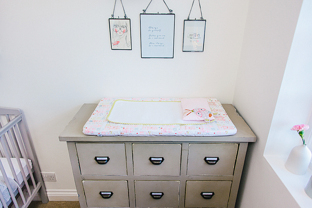
I found a battered set of drawers I loved, in a kind of a heritage green colour which I like very much indeed. I figured I could just put a mat on this instead should I need to, I couldn’t see how it was really any more or less safe than the allegedly specifically manufactured version anyway. As it happens we change Mabel on the floor. It’s easier. And there is absolutely no risk of rolling or injury.
The cupboard with wire frontage was reclaimed, originally burgundy and re-painted in Annie Sloan’s chalk paint in “Paris Grey”. I filled it with dirt-cheap storage boxes, which means all of Mabel’s wardrobe is neatly organised into various different sections, from sleep suits, to bibs, to knitwear, to socks and booties.
Colour Scheme
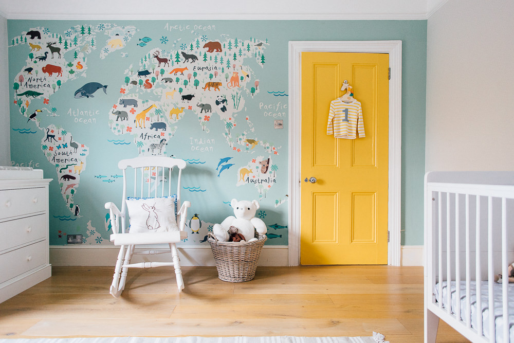
Are you detecting a theme here? Yep, greys and greens – my favourite. To add the required “pretty” I incorporated various peachy-pinks. The chair was a £40 bargain from Ikea and together with the various art work and aforementioned globe helped to create an altogether less boy-ish feel.
I really struggled with what to do with the walls as well as the lighting situation, several grey-green (!) tester pots and rejected centre-of-room pendant options later, I went with a backdrop of Crown “Brilliant White” which in my humble opinion is the perfect clean and unobtrusive (not to mention cheap) backdrop and my husband suggested we switch to hanging pendants from the wall side and then aloft from the ceiling via a simple hook. They were purchased from from Cox and Cox.
My friends and family who have seen the nursery have remarked on how soft and calming the colour scheme is, and I think they are right. I’ve got everything crossed that this means Mabel will find the room peaceful and therefore sleep through the night in the not too distant future…
(One can but hope.)
Accessories
This was my favourite part, and I guess it’s the finishing touches that really allow you to add some personality and individuality to your decor. Having managed to remain fairly thrifty in putting together the main features of the nursery there was scope to get a bit spendy on some really lovely extras.
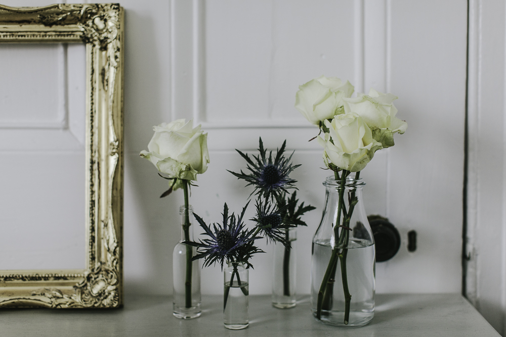
As I mentioned in our decorate with flowers book review, there are blooms in every single room of my home in a variety of vessels. I saw the ombre grey single stem vases in The White Company and had to have them. Expensive at £30 for the three but the cute “Enjoy The Little Things” mug from H&M was only a few pounds so I figured over all it was justified (!)
I saw the light-up star on instagram (a wealth of inspiration and shopping must-haves, if you are not yet signed up then I suggest you do sharpish) and knew it would make a great statement piece. It was £50 from Thea Webb and was worth every penny.
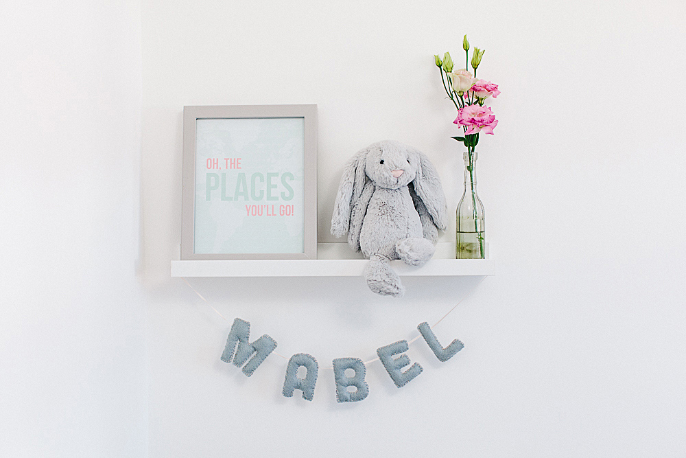
The soft toys are from the Bashful range by Jellycat, super soft and genuinely cute. My husband bought Mabel the cow and bunny and my parents gifted us Raymond the dog all from John Lewis.
The felt name bunting and hanging hearts were made bespoke by Becky who you may know from Rock My Wedding, she creates paper and material goods for big days and is now going into creating gorgeous things for kids too. You can contact Becky via her website Beautiful Bird Creations.
The “Places You Will Go!” typography print was from Fieldtrip and “You’re A Peach” was from Alexa Z Design, both via Etsy and both excellent service and speedy delivery. My friends threw me a surprise birthday/baby shower celebration last month and the This Little Piggy Went to Prada: Nursery Rhymes for the Blahnik Brigade book was one of my many generous and thoughtful gifts, you can find it at Amazon
I would love to hear about your little one’s room decor and furnishing ideas, and if there are any details of Mabel’s nursery that I have missed please do leave me a note in the comments section and I’ll do my best to fill you in.
*Mabel actually sleeps in our room for now in a Snuzpod from The Little Green Sheep (more on this in a future post.)
[/ezcol_2third]
[ezcol_1third_end id=”” class=”” style=””]
{Display/Store}
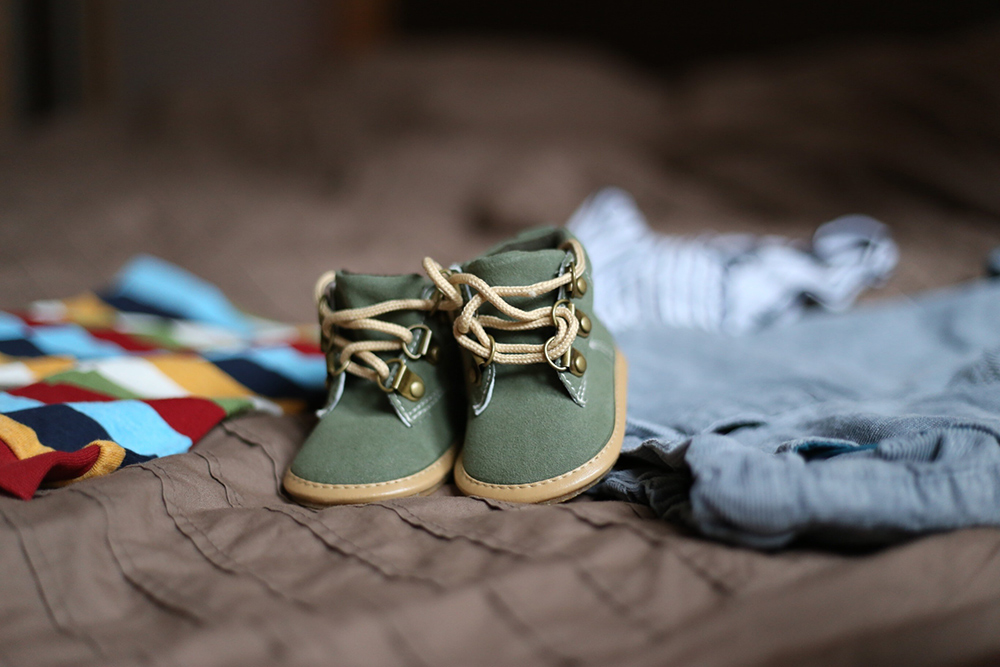
There are so many beautiful things for babies and children I think it’s a shame to have some particularly personal/favourite items hidden away in a drawer. As you can see I wanted to have Mabel’s soft toys and shoe collection (!) on display which works as decoration as well as a practical solution for storage.
Accessories: Ribba shelves from Ikea are amazing, a few quid, not too intrusive/sticky out-ish from a wall yet still hold artwork, books and various other parephenalia comfortably.
Clothing: We didn’t really have room for a wardrobe and the one negative about this is all of Mabel’s dresses have to be folded rather than hung. Instead we bought a sturdy long hook (again from Ikea) and fixed it to the back of the door, this holds up to 12 items and besides – who wouldn’t want to proudly display a tutu?!
{Budget Art}
The Etsy prints were not exactly expensive but it can add up when (like me) you love multiple illustrations and typography art to really personalise a space.
Cards: Possibly obvious to some but there are so many gorgeous greetings cards out there, why not put one in a frame? And this meant I could still indulge my Etsy obsession! I bought the cute caravan for less than three pounds from one of my favourite stores Hartland Brooklyn and the foiled “Choose Joy” was about a fiver from the Pretty Print Shop.
DIY: If you have a half decent printer (or know someone that does) then making your own typography artwork is easy peasy. Find a font you like, pick a quote (or make up your own!) and set it out any way you fancy – voila! The “fierce” and “mermaid” pieces were both created at Rock My HQ for the grand total of approximately 10p.
[/ezcol_1third_end]




LOVE!!!! I was in the middle of writing a blog post with one hand and patting Ethan to sleep with the other and had to drop both immediately (not the baby) to come on over for a gander. I was wondering which room you were going to put your little peach in.
Such a stunning outcome, although I expected no less from you lady. The choice of colours is absolutely perfect. Your daughter’s future-Aussie-surfer-husband’s nursery is awaiting some artwork frames, then it shall be complete. These kids are expensive little creatures, aren’t they?
Hi love! how do you manage the one-handed writing? have tried – my laptop did a back flip last week and ended up on the floor as I basically failed on the multi-tasking front ….(shh don’t tell Adam!)
Thanks for the compliments pet, I am very much looking forward to Mabel’s Aussie surfer husbands nursery details 🙂 And yes expensive, although I don’t mind so much, I love buying things for her x
Beautiful decoration. Love the name Mabel Rose too. Hope you are getting on ok with it all!
Is there a link to the star light? I must have it!!!
Thank Amy, I am trying to find out (I was one of the first to buy a light and I’m not sure what the web address is as I ordered via a friend) I will definitely be able to get the email address though – I’ll send it across to you x
Thanks so much! I’d seen a similar light in BHS but it was double the price and sold out!! :-/
Hi Amy
Here you go 🙂 she also does light up letters! theawebb@hotmail.co.uk
Thank you <3
Awww man, I had seen this too and loved it! It’s not even on the website any more! They still have the arrow lamp but it’s £95 :s a bit steep!
Thanks for the email Charlotte, have sent a wee mail already 🙂
This is so gorgeous! What a stylish little lady Mabel Rose is going to be! X
Thanks Tamsin 🙂
Yay I have been waiting for this post! Mabel’s room is a beautiful little haven, what a lucky little lady. I love the colour palette, soft, neutral and feminine. Do you mind telling me where you got your hanging frames from please?
We recently decorated our Sofia’s room and as we were having a surprise we opted for a gender neutral grey, yellow and white. I pinned for England in the run up and found some lovely ideas. We painted a thick striped feature wall and shopped around for furniture that wasn’t all matchy, matchy but worked well together. We made it a little more feminine with our choice of accessories too. It is by far my most favourite room in the house, so peaceful and relaxing. Xx
This sounds lovely Louise! I’m the same – Mabel’s nursery is my favourite room too!
You can find the hanging frames at Cox & Cox x
Fabulous thank you. Xx
Charlotte, I followed RMW for months before my wedding 18 months ago. My baby girl is now 6 months old, so I rarely get to look at the wedding pretty these days, but have spotted on FB that your baby is here! Congratulations, Mabel is such a pretty name, and I have had a nosy at your pics on Instagram – she is lovely!
Like you, I was utterly convinced we were having a boy. I remember when she was born, my husband telling me we had a girl, and I was so utterly thrilled – deep down I must have really wanted a little girl! We called her Isla Isobel. Also like you, we wanted a grey nursery. I spent weeks looking on Pinterest for ideas. We found some gorgeous ideas. Eventually we decided on a very pale grey all over, with the one wall being painted with thick, horizontal stripes of darker grey. It was a labour of love, and when it was finished we were so so pleased with it. We have accessorised with a white furniture set from Mamas and Papas – cot bed, changing unit (though like you, I use the floor – only really wanted it for the drawers) and wardrobe, plus a rocking chair that I got in an antique shop and painted white. We have had some prints made up to go on the walls from Etsy (https://www.etsy.com/uk/shop/PinkeeArt?section_id=13616090&ref=shopsection_leftnav_3) and have used 3 white Ikea picture rails to make bookshelves, so all the books face outwards like in a library display (looks like you have used the same?) We have used purple as our main accent colour, but her bedding and curtains have bits of pastel blues and greens in as well.
We love our little girl’s room, and hopefully she will love it too. We moved her out of her room a few weeks ago, and so far so good!
Really do love what you have done with the nursery, she’s a lucky girl!
Hi Lauren A *waves* I recognise your avatar! congratulations on your little girl, this thick stripe sounds fab, as does the Mamas and Papas furniture (I didn’t dare look to be honest, although our changing mat was from there and we’ve bought a few gorgeous outfits)
I would’ve loved a rocking chair but unfortunately there simply wasn’t room, I may however do a bit of a “change around” it the future so we’ll see if I can squeeze one in 🙂 x
Louise, snap on the grey striped wall!
🙂 gotta love a striped wall x
awwwww this is too cute – I love this room, Mabel is going to be so stylish growing up!!
I actually have the same star light in my office bought by Mr H for my birthday last year (he may have even called me a star in my card but ssssh tis a bit cheesy) Do you know where I can get my mits on the pink globe it’s really lovely!!
Congrats again Charlotte, Mabel is such a cutey on instagram and you are really looking fab too!! xx
That’s sweet not cheesy 🙂
Thanks Helen, I hope she likes it, you never know – she might have preferred it all Disney-fied and 100% pink! x
Such a lovely room, really love the soft neutral colours even though I’m going the opposite way. We’re having a surprise so I’m going for a mismatched mix of primary colours which will hopefully pop nicely on a white background.
I do prefer wall mounted light fittings to a ceiling pendant too – would be really good to see some photos of how you’ve done yours…
Either way really well done for this super stylish yet still girly and soft room for Mabel!
Hi Kat! You can kind of see on the first image – we basically mounted the fixing to the side wall, pulled the cord upwards towards the ceiling, hung over a hook and then the light hangs downwards…hope that makes sense!
I did toy with brights, they are very stimulating for babies, we do have lots of toys/play gym etc however which are in bold colours x
Wow Charlotte!! Huge congrats on the birth of your baby girl! I had a baby girl (Freya) on 1st November so she is almost 6 months! I don’t know where the time has gone! Cherish every cuddle!! 🙂
Gorgeous nursery and great new blog too! Congrats again
Sarah x
Sarah!! Congratulations to you too 🙂
I don’t know where the time goes either, Mabel is 4 weeks old today! Glad you like the new blog, come back and visit soon x
Hi Charlotte, first of all huge congratulations on the birth of Mabel! She is beautiful and so is her room. My little cutie, Hugo, is now 7 weeks old and I confess that we’ve not yet started his nursery – we were in the process of completely renovating and extending our kitchen whilst I was pregnant so we decided to put the nursery on hold until he’s ready to leave our room. I can’t wait to get started now though – you’ve inspired me!
I completely agree with you about changing tables. Up until recently were were doing nappy changes on the floor – until our backs seized up – so we bought a very cheap second hand ikea changing table (it’s “changed” my life!) on eBay which we’ve accessorised with colourful baskets from Tiger and a funky new changing mat.
I was intrigued by the Snuzpod. We have something very similar – a Bednest from NCT. Hugo hated being in his Moses basket so this was a godsend and the lazy person inside me is delighted that I don’t have to get out of bed to feed or check on Hugo.
Are you going to to a post on recommended baby products?! If so, I recommend the angelcare monitor and Ewan the dream sheep! I also couldn’t live without my baby Bjorn! Sorry for the long post…I’ll be quiet now! xx
Hi Laura! Thanks so much for your detailed comment. I was tempted by an Ikea table actually, it seemed better designed than any others I had seen.
The Snuzpod is great, Mabel can see us at all times and it looks so nice in our bedroom, the perfect shade of grey!
And I think yes, recommended products definitely, I too have an angel care monitor and Ewan the sheep 🙂 x
Mabel’s nursery is adorable and I’ve got a good mind to ‘borrow’ the colour scheme for my next bedroom makeover. So many beautiful details Charlotte. 🙂
Very much liking the sound of these thick stripes in other nurseries. I have a friend who is expecting a bouncing baby boy soon and I know she’ll be reading all the comments on this post to get inspiration x
I’m loving the thick stripes too, would work for either a boy or a girl too. x
Mabel’s nursery is gorgeous, it is perfectly feminine without being all pink!
Where did you get the book ledges from? I’m looking for some like that for our nursery! Thanks for all the great ideas x
Hi Jane, they are “Ribba” shelves from Ikea, only a few quid each and come in lots of different colours x
This is lovely and simple, I found it so hard decorating for my baby, I completely understand. I’m so glad you have said this about a changing table. I didn’t buy one either I couldn’t understand it and used the top of a small chest of drawers and within a few months I wasn’t even using that. I’m pregnant again and I’m not even going to use that. What I will bear in mind this time round is that they grow up so quickly and you have to adapt the room so often it is not worth investing in so many baby only pieces.
Hi Vicky, I feel the same, by the time Mabel moves into the room I wonder if I will change certain aspects, most probably!
Plus once she can stand up she’ll be grabbing at some of the lower shelves, I might have to re-think that. x
Oh this is just beautiful. I love the simple colour scheme, and the reclaimed furniture looks fab. I’ve always wanted to have a go at using the chalk paint, perhaps a wee “how to” on the blog would be a possibility as I have lots of old pieces of furniture that I could make over! I like the artwork in the frames too and her name bunting is super cute. I can’t wait til we have a little one to do up the nursery, must be so much fun! x
M-J it was so much fun! you’ll love it once the time comes. It’s given me lots of inspiration for other rooms in the home too….although that means I’m on some kind of all encompassing crusade which I’m not sure Mr O’Shea is that thrilled about 🙂 x
This is really lovely! Love love love the colour scheme and that you’ve used peach to inject a mini bit of girly into a very classy colour scheme. I’ve done mine grey and white too as we decorated most of it before we knew boy or girl and once I knew I struggled to add any girly things in as I just loved the grey too much with out any extra fuss – but this is just right! I am inspired to dare! I bought a changing table for my first two but, although there is a lip around the edge, once you’ve put a changing mat on its not really deep enough to stop them falling off anyway… plus we tried to make sure our daughter didn’t roll off sideways and didn’t expect that she’d jam her legs down and flip off backwards – which thankfully only happened on quite a low changing table once! We converted that v cheap ikea changing table into a dolls house for her 4th birthday when I sent my husband off to the shed with some instructions and MDF and he built another section, doors etc and made it as tall as me. I got busy with paint, wallpaper samples, art papers and sharpies…it was her dolls house for a few years and is now her very unique wardrobe! There’s a picture on my blog of the changing table we’ve gone for this time which was a company I found on ebay who made this chest to my spec. of numbers of drawers, height etc and cost me just £109 delivered right into the nursery itself. They also did a choice of finishes so I chose it untreated to paint myself. (http://moneyspendingexpert.blogspot.co.uk/2014/03/the-nursery-project.html) I agree its totally unnecessary to get a specific ‘changing table’ (unless you have plans to convert it to something fun afterwards of course!) Love these old reclaimed ones you’ve used so much though – the cupboard is gorgeous! Where are the M and R initials from? They are really lovely letters – my other children have an H and and E on their doors I pulled out of a v cheap HOME pack of letters I got from Dunelm but there aren’t any of those generic words they do with an N in it for Niema!
What a lovely nursery Amanda! LOVE the colour scheme and little accessories. The chest of drawers was a bargain, wow, I wonder if ebay man makes other stuff to spec?!
I’m glad it’s not just me who is perplexed by the changing table phenomenon, I started to think perhaps I was being incredibly stupid!
The M and R initials were from “The Vintage Wall” – they were originally from an old railway sign. They have lots of reclaimed letters, well worth a look. x
Oh my! What a dangerous shop you’ve just introduced me to! Working out the things I can spell on ALL the walls of the house… 🙂
This is such a gorgeous nursery. I would like to live there myself!! Really nice restful colours. I did my little girls nursery all white apart from a pale duck egg painted wardrobe (currently full of my clothes!) and Ferm Living owl wallpaper on one wall in retro brown and orange!! I didn’t bother redecorating when baby number 2 came along as it still looks perfect (Plus the wallpaper cost £80 a roll!!) and both my little ones have seemed to love staring at the owls. We also just got a chest of drawers and put a mat on top. Perfect and anyway I normally ended up changing the little ones on the floor, especially once they start rolling. Mind you, seeing this has just made me want to redecorate completely! Must finish other projects first though! Can’t wait to hear more about the SnuzPod! 🙂 x
Charlotte I think I need an invite to your house 🙂 x
Anytime Charlotte! Plus there is always cake at my house! x
Are the whole team invited? 😉 x
I vote we all go to Charlotte’s to admire Owls and eat cake 🙂
Plenty of space for you all and we can have a full on afternoon tea party! x
I would never have imagined a nursery could look so beautiful. I adore the colours and the framed prints you have used. I can only dream of one day having a room this lovely (if we are lucky enough to have as little one of our own). What a lucky little lady Mabel is. X
Anna you are very sweet, I am going to frame other cards in other rooms as they look ao lovely, and they are so cheap! x
hi charlotte! so fun to see this room – it’s gorgeous 🙂 a big congrats to you and thanks for sharing my work here.
amy (field trip)
Amy! *waves* LOVE your print 🙂 x
Gorgeous!! where are the frames from that have the joy and fierce prints in? xx
Hi Victoria, they are from John Lewis – I actually found all of my nicest frames from there to be honest. Ikea et al have bargainous frames but the sizing just didn’t work for my prints unfortunately. x
ooh thanks for the tip pet, the wish list is about to get bigger!
This website is getting very dangerous- I can see me spending a lot of money!
That nursery is amazing, I actually want it as my room. And I NEED to get that book, for my little one of course…
Now I am on Etsy searching for more art for Audrey’s room. I will be telling my husband it is all your fault Charlotte 😉
xx
Olivia you are officially allowed to tell him it is my fault 🙂
I tell my husband it’s all in the name of research…… x
It all looks gorgeous; I never understood the expensive nursery furniture either.
Instead for Holden’s nursery we got a grey cot from john lewis back in 2011 (they don’t stock it anymore which is a shame) then plain white malm drawers from ikea which I put numbered drawer pulls on and a white expedit unit which we stuck the changing mat on top of.
Then we painted one wall with grey stripes too!
Wow Gaynor, what a gorgeous nursery! those stripes do look lovely. x
Thanks Charlotte; I almost cried when we moved out! I so want to paint the stripes again in his new room, especially now his grey cot is gone and he’s got a white big boy bed! x
Hi 🙂
Although I am not yet a Mummy I had to have a read. What a beautiful room and such a pretty name!
Where are the hanging frames from?
Such a huge fan of this wonderful blog x
Hannah they are from Cox and Cox, so glad you are enjoying the blog x
YAY! Back from hols so finally get to see Mabel’s nursery!!!
Oh my goodness Charlotte, you really haven’t disappointed – it’s just so, so gorgeous! Mabel is one very lucky little girl!
Fab work lovely xxx
Thanks Rebecca, it’s been a real labour of love 🙂
What a beautiful nursery! I find it difficult to resist all the beauty that’s out there (cots, wall decorations, fabrics – you name it!) when it comes to nursery decoration, but I like the mix you pulled out in Mabel’s nest: it feels warm and peaceful. Just how it should be, right?
I think so yes, I’m hoping she will find it a place she can have sweet dreams 🙂
Hi Charlotte, please help! I ordered the ‘Oh the Places You’ll Go’ print as my husband read the Dr Seuss book to Amabel every night when she was a still a bump. It’s arrived (beautiful!) and I’ve realised it’s actually US Letter size and I can’t find a frame to fit….!! Can you point me in the right direction please? Thanks x
Hi Nicola! I just dropped you an email x
Hi Charlotte,
Congratulations on the birth of your baby girl…she’s a real beauty. I absolutely love this nursery and in particular the art work and letters etc. I’m planning on making some of my own similar typographic artwork for my little ones nursery and love the font you’ve used for the fierce print…could you let me know what font it is?! Looking forward to more baby posts and pictures of lovely Mabel!
[…] Swedish shelf isn’t just suitable for showing off your pieces of art. Charlotte has used a few in Mabel’s nursery to arrange a rather enviable collection of shoes and Adam houses a rather hefty fragrance selection […]
Hi Charlotte! Love this nursery, it’s absolutely beautiful! Thanks so much for linking to my shop for the Choose Joy print! 🙂
Hi Charlotte!
I found your website tonight and I want to tell you how much I thoroughly enjoy reading about your Mabel Rose. My daughter had her firstborn in October, 2014 and also named her Mabel Rose. She is named after my grandmother. Thank you for sharing your stories. <3!!