Rock My Wedding Account Manager, Lottie lives in a fabulous three bed house with husband Edd and two gorgeous girlies Molly and Alice. Their home is a beautiful Victorian property which successfully fuses together the light and airy features of the period with a bold, mid-century palette to create a relaxed yet stylish family home with oodles of personality. We’re splitting Lottie’s home in to two parts as there are so many fabulous details so hop back tomorrow to take a peek at the upstairs.
Its safe to say our house turned out to be slightly more of a project than we anticipated. I had a dream of a lovely Victorian house in a village and so when this one came on the market we snapped it up. I knew it would need a bit of doing up to make it how we wanted and a good survey didn’t show up anything untoward. The guy we bought it from quickly became known as Mr Bodge it in our household! My dreams of pretty paint colours and days ambling round the shops choosing lampshades quickly became a distant dream. The first winter we spent in the house was so cold that our pipes froze, boiler broke and we slept in hats and scarves! We quickly realised we needed to get saving and replaced the sash windows with double glazed versions, had thermal lining added in the coldest rooms and basically insulted every area we could. Now it is lovely and toasty in the winter, especially in front of the wood burner we had fitted. The work didn’t stop there and we have had to spend money re plumbing, fitting new heating systems, retanking the cellar as it flooded and rewiring the whole house. The rewiring was a chance discovery when I called our electrician out about a buzzing light switch and was still being finished when I was in hospital having our first baby. Great fun to come home to!
I wouldn’t say I have a particular style. I just tend to pick things I like and hope they come together. Its often an evolution as we have bought pieces when we could afford to and then added to them. Sometimes its not quite as I envisaged but it has a nice homely feel which is ultimately what this house is. With the world’s messiest husband and two toddlers tearing about I don’t stand much chance of having an immaculate home so my decorating decisions had to fit around that. It was also key that we had a lot of storage so that I can hide everything away when I want to! If we could fit a cupboard or some clever hiding place then we have.
We’ve been hear about four and half years now and we finally got round to the fun projects and the house is finally taking shape. I love the house for its high ceilings and sense of space that you don’t get in a new build. It may be a bit higgledy-piggledy and not a single wall or floor is straight but that is the beauty of it. I’ve loved creating our family home and finally feel I am at the point where I can spend my money on those frivolous cushions. Or maybe its time to redecorate, or move!
Kitchen
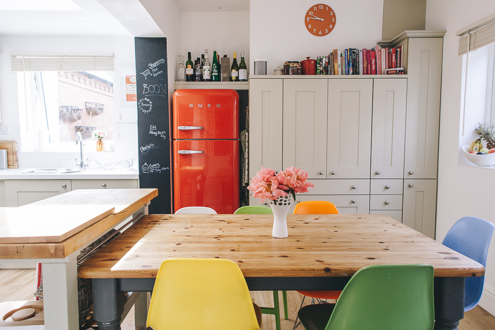
The kitchen was probably the most important room for me. As a baking fan I wanted a space where I could spend hours crafting cakes but equally that withstood having children bashing in to the cupboards on their scooters! When we moved in the kitchen was fine but just not ideal. It had white gloss doors but just felt unfinished and the layout wasn’t great. It never felt cosy or somewhere that I enjoyed spending time. When we could afford to we decided it was time for a change. The main requirement was that I could fit in a lovely 110cm Rangemaster and so we started looking at new layouts that would accommodate this. The current cooker was housed in a chimney breast which wouldn’t fit the new range. Our fantastic kitchen designer came up with a new layout that involved turning one of the two doors out to the garden in to a window and allowed us to move everything around without loosing space. He also created the most fabulous bank of cupboards and drawers in the old chimney breast so that we could maximise cupboard space. We chose a shaker style real wood kitchen in a sage green and finished it with white composite worktops. They have the benefits of granite but are much more durable and also a lot cheaper. Our designer was amazing as he suggested so many things we wouldn’t even have thought of and it cost the same, if not less, than if we had got it from a high street store. For the flooring we went with Karndean which I have to say is amazing. My husband took some convincing as he had an aversion to vinyl but it really doesn’t look at all like vinyl. We then added in our fabulous red Smeg fridge in to a special cubby hole. I will add here that we made the classic mistake of buying the fridge before moving in and so it spent the first two years half covering the one doorway as there was no where for it to go! I then bought a vintage pine table and added bright reproduction chairs from Blue Sun Tree. We pushed this up against a fabulous butchers block from Ikea which is ridiculously sturdy and well made. (Unfortunately they don’t make it anymore but this is similar ) I’ve then added little touches like the blackboard wall which took about five minutes and cost the grand total of £9!
Snug
The snug has been a few different things since we moved in. It started life as a dining room as it flows off the kitchen but once we had the woodburner fitted it quickly became a second lounge and then when the kids arrived it was a playroom/family room. It is probably the room we spend the most time in as its really cosy and I don’t care if the kids drop toys everywhere or create general chaos. We’ve just had the carpet changed to Karndean in here so that it flows through from the kitchen and it is great. I used an offcut of our stair carpet to make a rug and got it bound at our local rug maker for the bargain price of £12. The focal point of the room is the lovely fireplace which was here when we moved in and we fitted it with a huge wood burner. Unfortunately I have to have a rather unattractive fire guard with the girls but safety first I suppose! I’m a bit of a sucker for fun wallpaper and after seeing this in a London pub we had to have it. I spent a long time googling badger playing instrument wallpaper until I finally found it from mini moderns and a love affair with their papers started. It adds a pop of colour against the walls which I painted in Bleached Lichen from Dulux. The large built in cupboard is an original feature and a godsend for hiding away the toys and clutter. We wanted a big squishy sofa that was comfy enough for us all and this was a complete steal. We had popped to M&S (not for a sofa!) and spotted this ex display model reduced from £1500 to £500 and made probably the only snap decision of my life. I love it. The pictures above the sofa are vintage Guinness adverts with an Alice in Wonderland theme. We first saw one in a pub (spot a theme here!) and I tracked some down for our first wedding anniversary being paper and all. Edd loves Guinness and Alice in Wonderland and I worked in advertising at the time so they were perfect. Plus our little girl is named Alice so they fit in even better now.
Hall
I love our hall. Having space when you first walk in is great and it makes the house feel really light and airy. We have a beautiful stained glass window which we fitted a new window over as it was rather drafty. Storage was key for us here and I really struggled to find a unit that worked in the space and gave us everything we wanted. Instead I asked a local carpenter to design us a unit and it is perfect. I honestly can’t recommend having things made enough and we have used him numerous times since. The craftsmanship is beautiful and the cost was comparable to high street stores. One top tip he gave me on the shoe element was to go for open shelves. Apparently with a non house trained husband and kids they are more likely to put their shoes away if they don’t have to open a door! Can’t say it works 100% of the time but its a lot better than it was. My mum kindly gave me this huge mirror from her old house and it is just perfect here. We added cute coat hooks for the kids and more in the inner porch for us. A little unit above from a local shop provides a space for spare change, keys, general clutter (oh and my Mulberrys!). I love having photos up so created a bit of a gallery wall that has grown quite large now with an odd assortment of frames.
Lounge
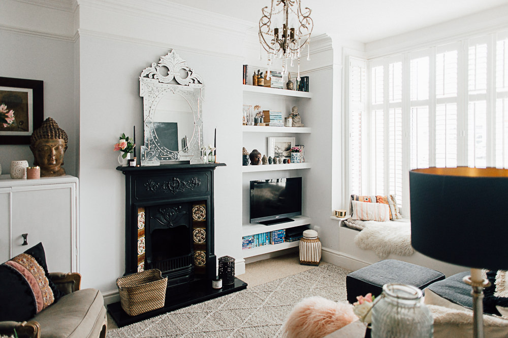
This room is really calm and relaxing. The light from the bay window is beautiful and I try to keep this room children free. It doesn’t really stay like that but more built in storage helps us keep everything hidden away. I’ve gone for a mellow mocha shade from Dulux on the walls which is really warm and then added bright accents of colours. There wasn’t really a plan here but over time I have purchased, knitted and sewed various cushions and throws so we just added to it. Some of my latest cushions are the cute hare and squirrel designs from Homebase and then I added a few striped ones from H&M. I love a throw in the winter so always have a few ones I knitted on the sofas. The main sofa is a sofa bed from John Lewis as this acts as our spare room and we added a second from M&S in more recently. We recently had this beautiful window seat built for a lot less than a chair would cost. It has opened the room up, the girls love sitting on it and it provides extra storage so is just perfect. This and the other built in cupboards are painted in Farrow and Ball Bone which looks a nice green colour in this room. We have lots of hidden storage in here. There are cupboards in the alcoves, one original and one new, the window seat, storage under the sofa bed and these great tables from Habitat which have lift up lids for chucking stuff in. The fireplace in here isn’t my favourite but at the moment replacing it isn’t a priority. When we moved in it was a deep mahogany with floral in lay which just wasn’t my thing so I painted it out in Wimborne White. I then painted the marble inner surround in Annie Sloan more recently as I just didn’t like the marble. I’ll be sharing the upstairs tomorrow. See you then!
{STEAL LOTTIE’S STYLE}
[show_shopthepost_widget id=”866070″]

I expected nothing less. It is such a wonderful reflection of you. You know what’s coming now don’t you?… It’s so fresh. What a beautiful space and I love the design of the kitchen. Such an inviting space. X
Thanks lovely! You do make me chuckle! I think I like to surround myself with bright things to wake myself up. You will have to come for a cuppa soon xxx
This is the most house envy I have every had! I am going to move house next year hopefully and I will make it look just.like.this!!! Particularly love the little bench by the show rack… practical AND gorgeous!!! xx
You made me smile Vanessa! Its been hard work but worth it in the end and I’m sure your new house will be super dooper lovely. I highly recommend finding a local carpenter. He made this bespoke shoe rack and seating unit for us which fits perfectly and was the same, if not less, than buying from a shop. Good luck with the house move xx
Oh my…
Dream home. Definitely the best house featured on RMS in my opinion, and I’m now going to copy all of it.
Truly gorgeous and so many inspiring ideas Love, love, love it.
Thank you for sharing your beautiful home with us!
Love that you love it Emily! xxx
Absolutely gorgeous Lottie.
I’m very envious of all your built in storage! You can never have enough with little people.
You’ve created a wonderful family home, that’s so inviting xxx
Storage is an absolute must Lorna. That way I can hide everything away at the end of the day (or I try to!) xxx
Absolutely gorgeous! I will be pinning lots of this! The kitchen is perfect, love the choice of wall colours in every space and it’s so cosy looking. Love love love x
I love the downstairs of your home Lottie but I ADORE the upstairs. Can’t wait to share all the bedrooms tomorrow 🙂 x
You sweetie. Looking forward to you sharing the upstairs too. Molly is excited to see her room on mummy’s computer! xxx
Beautiful! Can I ask what the blinds are in the lounge? We’re looking for something similar to give a bit of privacy in the lounge but I’m struggling to find something I like! Thank you 🙂
Hi Claire. They actually just good old Ikea. I wanted some lovely soft grey painted ones from Laura Ashley but due to the size of the window they were just too expensive. These were meant to be a stop gap but 4 years later they are still here. Luckily the sizes fitted the windows exactly and as with Ikea they were super long. I can highly recommend the Laura Ashley ones though with the wide tape. My sister has them and I have blind envy xxx
Ikea!! Who would have thought! I’ve just searched for them and they come in lots of different widths so that’s super helpful, thank you 🙂 xx
I’ve seen it is real life and it really is such a great space – such clever use of nooks and crannies and colour. I was particularly inspired by the wallpaper choices (even more upstairs!) and all the photos everywhere – we are notoriously crap at hanging pictures and our kitchen gallery wall is now one of my favourite things in the home. When we move I’ll be taking lots of inspiration from Lottie’s interior design ideas including that amazing sofa with the lie down bit! x
If only I got relax on the sofa more often Charlotte!!! Photos are my absolute favourite and I struggle not to put up even more, I’m fast running out of wall space. xxx
Oh its just GORGEOUS! Good job you did save the upstairs for another post as this is just exploding with inspiration and beautifulness! (not an actual word) What an absolutely gorgeous family home Lottie. Its just so full of creativity and character. Your kitchen is just the most perfect kitchen and the hallway is so charming! Love love those guiness alice prints too. Well done on all of this – its such a good balance of good taste and style with ‘yes we actually live here and have a lot of fun’ Ooh so much to copy!
Love the ‘yes we actually live here’ comment Amanda! That is extremely true and I personally love your new beautifulness word. xxx
Yummy house and yummier kitchen, can I ask where it’s from?
Thanks
Rebecca
Thanks Rebecca! Our kitchen fitter sourced it for us but its the Erin painted oak from Burbidge xx
Wow – love this! Can’t wait for tomorrow. The pops of colour are so vibrant and fun. Makes me think our house is so boring in comparison…! Definitely second going to carpenters, they are amazing at making things work and suggesting ideas you didn’t think possible. x
Gorgeous home! I love the mix of colours throughout 🙂 we’ve just bought out first flat and I’m trying to do something similar, and because the kitchen and living room are open plan we went for a cheaper version of your SMEG fridge – you can find it here – http://ao.com/product/SR11010ON-Swan-Retro-Fridge-Freezer-Orange-28519-28.aspx – (although its not available just now 🙁 ) I love it, and it allows me to play with colour throughout the living/kitchen area.
Good inspiration for fabrics and wallpapers – love the badge playing an instrument 🙂
Thanks Annie. My sister used to have that fridge, its ace. The Smeg was a rash ‘Yay we’ve bought a new house’ purchase which wasn’t the best decision when a) we didn’t have space for it and b) we should have saved the money for essential make the house liveable projects. Oh well! xx
There have been some lovely views of people’s houses on RMS but to me this is one that really stands out as a home. You get a real feel of the homely, traditional, vintage influences, and then the bright pops of colour really bring all the spaces to life and incorporate the whole family. This is my kind of home tour – I could move straight in!
Where is the amazing wallpaper in the snug from?
Thanks Claire. I’m sure I have some spare space somewhere for you to move in! The paper is by Mini Moderns which is now stocked in John Lewis. They have some of the most fun wallpapers. xx
LOVE these home tours, very inspiring and achievable. Especially love this one as we are about to decorate our new house and have lots of similar toddler based considerations! I also want a window seat…
(and a new kitchen now!)
Toddlers do dictate decorating choices a bit don’t they?! Especially when they choose to redecorate with a pen as my little girl did! No washable felt tips for her though, she picked a sharpie pen. Great fun! x
My boy is known as Banksy among friends and family!
Love it!! x
I love the amount of space you have in your kitchen and how it’s so open but can also be divided up when needed/wanted. There are so many things I’m going to steal from this post. Can’t wait to see upstairs.
It is great having the family room leading off the kitchen as it just works so well for us as a family. Feel free to steal away! xx
I love love love your house! I have definite house envy!! Where did you get your chunky wooden & from, I’ve been scouring the internet but to no avail!
Thanks x
Thanks Victoria! The & was actually from Homebase. Think it was about £5 which was an utter bargain. I’ve also seen a few in Wilkinson recently incl a fab concrete one xx
Oh Lottie! Your home is gorgeous but I expected absolutely nothing less. I have to concur with Becky on the ‘freshness’ aspect and I love the amount of light that just floods throughout. The hallway is a particular favourite – as is the living room but do you know what I love the most? It’s the piles upon piles of photos you have of your nearest and dearest that are framed and hung up – something I think I can definitely learn from! Can’t wait to see part two!
Coming from the queen of style I am flattered Lolly! It weird but I never really noticed the light when we first moved in but all the jobs we’ve done just seem to enhance it and everywhere seems so much brighter now. I’m forever framing photos as I just love them. Especially once you have kids as there are just too many gorgeous moments to capture xxx
Lovely home, we have just done our sons room and as we love totoro can I ask where you totoro poster/print is from?x
Hi Claire. My husband is a huge Totoro fan so they seem to sneak around the house quite frequently! It is an Olly Moss ltd edition print I’m afraid. I know you can still get them on eBay but they have ended up being a bit pricey as everything with Totoro seems to be! xxx
[…] you lucky people got to have a snoop around my lovely old Victorian House! It’s been a bit of a labour of love getting it to where it is now but it was great to share […]
Amazing home! what paint did you use in the snug and lounge? thank you! x
Hi Megan. The snug is Bleached Lichen and the lounge is Mellow Mocha. Both from Dulux. x
I love love love your Totoro print, can I ask where you got it from? So unique!
Hi Kirsty. It was an Olly Moss print that I got my husband as a present. He releases limited editions every so often but unfortunately after they seem to go v expensive on Ebay. You can find them about though xx
Hi Lottie, I love your kitchen! I am repainting my cabinets and wondering which shade of F&B paint your cupboards are closest too? would love to achieve a soft sage green which isn’t too dark!
[…] you saw my home tour here and here you will see what I mean. It’s a myriad of colour and patterns which probably […]
What a beautiful home Lottie! I especially love your very calming living room and just how jazzy your snug is in contrast, lovely!!
Gemma xx
The British Feather
[…] wooden legs from eBay. I toyed with the idea of getting them in bright colours as I bloody loved Lottie’s home tour but chickened out at the last minute and bought two in white and two in light grey. They are super […]
So you posted this AGES ago so I don’t know if you’ll see a comment now but WOW to your home! A few questions….! What wall colour is in the hall, is it ‘just’ white? If so, which white??? And the blind and curtain over the front door? Love your style!
Hi Sarah. So pleased you like my house. The walls are just Dulux pure brilliant white. It was the easiest thing when it came to reappointing them. I actually made the hall curtain and blind (crafty I know) using fabric from John lewis. It’s actually very easy. The curtain is just a big rectangle and if you google how to make a roman blind it’s not too bad. Obviously you could just buy some but we have odd shaped windows and doors! xxx
That’s amazing! I can totally do that! Thanks for the inspiration – we have a 1998 new build and so it’s hard to tread a line between modern but with character. Your pics are now all over my Pinterest board, thanks for sharing!
Glad to be of service! Good luck with the decorating xx
Hi,
I love the colours of your kitchen cabinets, can I ask what paint you used for them?
Thanks!
Hi Lottie, Adore your home! Absolutely stunning! Looking to paint our bedroom with Bleached Lichen, if possible could you tell which tone, 1, 2, 3 or 4 of Bleached Lichen did you use. As my partner and I love the colour of your snug. Thank you – Yazmin