
[ezcol_divider]
[ezcol_divider]
[ezcol_1half id=”” class=”” style=””]
{Browsing Rock My Style}
We want you to get the most out of your Rock My Style experience whether you visit us on a desktop computer, mobile or a touchscreen device so we thought a little tour of how everything works might prove useful.
Of course nothing beats a good old fashioned click around but you might find the odd little trick or tip here that will enable you to explore Rock My Style and find content in a way that you never expected.
[/ezcol_1half]
[ezcol_1half_end id=”” class=”” style=””]
{Finding Content}
Our most recent content always appears at the top of the home page in our headline story. Immediately below our this you’ll find our next 6 most recently published stories.
Beyond that we have incorporated a few little neat tricks that should help you get to the content you are most interested in quickly and comfortably.
[/ezcol_1half_end]
[ezcol_divider]
{Navigation}
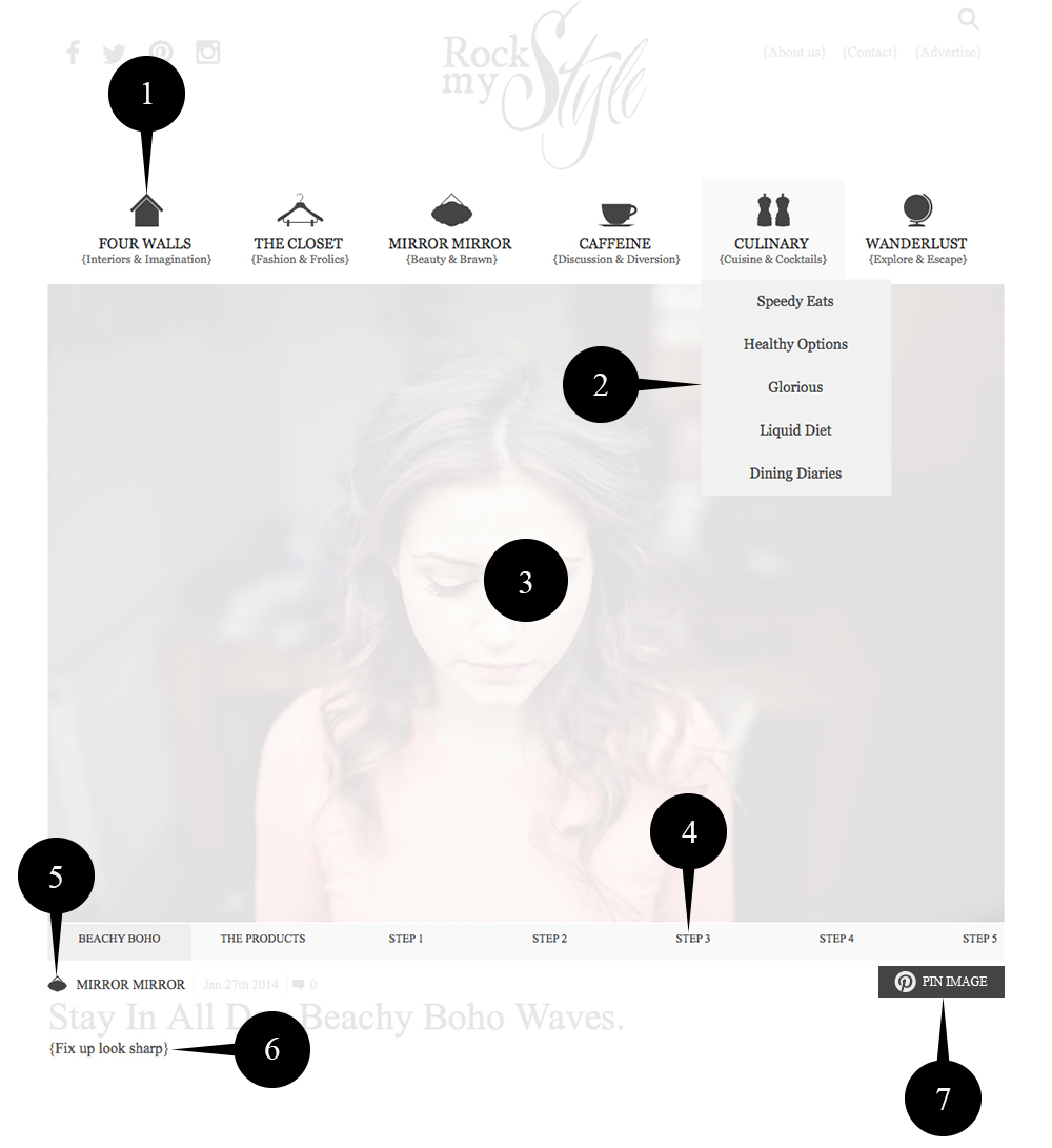
- MAIN MENU.
Here you can see our 6 main categories. On mobile this menu is optimised and can be hidden to maximise screen space.- SUB MENU.
Each of our main categories is split into relevant subcategories. Selecting one will take you to our archives for that particular subcategory.- GALLERY SLIDER.
All of our post images are contained within a single sliding gallery that appears at the top of every post. You can control the gallery using the arrows that appear when you move your mouse over the image. You can use swipe gestures on touch devices.- GALLERY TITLE.
You can also use the Gallery title strip to navigate quickly through the images in each post with clicks, touches or swipes.- TITLE CATEGORY.
Let’s you quickly know how the current post has been categorised. clicking on this title will take you to an archive of all posts in the category.- SUB HEADING.
This is where things get a little different. Each of our posts will have a subtitle and if you click on it you’ll be presented with an archive of all posts with that sub title. It’s a different way to browse Rock My Style content. try it, you might like it!- PIN IMAGE.
Clicking this icon will quickly allow you to pin the image that is currently selected in the Gallery Slider complete with full image description.
[ezcol_1half id=”” class=”” style=””]
{Searching}
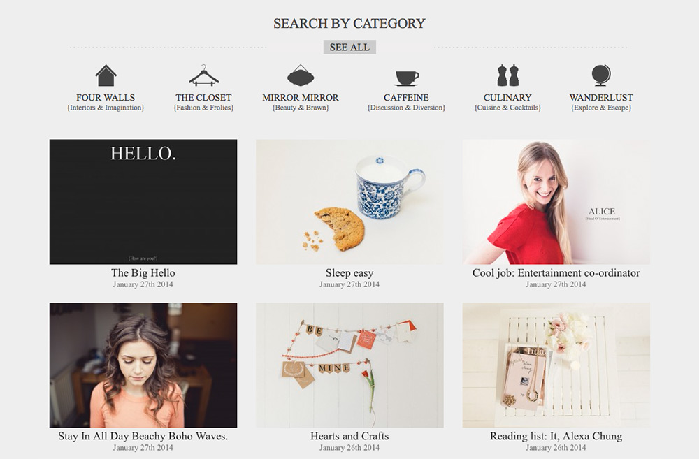
You can use the search button at the top right of the site if you are looking for something very specific. If you want to search through our categories you may prefer to use our category filter which appears in the grey section of Rock My Style on every page under the main content. It looks just like our main menu but when you select a category it serves you with the 12 most recent stories underneath. Switching categories replaces the currently loaded content with your new selection.
[/ezcol_1half]
[ezcol_1half_end id=”” class=”” style=””]
{Mobile Browsing}
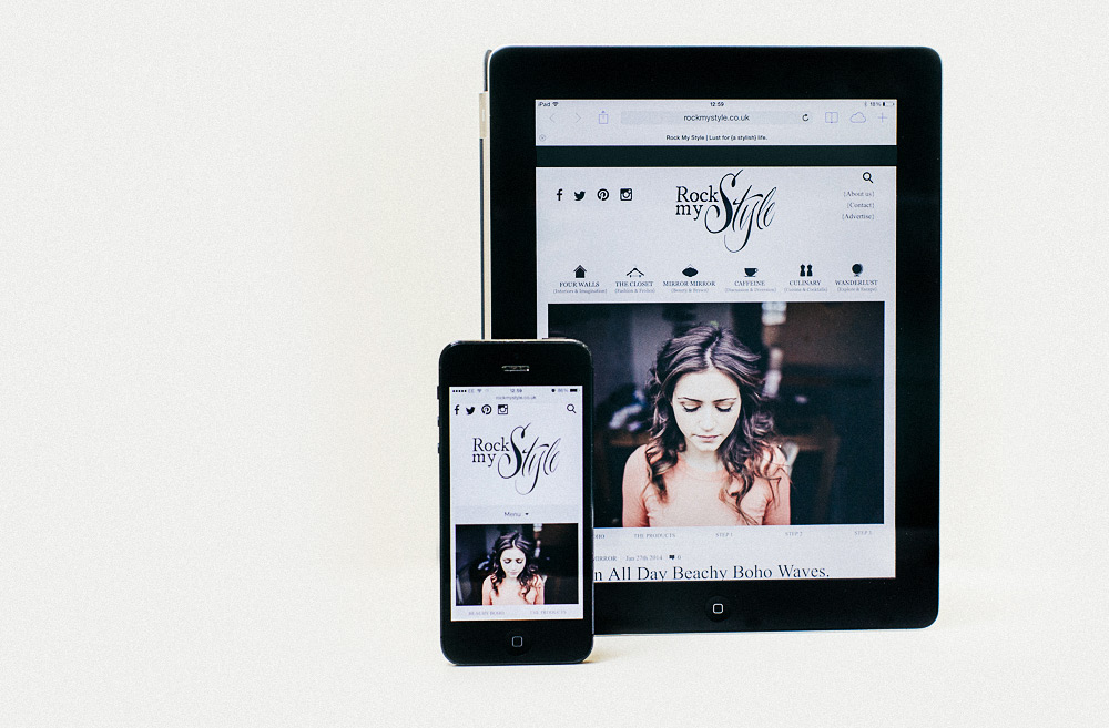
Rock My Style has been optimised for speedy touch screen and mobile access. You can browse our slider galleries and menu systems with simple swipe and touch gestures. Our mobile phone interface utilises a main menu that you can show and hide, maximising space for content. All of the desktop features, content and functionality are present on the mobile version of Rock My Style, so even with a small screen you get to see the full picture.
[/ezcol_1half_end]
[ezcol_divider]
If you have any specific questions or feedback regarding our user interface, or anything for that matter, please feel free to drop us a line on our contact page.