Yes, it’s me… Today I will be giving myself the home tour treatment. I live in Edgbaston, a suburb in Britain’s second city. The houses in my neighbourhood are typically massive three storey townhouses and many have been converted into apartments. This is the case with my home, a 1930s split level flat (or duplex apartment if you want it to sound much more American and appealing) that has been carved out of the first floor and roof space of a generously proportioned and detached property.
So, come on in. Make yourself at home and have a mooch around. If I’d been more organised I’d have baked a banana loaf.
The Living Space
It’s a bit of an unusual layout… You walk into a small reception hall that leads directly in to the living and dining area on the first floor or to the right you can climb the staircase to the office space, kitchen, bathroom and bedroom. Let’s start on the first floor with the living space.
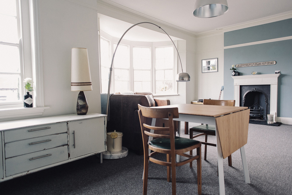
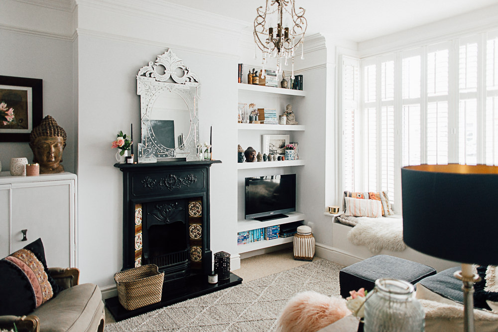
The living and dining area is huge – once a first floor main reception room of a three storey townhouse it measures in at 6.20m x 4.88m into the bay (20’4″ by 16’0″ in old money) and although no longer working the fireplace and other period features such as the original sash windows are a really nice touch. I’m not a fan of UPVC I’m afraid. The sofa’s are from Halo, the dining table is Ikea and the Arco style floor lamp is Dwell (why pay a over a grand when this copy for £200.00 looks this good!) Everything else furniture wise has been acquired over the years from flea markets, eBay and in the case of my 1970’s G-Plan coffee table – stolen from my parents.
Upstairs
The top section of the staircase was widened during the apartment conversion and opens into the second floor hallway which is in an L-shape. This extra wide hallway (nearly 2m wide) has just enough width to squeeze a desk into without seeming cramped… The vaulted ceiling, Velux roof light and white walls also add to the illusion of space means that I’ve essentially been able to squeeze an additional room into home. As an office space it works brilliantly as the desk sits against the wall and if I look to my left I see my bedroom, to my right is the velum window… it feels like a massive room! My desk is probably my favourite item of furniture – it is a 1940’s original design – battered beyond belief but that means that I can relax because it doesn’t matter if I scratch it. I bought it off eBay after a night of Malbec fuelled bidding and probably paid more for it than I should have done but I love it so it’s ok.
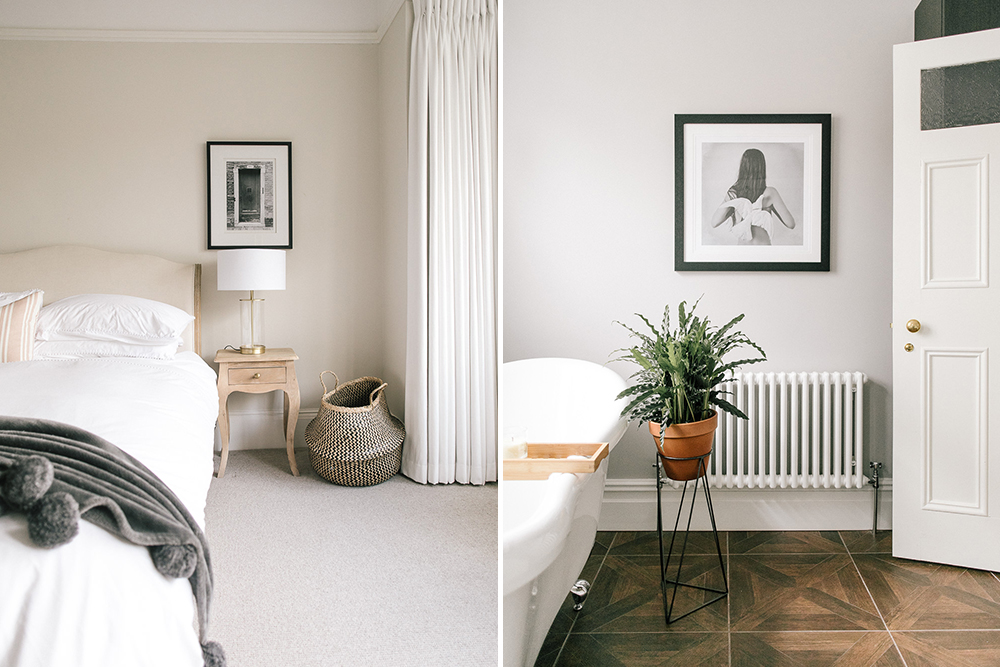
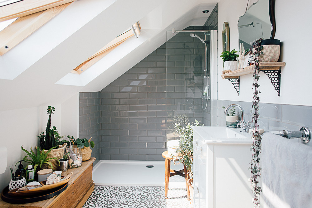
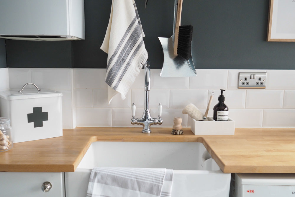
The Kitchen and Bathroom are both nice light spaces, the colour scheme is the same in every room of the apartment… I choose two colours both from the Crown Period range – the finish is described as “Dead Flat Matt” and has that chalky powdery finish that looks so deep and lush whilst being considerably cheaper than the likes of Farrow & Ball. The main wall colour is “Aged White” which apparently re-creates the colour of lace from a vintage wedding gown(!) and I chose “Duck Egg” as an accent colour. I decided on one colour scheme throughout, a tactic that increases the feeling of space in smaller homes, it’s an idea that lauren discusses in more detail in her post Creating A Whole House Palette .
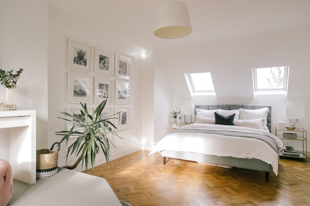
The bedroom has a beautiful semi circular window that dominates one of the walls and provides views toward the city. Bedside tables are created from a crate and old up-cylced drawer unit and the bedside lamp is an Adam Crohill original made from a glass jar purchased from TK MAXX home and some fairy lights from Cable & Cotton. You can find out how to make your own version here. I’m not sure what to do with the window… As you can see it has no curtains or blind – I really don’t want to loose that beautiful shape but it is somewhat inconvenient to have an East facing bedroom that has no way of blocking light. I have kinda got used to it now and Lizzie has taken to using a sleep mask when the morning sun is particularly strong but if anyone out there has any bright ideas (if you’ll excuse the pun) then please share!
On a whim I painted a monster on the other wall. His name is Martin.
There must be loads of other details worth mentioning but it’s so hard to see them all when it’s your own home… So if you spot anything you like or want more information on then please leave me a comment and i’ll do my best to answer you.
{The Particulars}
- Who: Adam & Lizzie
- What: 1930’s 1 Bed Duplex
- Where: Birmimgham
- Style: Contemporary with shabby and industrial flourishes
{Key Features}
- Reception Hall Artwork | Jasper Goodall
- Leather sofa’s | Halo
- Dining Table | Ikea
- Arco floor lamp | Dwell
- Office space artwork | Jason Munn
- Kitchen | Ikea
- Gin | Hendricks
Up For Rent
So there it is – I suppose if you are talking themes then this living space is contemporary and modern, with occasional shabby chic and industrial flourishes. Crates are used throughout, we have up-cylcled mis-matched furniture and painted wooden floors. The tiled bathroom and kitchen with oak flooring and solid wood worktops add a touch of luxury and the huge open living space and large windows give a loft apartment feel. I love it and I call it home, but not for much longer as it happens. I am currently in the process of moving to Cheltenham with Lizzie (I assure you it wasn’t simply because of the lack of curtains in the bedroom!) and so an exciting new chapter begins, involving knocking down walls and general renovation fun. Watch this space for an introduction post to #TheCheltenhamhouse soon!

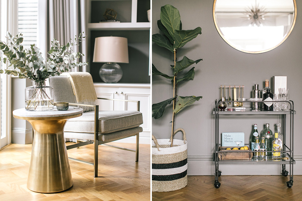
It looks fab! I love the drinks cabinet/bar thing it is really awesome! It is really light, if we were moving to Birmingham I would love it but sadly it’s a bit further than we want to move! Good luck with the new house project I bet it’s going to be immense!! Xx
Thanks Alex – I love how light it is too (apart from in the mornings sometimes).
I’m looking for a bid silver plate to complete the drinks area and then it will be perfect.
Adam.
I love home tours! They’re my favourite part of RMS. Your flat looks awesome. I love the consistent colour theme throughout and will be taking a lot of inspiration from the grey and duck egg – we’re just in the process of buying our first flat (fingers crossed for exchange soon) and this is going to be a very useful source of inspiration as my bf is keen that I don’t go too ‘girly’ on the decoration. I love all the small details, it makes the flat really quirky – the bell is my favourite. I’m sure you’re going to have no trouble renting it out! Good luck with the Cheltenham move, can’t wait to see photos of the renovation.
Thanks Sian, glad it’s going to be useful for you.
Love this! The colour scheme is gorgeous and everything looks immaculate. That coffee table brings back lots of memories as my aunty had/still has it in her cottage in Salcombe where we went on holiday every year. For a long time we all couldn’t understand why she kept it all those years but now we keep trying to steal it (along with the G Plan table and chairs). Love the use of the ikea little picture ledges for storing toiletries etc. May steal that idea for our bathroom. Can’t wait to see the new house! x p.s. I could have baked a banana loaf if you’d asked!
Charlotte, We’ve literally just finished decorating so it was a great time to take the photos… It won’t be this immaculate for long!
And I totally stole the ikea picture ledges as shelves idea from mabels nursery 🙂
Right when I can move in???!! Unfortunately it is not within a workable commute (would take about 2 hours to get to work!!) but what a great pad.
Your new house sounds like a great project. We are slap bang in the middle of deciding between buying a large project house or a smaller more finished house and we only have one week to make a final decision. It is driving us nuts and we have NO idea what to do. Think we may have to roll a dice…..
It’s always tempting to go for the project isn’t it… I love a project.
I still think you should save you money – rent this one off me and spend all the money you’ll save on a really posh comfortable car that you can spend 4 hours a day in… Maybe get a driver too…
I LOVE everything about this.
For me it’s all about the grey and Hendricks bottles. Going by the number of them dotted around, you’re clearly a gin wife!
Ha ha… you got me. Although These days I am becoming more partial to whiskey… I might have enough Jura bottles soon to be able to do some redecorating!
Problem is its a rather large and expensive project which could skint us over time. however it will be worth a lot more in the future. it also has sentimental worth as it did belong to my husbands grandparents. we feel really stuck at the moment and really dont know what is best to do. would love to see a post about project houses!!!
You’re flat is so incredibly awesome! I adore the shabby chic and that colour palette makes it feel so light and spacious. I am really impressed. It is nowhere near my usual style, but I’m doing some serious thinking how I can incorporate some of this in the house that we are getting built.
And I loooove that bedroom window!
Thank you so much for the lovely compliments Anja, so pleased you like my flat 🙂
The house building sounds exciting – you’ll have to share your results with us. I am now totally expecting you to hang a big brass bell somewhere 😉
Who’s a trendy wendy then? Love the colour palette being taken through every room, my husband (ha – second time i have ever written that since getting married) would love a grey house (but he has to put up with white and gold!)
Nicola x