
Blush has been on the radar for a while, however Pantone’s decision to name rose quartz one of 2106’s ‘Colors’ of the Year has catapulted pink hues into everyones decor.
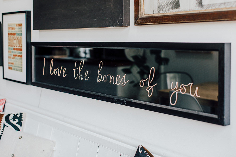
I am toying with a combo of the palest pink and an inky charcoal in my soon-to-be office. I’m hoping the palette will be contemporary yet really complement the traditional features of the room.
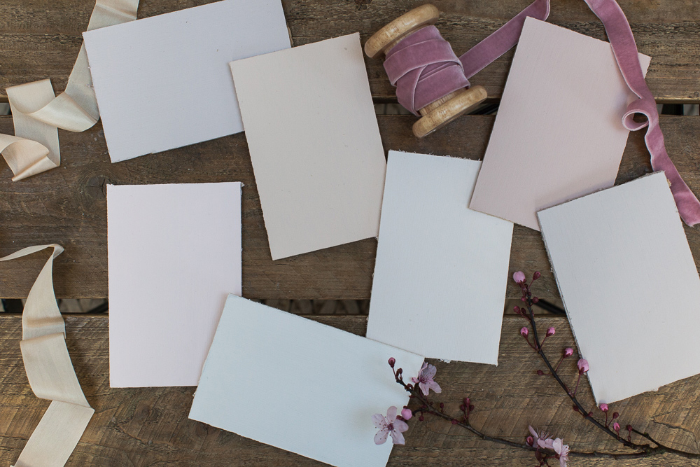
However setting out on a search for the perfect blush has proved tricky. A seemingly demure shade can resemble a sugared almond when it reaches the wall and so we’ve put together a little colour guide to save you from splashing out on endless testers. This is the first of our paint guides but we’ve also shot samples for both greys and whites to share soon. We thought it would be helpful to see the shades side by side to highlight the differences in all the tones. Simply scroll to the next image in the slider to view the shade names.
Farrow and Ball Peignoir
One of F&B’s new 2016 collection, Peignoir could be described as a pinkish grey. Named after a feminine negligee, this shade is slinky, sophisticated and perfect for your boudoir.
Farrow and Ball Pink Ground
The yellow pigment in Pink Ground results in a very soothing, soft blush. This colour transforms dependent on the time of day so expect an almost unpainted plaster look in natural daylight and more of a blush in sunlight. Very grown-up and sophisticated it looks particularly good with grey.
Hemsley Cheriton Blush
This was my first forage into Hemsley. Exclusive to Homebase these paints are ultra flat so you get a great depth of colour. The whole range is muted and timeless so well worth checking out.
Laura Ashley Chalk Pink
Chalk Pink is creamy, pretty and elegant. Laura Ashley also do a lighter shade of this colour, ‘Pale Chalk Pink’ if you’d like to get and subtler look.
Dulux Frayed Hessian 4
This is my personal favourite. As a warm, neutral shade Frayed Hessian is a subtle beige with just a hint of pink.
B&Q Subtle Blush
If ever a paint name summed up a shade this is it. It’s subtle and it’s blush. This B&Q paint was the rosiest of all the colours we tried.
Dulux Love Note
I’ve read some say Dulux’s Love Note is similar to F&B’s Calamine but for me this had more of a purplish undertone. You get a gorgeous flat colour with the Timeless Classic Range so it’s very sophisticated.
Anyone else inspired to use blush on their walls? What shade have you gone for?


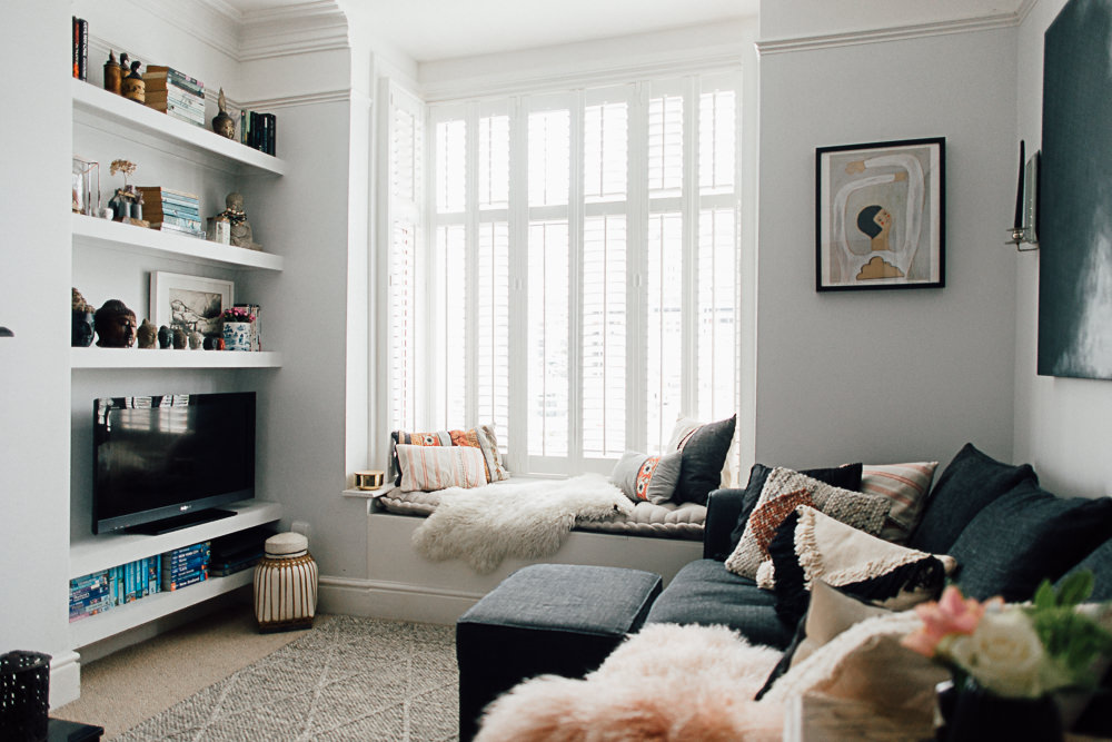
We have Farrow and Ball Great White in our living room. It has the palest pinkish grey tone which works beautifully with our dark grey sofas. I’m currently trying to decide whether to add a splash of indigo……
Susie, do it! It’s exactly the palette I’m thinking of. Let me know how you get on x
Just a little comment on a phone I can’t see the names on the swatches….
I love f&b calamine but hubby dead set against pink paint! I’ll have to sneak it in somehow!
Good point Victoria – hope you can see them now x
??
I’ve just painted a wall in my hallway in Pink Ground. I love it. The space doesn’t get much direct natural light, but it looks fab under artificial light too. It has a kind of muted Miami feel and I’m on the hunt for just the right print for the space now. It is also immensely cheering. How can you be sad with a blush pink wall?
So chic Elle. Miami? Surely a bit of palm print or a flamingo or two is required?!
My living room is f&b calamine and pavilion grey. I love it!
Beautiful combo Amy x
Pinks is allways a great idea! 😉
Sabela
Indeed it is Sabela 🙂
F&B’s Setting Plaster is a lovely soft pink – and on the subject of F&B I’m going to pick up a sample of Cornforth White later today. After seeing the picture you posted in Instagram I’ve decided it is the perfect colour for my living room – and I might also have eyed up a new throw, curtains and cushions too….
I’m in love with Cornforth White Claire. New throws, curtains and cushions are compulsory when you paint 😉
Moving house in 2 weeks and wanting to decorate my 15 month daughters room first. am very tempted with the new F&B Peignoir with a bluey grey (maybe the new Cromarty?)- her current room is homebases duck egg and chalk pink, so thinking this would be a slightly grey-er version. Will be heading to the F&B shop very soon to pick up some sample pots and get splashing the colour around! That being said, I do like the look of the Hemsley range too, so maybe needing those too….
Hope the move goes well Danielle x
I’ve got the hubby to agree to painting our bedroom pink, but I’ve struggled to find the right shade. I think Peignoir is a contender but I do love the warmth of Pink Ground…
Either would be super Jenny. So romantic x
I had my bedroom in Farrow and Ball pink ground 10 years ago. Its a fabulous colour, warm and soft. I had it with gold silk curtains and a patchwork quilt made of saris! Not quite the look you are going for I know but I can imagine it would look stunning with a warm charcoal grey.
oh and if you could find me the perfect coral thats just the right amount of orange and pink to paint my kitchen i would be thrilled!!
[…] closer you’ll see there are very subtle differences between all these hues. As with our recent blush paint guide we’ve placed some of our favourite greys (or grays for our American friends) side-by-side to […]
Think I’m going to paint my Scandi-style sitting room with Peignoir. Or Calamine. Can’t decide. Had been going to go for a F & B Grey like Manor House, or even Downpipe, but hubby decided that was too dark and I’m thinking that Peignoir would be more interesting – but still on the grey side – than a straightforward grey like Manor House. Got a few brassy things going on and a white/cream Beni Ourain carpet. And a bit of pale wood. Hmmmm…