

After putting together several paint guides in the past, I can’t tell you how many people email me about paint colour suggestions. The truth is that as my recent repertoire covers either Dulux Supermatt White (not Brilliant White) and Crown Sail White I feel I’m not at the top of my game when it comes to offering advice on swatches. This my friends, is where you come in.
Our very own Laura dropped me a note recently asking for my thoughts on how she should tackle the south facing living room:
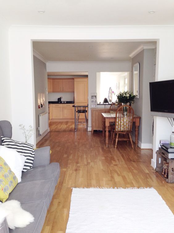
We have a fairly average size south facing Victorian terrace lounge. The room has been knocked through to our dining room, which sadly leaves little room for creative furniture configuration, however, a huge bay window and high ceilings mean the space is very bright, and airy. We’ve recently had a new window fitted, and so the space is in need of a paint update, and to be honest after four years of brilliant white we’re more than ready for a change. Light and bright is the general theme of the house, so I’m not sure we should do anything too drastic, even though going dark fills me with excitement. All the rooms in our house are painted white with the exception of the dining room, which has our favourite Cole & Sons Woods wallpaper, and Pavilion Grey walls. Being completely open plan downstairs, the lounge has to work with the aforementioned dining room. We’re also not in the position to invest in a new sofa just yet so the colour has to work with our dark grey and hugely uncomfortable sofa, as well a white glass fronted cabinet which will be moved in to replace our current shelves.
The Current Space


In my opinion Laura can have anything she blinking well likes as the luxury of south-facing means the space will be bathed in light for much of the day. I think the reason brilliant white can be overwhelming when you have a southern aspect is that such a huge amount of daylight streams in that it can make a room feel a bit washed out, especially around mid day.
Light
So should Laura go light, mid or dark? Well if opting for a light shade then do bear in mind that such a huge amount of warm light will amplify the undertone. Using pale shades with a yellow, orange or red undertone and may overpower the space with a warm glow so best to go for one with a cooler base. I’m thinking Crown’s White Glove may be a good one to try if Laura wants a very subtle change to the brilliant white.
Mid-tone
The same applies for a mid-tone too – a grey with bluish undertones would be really effective in toning down the brightness of the space. A shade such as Farrow and Ball Dimpse would also complement the Pavilion Grey in the dining room. However I did mention to Laura about taking the Pavilion Grey right the way though the space.
Dark
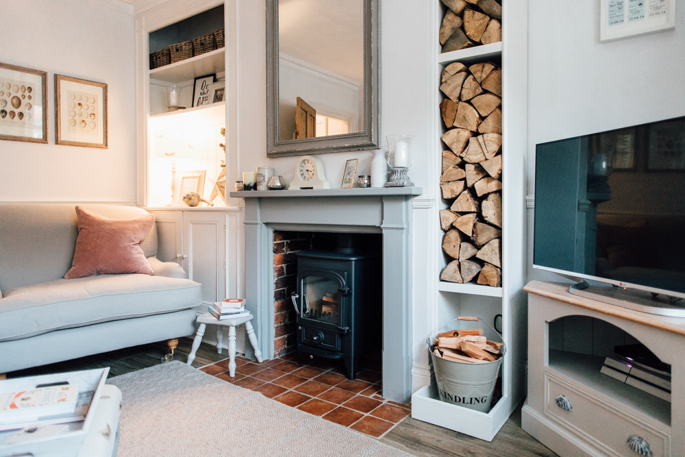
Even though I haven’t been brave enough to go a dark shade (other than on my snug shelving and fireplace which you can see above), I think Laura’s lounge would look stunning painted in a dark hue. Again one at the cooler end of the spectrum which would be cosied up with all the warm light.
I’d also encourage Laura to splash out on a few testers and paint large sheets of paper to hang up in her lounge. Particularly in south facing rooms, the level of light dramatically shifts during the day and one shade that looks perfect in the morning can be less so by the late afternoon.
Now I realise I haven’t been particularly helpful in pinpointing particular shades and that’s where I’d love it if you came in. Have you used any coolish shades in any of your south-facing rooms? What do you think would work in Laura’s living room? If anyone would like me to attempt to do a similar post for other aspects then please shout.

So many possibilities. Bringing the pavillion grey through would look lovely. However a complementary slightly ‘stronger’ grey would work well. We have Dulux ‘chic shaddow’ in our living room and we are really peased that the light doesn’t pull out any strong undertones. One we considered was a green. A willow/ aloe shade keeps things fresh and also means that all furniture etc still works withbthat shade. Fartow and Ball ‘ vert de terre’ is a beaut go keep things airy fresh and fabulous.
I still need to use Chic Shadow Faye – it’s regularly mentioned a favourite on here x
It looked so dark when I first popped it on the walls but i love it. So calm and fresh but also cozy if that makes sense. Also duluk do it in all the different finishes including their endurance.
North facing help please! I am having a nightmare choosing paint for our living/dining room. It was knocked through and the living room has a large north-facing bay window. However, the south facing dining room window is now a set of double doors into a sun room. It’s really bright and painted white but takes a lot of that south-facing light away from the dining room. Doesn’t help that the people we bought from had black carpet and dark brown feature wallpaper on the long wall joining the two rooms. The wallpaper is gone but the carpet is still there.
We have plans for replacing the carpet and fireplace eventually but taking a decorating break for the rest of the summer after removing brown/beige feature wallpaper from 5 rooms! I was going to choose a pale grey with navy accents, but our sofas are grey and I worry it’ll look too much like a grey box. Plus all greys seem to look really blue. I suspect the floor is a huge factor but with a toddler around I’m not sure spending lots on a carpet for a big room is wise! I’m leaning towards Dulux Natural Calico as it looks warmer than the others, but I’m worried it feels really boring. I’d love a very pale pink but haven’t found one that works and my husband has ruled out going dark!
I found a lovely pale pink called “Tea Rose” by Valspar, i have it in my living room and its the perfect sort pink shade without looking overly girly xx
Read your comment about Valspar – there are hundreds of complaints in last month about Valspar!
Apperently bacterias grows in the wall and start to smell like cat wee…
Make sure you read the reviews no matter which brand you choose.
Linsey have you checked out any of our paint guides? The grey one from last year looks at greys that don’t have strong undertones – http://rockmystyle.co.uk/tag/paint-guides/ x
Hi Lindsey, I have just painted my north facing lounge room in Cornforth White a f and b colour but I had it colour matched in Leyland paint, it’s a lovely warm grey with no hint of blue. I did all the woodwork in cornforth white too.I’ve also painted our north facing bedroom in f and b pink ground again colour matched to Leyland paint. This is such a stunning pink in a north facing room, warm but not sickly, my hubby loves it! It’s like a neutral and not obviously pink! I’ve painted the skirtings and ceiling in f and b ‘all white’ , this is a really soft white that isn’t too stark. My dining room is south facing and again this is in ‘all white’. Hope this helps.(ive never posted a comment before but just wanted to share, getting colour right is so much trial and error, good luck!)
If it helps we have “almost Oyster” Delux in our bedroom which is a white with very pale pink tones (husband didn’t even realise it was pinky until a year later!) I think a pink tone would work well with the greys and carpet you’ve got!
I desperately need help with my hallway and stairs, I Have white washed wood flooring throughout my hallway and into the kitchen, The front door lets in some light through the windows, and there is a smaller window that doesn’t get much light, I have no idea what colour to go for, I know i want it to feel bright and airy, and to go with my shabby coastal theme? Any tips would be greatly appreciated xx
@Laura – not really seaside, but we painted our north facing dark-ish hallway and stairs bright yellow (the Farrow and Ball one – the really bold yellow 🙂 ) and pale grey woodwork. It looks great still six year in and really makes it feel warm and bright. Or you could go dark! I have just repainted out small single bedroom, which gets very little light till about 2pm, downpipe grey, bringing out the dark!
How about F and B “Blackened”? It’s a lovely grey white shade.
I’m embracing the Crown Trade Matt white for the whole barn….
I second f&b blackened, I’ve used it in two south facing rooms and loved it. I also recommend f&b wevet which has grey tones and will still look white in a south facing living room without blinding you.
Eagerly reading these responses as I may need to copy for our lounge!! x
Looking forward to reading people’s suggestions. I would just like to add our house does not look as boring and dull as these pictures suggest anymore!!!!!
Ooh! I’ve just bought my first hosue and it is currently a bright white box! Although I love how clean and fresh everything looks, I am considering painting a little at some point. My kitchen is white gloss with oak worktops, the flooring throughtout downstairs is honey oak Amtico (although it looks much more dusky and cool than you would expect with the term ‘honey’). I am considering painting the wall above the table in the kitchen a dark grey, but I’m a bit scared. I’d also like soft pink somewhere, either the master bedroom or lounge. This is my starter home, so I don’t want to invest too much. I’d love some advice on the pros and cons of different paint brands, which should I use?
Congrats on your first house Bunny 🙂
Are you looking for a hard wearing finish or is colour more important? x
I’m a big fan of Dulux Timeless, we first painted our bakery with this chalky colour and it works perfectly in the bright space as we have windows running along both sides. I have since painted our bedroom and kitchen in Timeless and it just adapts to the light at different times of the day so nicely. We have the endurance finish in the kitchen which I would recommend with little people running about as I have scrubbed it a couple of times and it still looks good!
Laura the pics of your home in IG always look so lovely would love to see more, guess it’s because I’m nosey 🙈 xx
Dulux Endurance is so good! I loved it in my hall in my last place x
What a lovely space. Looks like a blank canvas to me.
My first instinct is to bring the pavilion grey through and then get lots of dark accessories, dark grey/black luxury rug, big piece of art on the fire place. is that a mirror above the dinning table? Replace that with some art. Nice big lamps with dark shades. Lots of plants too.
We have a south facing bedroom and living room and recently decorated both – we actually have sail white in the bedroom after your love of it, Lauren! It actually looks quite creamy rather than grey which is lovely and restful, but it doesn’t look as much of a cool colour in our room as it does in Lauren’s rooms, oddly. We have dulux rock salt in our living room with a crown midnight navy feature chimney breast, and they work really well together. The navy is a flat matt which is lovely. The rock salt is a very pale grey which really looks mostly white until you compare it with the brilliant white ceiling.
I was thinking the other day Katie how our living room looks a lot creamier than it used to!
Love the midnight navy. Can imagine they work so well together x
I’ve lived in too many rented houses/flats and am big on actual colour. We have a white bedroom, but with wallpaper on one wall – is wallpaper an option here? A bit less scary than a block of colour?
You could try getting test pots and painting a big piece of lining paper to see what works? We have a gorgeous dark blue in our living room (more Farrow and Ball) which looks great with the light on it, but feels cosy in the evening. A bold colour is worth considering!
I have Pavillion Grey in the living room of my south facing Victorian terrace and I love it. During the daytime it looks a beautiful soft dove grey but at night it with dimmer lighting it looks more of a mid grey, but feels cosy. I love how it works with the different light in the room. It may be worth running it all the way through the living and dining area
I couldn’t persuade my husband to go dark in our south facing living room (though succeeded in our bedroom – hurrah!). He was dead set on white to make the room as airy as possible. After an awful lot of testers stuck on all 4 walls and reviewed at different times of the day, we finally settled on F&B White Tie (colour matched, obviously). And I can tell you it is the perfect white. Not too white but not cream or magnolia. Kt reflects light and feels bright and airy on sunny days and warm and comforting on cloudy days. Pretty much perfect. I’d highly recommend!
Help needed! I have a small South facing living room. It’s always been wallpapered in the past but with advancing years I must be aware that both from a cost and more hidden disabilities arising I’m not able to do it myself. I’m thinking I need to go the way of painting walls instead (over blown vinyl). The rest of my home has always been white and boring. I recently paintedy hallway magnolia and hate it. I don’t want to make the same mistake with living room as I’m not able to move furniture around. I would really appreciate your help with colour choice. Thanks for reading, Jan.