I’ve been itching to share Olivier’s mid-century modern apartment ever since I spotted it over on Anton Rodriguez’s photo project – Barbican Residents. The photo series documents the wonderful mix of residents within the intimate settings of their own homes at the Barbican development in London.
All of the properties are wonderful so I urge you to take a look for yourselves at them once you’ve finished here. Olivier’s property is particularly gorgeous though, so I was as pleased as punch when Anton graciously accepted my plea to showcase this beautiful example of mid-century interior design here on Rock My Style. I just know you’ll love it as much as we do.
Over to you Olivier…
Originally from France, I have now lived in London for over 28 years which makes me a French Londoner, I guess. I have always lived in Central London – I feel most at home surrounded by big buildings and buzz.
House History
My partner and I bought our first flat together in Notting Hill. We then moved to Clapham Common because, at the time, we fancied having a garden. And whilst we enjoyed living there we knew that we needed to be more central so we started to look around Shoreditch, Spitalfields, Brick Lane… Back then, this part of London was totally different – it was absolutely the new, exciting London 13 years ago now. And so we started the search for our new flat.
Interested in both art and architecture (but not practising either), we decided to come and check out the Barbican which we already knew as visitors. At the time, the Barbican was in one of its unfashionable phases and most certainly wasn’t as sought after as it is now… When the estate agent suggested a flat that had been for sale for a few months already, we thought ‘what’s wrong with it?’ … And when he opened the door to what was to become our home, all hesitations fell away and we both knew instantly that that was the flat we wanted.
The flat was in its original state, original bathroom, original kitchen (in a bad state), horrible carpet throughout but the light was – and still is – fantastic. Huge floor to ceiling windows in every room and sliding windows in both lounge and kitchen/dining area with views over other Barbican “houses” and the three towers on the South side and over North London on the opposite side: a perfect urban vista.
And then there were the two standouts of this type of triplex in the Barbican Complex: The barrel vaulted ceiling on the third floor that lends our bedroom the air of a little white chapel; and The Internal Staircase – it needs capital letters to do it justice. It’s a masterpiece of teak and black metal linking all three floors in the flat with simple grace. Someone once described the flat as a staircase with rooms attached … It is, to this day, what I love the most about the flat.
Mid-Modern Style
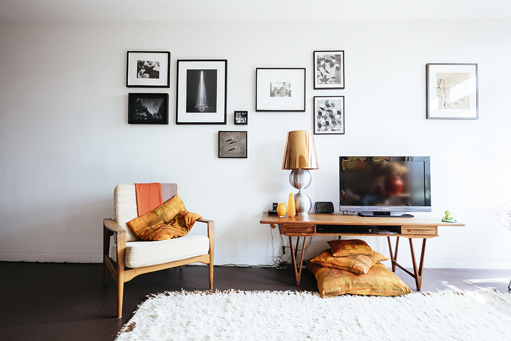
We have been interested in “mid-modern” style for a long time, so the Barbican, conceived in the late 50s and early 60s and built up to the mid 70s was the perfect setting for the type of furniture we like. We already had certain pieces in our previous flat – the Bertoia diamond chair, the Eames DSR chair – so we just expanded on the theme when we moved here … We wanted some English designers, with or without a link to the estate: Robin Day, John and Sylvia Reid. We also added Danish pieces. We built the “style” bit by bit, organically, thinking that one piece would find its place within the family and we continue that approach. We’ve never wanted to do the ‘let’s have someone in” thing because I think homes always look better when they change and grow with you. We have replaced some of our furniture a number of times over the years but have always retained the same style … A style we feel very comfortable with.
We first sourced pieces in Camden market when the dealers still had stalls there ( it feels like a century ago) but now buy them either on eBay or after a visit to one of the Modern Shows in Dulwich or Haggerston. We have bought quite a few pieces ( of furniture and of abstract Danish art) from Jonathan Stephenson at Rocket gallery in east London. He’s a nice man who really knows his stuff. For more contemporary pieces, we often go to SCP in East London and even to John Lewis – a great range in its lighting department. Our fantastic huge Moroccan Beni Ouarain rug comes from Liberty.
Refurb & Alterations
The first alteration we did in the flat was the kitchen. We worked with Roundhouse design to plan the bespoke kitchen before we actually had the keys to the flat. We retained the original layout of the Barbican kitchen but added extra storage and appliances one cannot live without today: a dishwasher and a washing machine. We wanted a glass splash back (quite a new thing 13 years ago but still looking good today) and decided to go bold: and of course the colour had to be orange. We then had to choose a colour to work with the splash back for the cupboards and settled on a Cappuccino-esque colour – a colour scheme we then used throughout the flat as virtually every room leads to another seamlessly within the flat (there are only three doors in the flat over three floors). It’s also a colour scheme that marries very well with mid modern wood furniture and a sculptural wooden staircase.
After a long time, now, we are soon to embark on a redecoration. The bathroom, untouched since 1973 when our part of the Barbican Estate was finished, is showing its grand old age, and we also want to try something new for our bedroom.
We are working with an architecture and design studio, Archmongers, to design a new scheme for these two rooms. We will retain the strongest elements of both (white clinical tiles in the shower room, towering height in the bedroom) and update them by referencing the rest of the Barbican and introduce materials unused in the flat at the moment but found elsewhere in the complex: old style granito floor in the bathroom and fine metal ridges and rivets between new style pannelling in the bedroom. Some new colours will be introduced in the bedroom (but obviously not jarring with the rest of the flat) and our favourite colour will be seen in the shower room – both the basin tap and shower head will be Vola, designed by Arne Jacobsen, in glorious orange. Archmongers are proving the perfect match for us.
Inspiration
I spend a lot of my free time visiting galleries. Contemporary art is my passion. Consequently there is nice selection of works by mainly French, English and Danish artists on our walls.
Some of these works were bought from independent galleries, some editions at the Sepentine gallery (works by Anthony McCall, Takeshi Murakami), the Whitechapel Gallery (Andrew Grassie, John Stezaker, etc), some were bought at The Drawing Room Biennal where works on paper are auctioned to raise funds to support the gallery’s program, with others purchased directly from the artists (Rowena Hughes and Lucinda Rogers for example) after seeing their works at art fairs or reading articles about them.
We have also commissioned some works by other artists. But my two favourites pieces are the huge painting hung on our study wall, which we actually found near a skip in the underground car park beneath our flat! A rather moody, dark oil on board with a great 50s-ish, 60s-ish feel to it. And the second is the limited edition print that my partner gave me more than 15 years ago by the greatest living French female conceptual artist – Sophie Calle – that we have hung on its own in our dining room.
What Next?
We have been in the flat just over 13 years now. Could we move anywhere else in London? I really don’t think so. We can walk or cycle anywhere we need to be from here. The Barbican is a safe environment right in the middle of the City, right in the middle of London. We are extremely well looked after (some might say pampered) by the Barbican Estate Office team who sort everything out for us whenever there is an issue. And we just love the flat itself, how well built it is and designed down to the minutest details. We love the huge picture windows (we never bothered to add curtains or blinds in our living room … Why would you hide such a view?). It fits perfectly with how we lead our lives, both professionally (I work from home mainly) and socially (gym, restaurants, galleries, cinema all nearby).
We also love that the environment we have created in our flat fits perfectly with the architecture of the buildings surrounding us. It feels like the mid century ethos but without it being a pastiche of it, nor frozen in time … A modern way of life in a great city, in an incredible, timeless architectural masterpiece.

What a stunning space!! I love all the orange and retro feel to it, very cool.
Gemma x
BRB, just need to pin every single image in this post <3
Haha Franky!! I was EXACTLY the same xx
LOVE! That staircase is amazing xxx
Serious apartment envy!
Retro perfection! It’s making me weep for my old mid-century sofa. It was a beauty but completely impractical for us now 🙁
I love all of this. The light is glorious x
Favourite home tour ever. Love mid century and I love how this is still a home- albeit a very stylish one. Can I move in?
Wow!