As we all know buying a one-bed or even a studio in London can be a pricey business, and a two-bed? Extortionate. Today we’re delighted to share Interior Designer, Greg Miller’s recent project where he took a simple one bedroomed flat and converted it to a stunning two bed family home with bags of personality and style.
The Property
When my wife suggested we upsize, back in 2011, I have to admit that I expected to be gaining more space from the move. However, not wanting to move out of SW18, I soon became realistic about what we could get for our £300,000 budget. We saw a one bedroom Victorian conversion flat in Wandsworth where the sale had just fallen through. Being an interior designer, I could see the “potential” although the garden was shared with the upstairs neighbour, so we would have to convince them to sell their share in order to be able to extend. Still not entirely convinced that this move was a good idea, I called my wife to discuss the sense in moving to another property of the same size. Never one to hang around, she told me it was too late and she had made an offer. So, we ended up trading our 589 sq ft one bedroom flat for this 622 sq ft one bedroom flat.
What a bargain, £55,000 for an extra 33 sq ft! Plus the 3% stamp duty we generously gave to the government.
Three months later we moved in and I set to work making the best out of what we had on our non-existent budget. Job number one was to remove the vile coral coloured, high gloss laminate covering from the kitchen units in the hope that the wood underneath could be painted and we could make do without changing the kitchen immediately. We started saving for the renovations and the possibility of extending to make two bedrooms. Six months after moving in, we broached the garden question with our neighbours. Needless to say, every previous owner of the ground floor flat had had the same idea and they had resisted every single offer. Anyway, we persisted and eventually agreed a price only for our neighbours to pull out after solicitors were instructed. Back to the drawing board then. Fortunately, I’d got a plan B, which was to maximise the space and value by flipping the entire layout around and creating another bedroom.
Finally in Spring 2013 we set about consulting with builders, structural engineers, building control and Wandsworth Council (our freeholders). The plans were drawn and we were ready to go. The builders had quoted £35,000 to reconfigure our flat into two bedrooms, bathroom and an open kitchen/reception room. This involved totally flipping the accommodation.
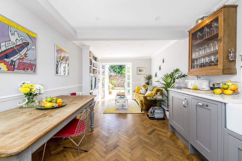
Our kitchen and living room which had previously been at the front, would now be to the rear of the flat with French doors leading onto the garden. The front half of the flat would be two bedrooms, with an internal bathroom in between. Having saved hard for 18 months, we nearly had all the money in the bank and were ready to go.
In August 2013, the works started. It was impossible for us to live in the flat as the builders were knocking down virtually every internal wall and rebuilding it in a different place! Luckily, there was a spare room in a rental flat my father-in-law owns in Parsons Green, so we moved in rent-free to live like students again. It is worth noting at this point that my wife was four months pregnant, so I was under huge pressure to finish before we had even started! Possibly the most stressful three and a half months of my life ensued – naturally the project took two whole months longer as the floors and ceilings needed replacing throughout. C’est la vie…
The Interior Design Process
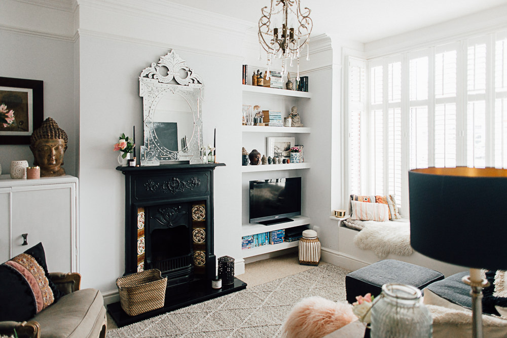
The starting point for the interior design for the property, was the house itself. A Victorian property which had been stripped of all of its period charm and features, I was adamant that I wanted to put all this back, whilst still achieving a light, bright living space and elegant, relaxing bedrooms. Not being one to play safe, I chose a palate of grey as a base, with splashes and blocks of jewel-like blues, greens and oranges was decided upon. Much to the concern of my wife…
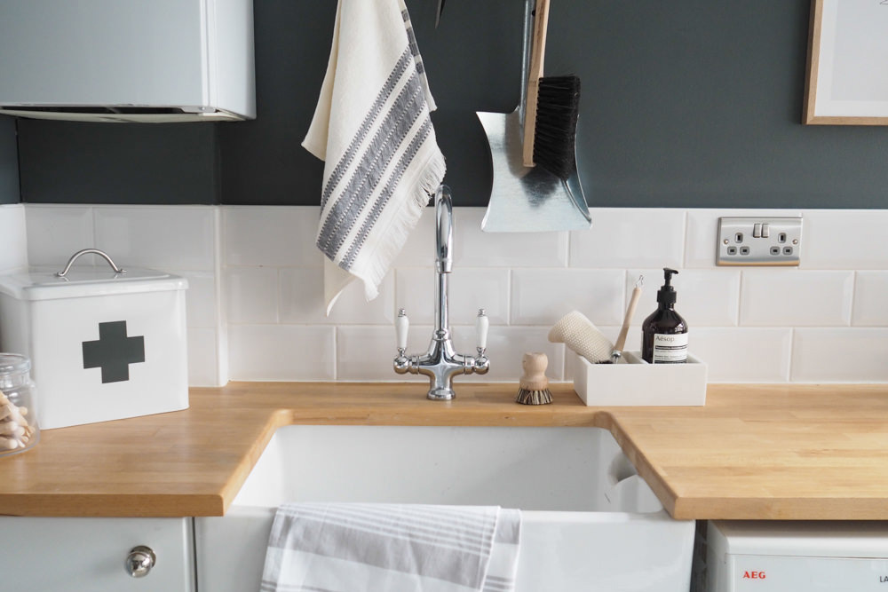
With this in mind, I set about working out how to spend the budget. The kitchen was small, but I wanted it to feel high-end and a bit luxe, so I decided to put the majority of the allocated kitchen money into the work top. By choosing marble with a detailed profile edge, it looked the part and made a fairly standard kitchen look really special. Other touches like bib taps, Belfast sink and separately sourced pewter and ceramic door handles also helped.
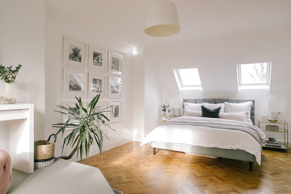
Another big decision was the floor. Over the years, the flat had been knocked around so much, none of the original boards had survived. I have always had a fondness for parquet flooring as it’s so versatile and can make a small space seem larger. The texture it offers too is really stunning. With all flooring, it’s important to think about your scheme and to tailor the finish to it. I decided on a tumbled oak, which gave the impression it had always been there as the edges were a little roughed up.
Replacing the dado, skirting, picture rails and coving also make a real difference – especially in the hallway where a bold colour made for a real statement entrance. Clever use of a mirror here helped to disguise the upstairs stair well, and gave the impression that the chandeliers went on, and on, and on…
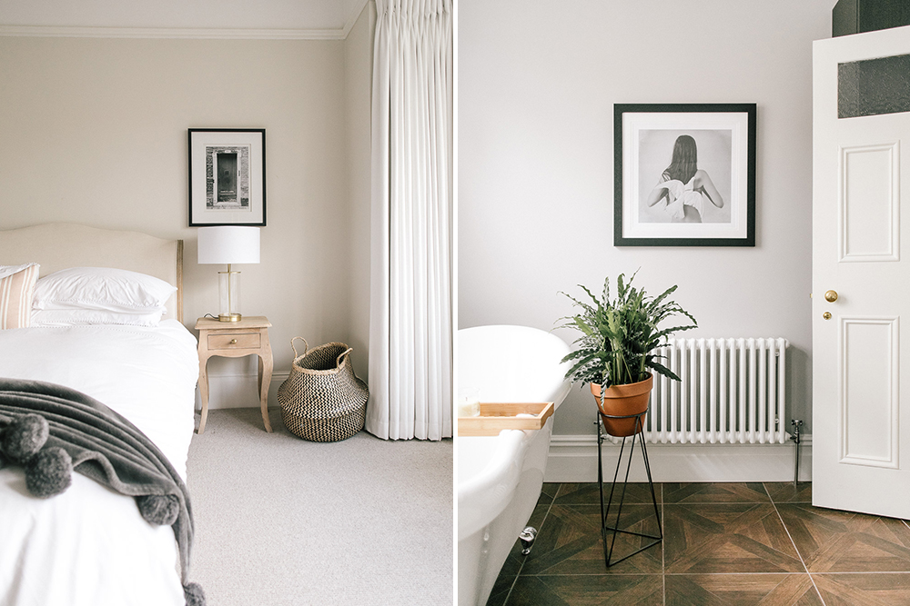
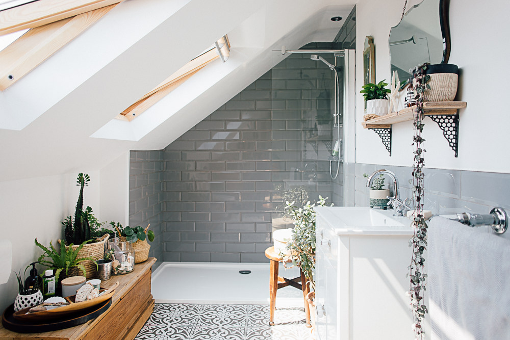
The bathroom too was a bold scheme, with stunning, period style fittings soured from the excellent Glass Trends bathroom specialists, dark wood and chrome being highlighted beautifully by a rich, opulent green.
I wanted a real feeling of luxury in the main bedroom, so a deep, rich grey on the walls was offset with pure white detailing and splashes of deep orange. Thick carpet, also in a dark grey helped the overall feel, and was so nice underfoot!
The flat was such a lovely place to live, and practical too. As we had completely gutted the place, we had the opportunity to really think about what we needed (and wanted) regarding storage. Everything was built in, so we had virtually no free standing pieces which could clutter up an already pretty small space.
All in all, we have enjoyed living there a huge amount. Now, though, it’s time to move on. Our little boy is now nearly two and he needs more space – inside and out! We moved into our new house in Roehampton three weeks ago, and works started last Tuesday to make this four bed house a lovely, light, bright more contemporary home.
Here we go again…
{STEAL THE STYLE}
[show_shopthepost_widget id=”1206651″]

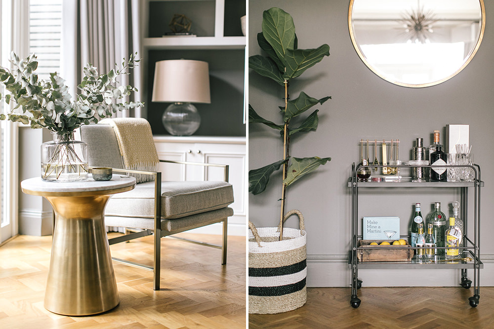
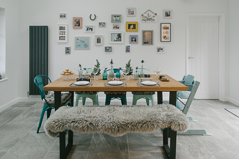
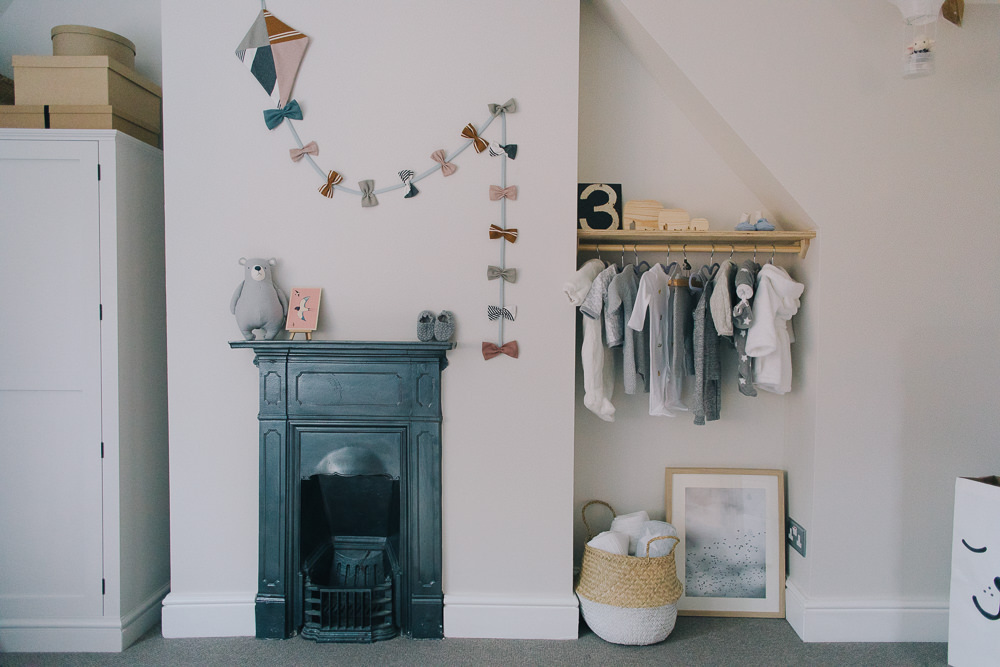
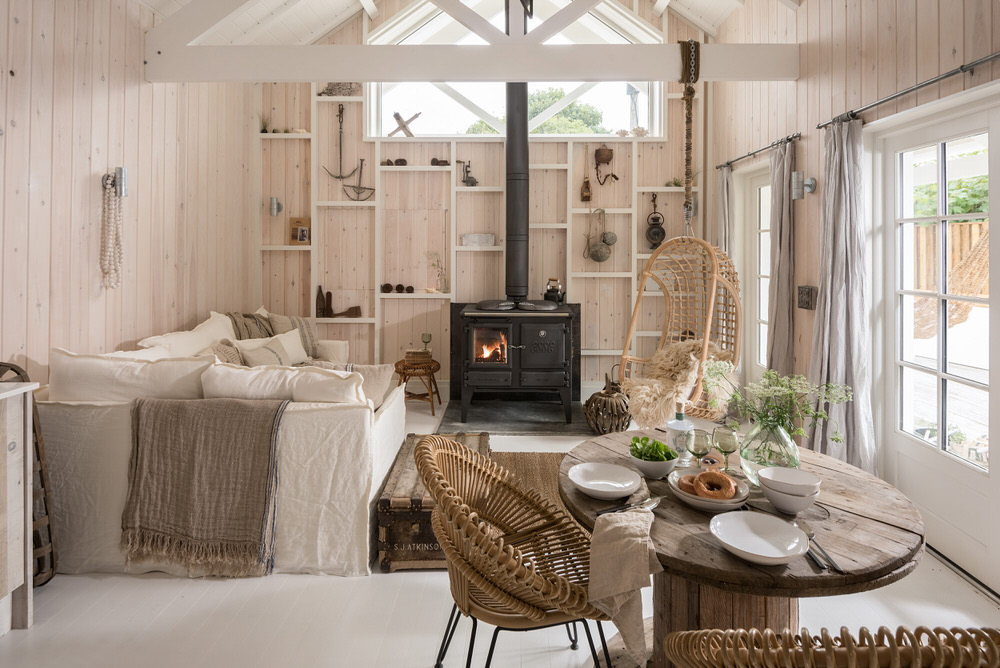
LOVE this flat! Having been a visitor myself I can say that it is a truly lovely space and how Maddie and Greg changed it in to a 2 bed is really rather amazing. I couldn’t quite understand how they were going to turn it in to a 2 bed but Greg worked his magic and you would never know any different. It was fantastic. I’m a big fan of colour so I love how Greg has used it on the walls and accessories. Makes me want to repaint everywhere in my house now! xx
This. Is. Stunning. Greg’s done such a beautiful job and it sounds like him and his wife make a brilliant team – I think my husband would be furious if I put an offer in without speaking to him! Lots of interior eye candy going straight on my pinterest! x
Mine too Rebecca!
Looks like Maddie made the right decision though. A winning team!
Who would have guessed it used to be a one bed! Such clever and stylish use of the space. Would have loved a good old before and after as it sounds the transformation was nothing short of amazing.
Hopefully you can get an idea of the original space in the second pic in the slider. I appreciate they’re small images though!
I agree so clever and stylish x
Gorgeous…lots of lovely inspiration here. I’m often scared to use such bold colours but here, it looks fabulous and is certainly food for thought. I love the mustard/gold sofa and the wooden logs in the shelving unit. Just lovely! Thanks for sharing.
I love the combo of the bright shades and the muted tones. Works so well together.
I don’t suppose there are any details on sourcing parquet flooring? Desperately want to fit it across our downstairs
Hi Chloe
Thank so much for your comment and your interest in the project. The floor was really important to get right, and it’s lovely to hear that you like it.
I sourced it from here http://www.naturalwoodfloor.co.uk, though if you are looking for something specific, do let me know and I might be able to point you in a better direction.
I chose a aged, tumbled block rather than a clean cut. It looks older straight away, so it looks original.
Hi greg i am interested to see your floor plan as i am looking to convert too for the same reasons
Hi Daniel, thanks for your comment. I’m sure I have the floor plans before and after. If you email me at gregorymiller@design-club.co.uk I’ll see what u can do.
All the best,
Greg
Ditto Chloe – would love to know where Greg sourced the flooring. It’s stunning and looks as though it’s always been there x
I absolutely love this flat and the clever use of colours. Lots of inspiration!
Just gorgeous. I love the open plan kitchen area so will definitely pinning this for future inspiration. Amazing.
This is stunning! Incredible work x
Love the flat, I could move straight in and would not want to change a thing.
Would you recommend your builders? I live in a house in Clapham Junction SW11 and we have been struggling to find a builder we trust to renovate the place.
Thanks!
Hi Bindy,
I’d definitely recommend them. I use the, for all of my projects, professionally and privately. They’re really fantastic and their attention to detail is superb. I’d be happy to make an introduction if you’d like? Email your details to gregorymiller@design-club.co.uk and I’ll happily help in any way I can.
Greg
Beautiful flat, love what you have done!! Please could you let me know what the grey paint colours you have used are?
Hi Evie,
Thank you for your lovely comments! The grey in the living space is Ammonite and the main bedroom is in Manor House Grey. Both by Farrow and Ball. Grey works so well with spashes of colour, and really well when combined with the pure white painted detail features, like the picture and dado rails.
People often think grey will be cold, but if you choose the right tone, it can be warm, luxurious and very elegant indeed.
Happy paining!
*painting!
Love this house transformation! I’m looking for a kitchen like this – would you mind sharing where it’s from please?
Hi Jenny,
Thank you so much! The kitchen was one of my favourite things about the flat. Because we had a tight budget, I sourced the different elements from different places. The carcasses and doors were from B&Q, from the Cooke and Lewis range. The worktop was the the most expensive part, but it made a huge difference, so money well spent, I think! It’s marble with a bespoke profile, and I think it looks amazing. It adds an element of high end lux to a pretty inexpensive kitchen, and that combined with the bib taps and Belfast sink gave it real period charm. I chose 150x75mm crackle glaze tiles – slight smaller than the metro tiles which are often used in designs like this – because the space was smaller, their proportions were simply better. The crackle glaze adding a hint of rustic which balanced well with the flea market cabinet we used for our stemware.
If you need any help planning your kitchen, let me know.
Its a lovely flat, beautifully done, but boy it makes me glad I left London house prices behind 15 years ago.
Wow this is gorgeous! I absolutely adore the light and airy feeling and those beautiful bold colours! It makes everything so vibrant and alive!
What an amazing flat love all the greys used throughout! Which grey dos you choose for the nursery and did you paint the kitchen units grey? Again which paint. Stunning
Hi Deb,
Thank you so much for your kind comments. The little man’s room was F&B ammonite, it sits really well with simple white detail and colour really pops. The kitchen colour was a bespoke shade, but the closest colour would be Antimony by Fired Earth. Do let me know if I can help with anything else, and thank you again!
A bit late with the query here but where have you got your fridge/freezer and washing machine? Debating what to do with our kitchen area eg under counter integrated or have a freestanding fridge freezer somewhere and your kitchen looks an amazingly smart solution!
Hi Katie,
Lovely to hear from you!The appliances are all integrated – we have a fridge and a 3/4 dishwasher hidden behind two of those doors. The washer/drier and freezer went downstairs in the cellar – which was a bit of a godsend, space wise! Do let me know if I can help with the space planning
Thanks Greg, we’ll look for an out of the way place to hide some of our appliances!
Nice, I am looking to do the same is there a minimum living space requirement when converting 1 to 2 bed?
Thanks
Hi Jack,
Apologies for not replying sooner, I didn’t see a notification on your comment. That’s a really difficult question to answer without knowing a bit more about you and the property. I’d be happy to chat about it with you though, you can find my contact details on my website http://www.design-club.co.uk
All the best,
Greg
Hi Greg,
Where are the beautiful birds from in to your lounge? They are incredible.
Natalie
Hi Natalie,
Thanks, I love them! They were from a company based in Edinburgh, I think… I’ll see if I can find their details for you.
All the best,
Greg
I have read this feature so many times and just think it is absolutely AMAZING. Fascinated by the interiors from the paint choices to fittings. Did u end up varnishing and painting the existing kitchen doors and where did you source the handles – they are fab. Looking for inspiration to change MDF 90s white kitchen units into something desirable on a tight budget!
Hi Lisa,
Thank you so much for reading the feature, it was such a lovely project to work on!
The kitchen was actually a B&Q range and I think the handles were from Lark&Larks. For more inspiration, have a look at my blogs on my website http://www.design-club.co.uk
Thanks again!
Greg
Hi There,
Absolutely love this incredible conversion! I myself am about. to purchase a very similar ( almost exact) property and intend to do the same conversion to gain a two bed lay out ( although I will add a side return rather than a rear extension as it is a shared garden so I cannot.
My main question is, how did you manage to get ventilation into the bathroom. I have a major fear that it would be an awful damp trap.
May I ask if you have any tips? The second thing I might ask is how long did it take?
I am aware that this may be a very old thread so you may not respond. Here’s hoping 🙂 Best Alicia