Back in May I asked the Rock My Style community for advice regarding choosing a kitchen worktop which would add the finishing touch to our victorian terrace galley kitchen renovation. You responded with tonnes of great advice and suggestions and today I am proud to reveal the new kitchen, complete with before and after photographs.
Before
For the record, neither Lizzie or I thought our old kitchen needed ripping out when we first saw it. I mentioned in my previous kitchen post that upon taking on #thecheltenhamhouse renovation project (As it has now become know as on my Instagram account) the kitchen was the only room we decided didn’t require major work. However, as we started to renovate other rooms in the house the kitchen became a weak link in the aesthetic chain… Add to this a distinct lack of storage (and a lack of dishwasher) and the argument for a layout rethink started to gather momentum.
Do It Right
What began with a kitchen layout redesign soon escalated into a major room renovation. Once we had chosen our contemporary white handless kitchen we realised that the clean lines of the units were probably going to show up our victorian wonky walls and ceiling. So, the ceiling came down and the walls were stripped back to bare brick. We toyed with the idea of leaving one wall exposed but the brickwork was in such poor condition (check out the evidence here) that we decided to re-plaster. The red brick flooring also had to go, it was an original feature so it was a shame to rip it out but it had been so extensively damaged (And repaired with red painted concrete!) over the years that I didn’t feel too bad about giving it the old heave-ho. To finish the job properly the room was re-wired and all previously exposed pipework and wiring was hidden away.
All of this preliminary dirty work added considerably to the total job cost but I feel it was the right thing to do. Not only do we have a new kitchen, we have what feels like a completely new room.
Space & Light
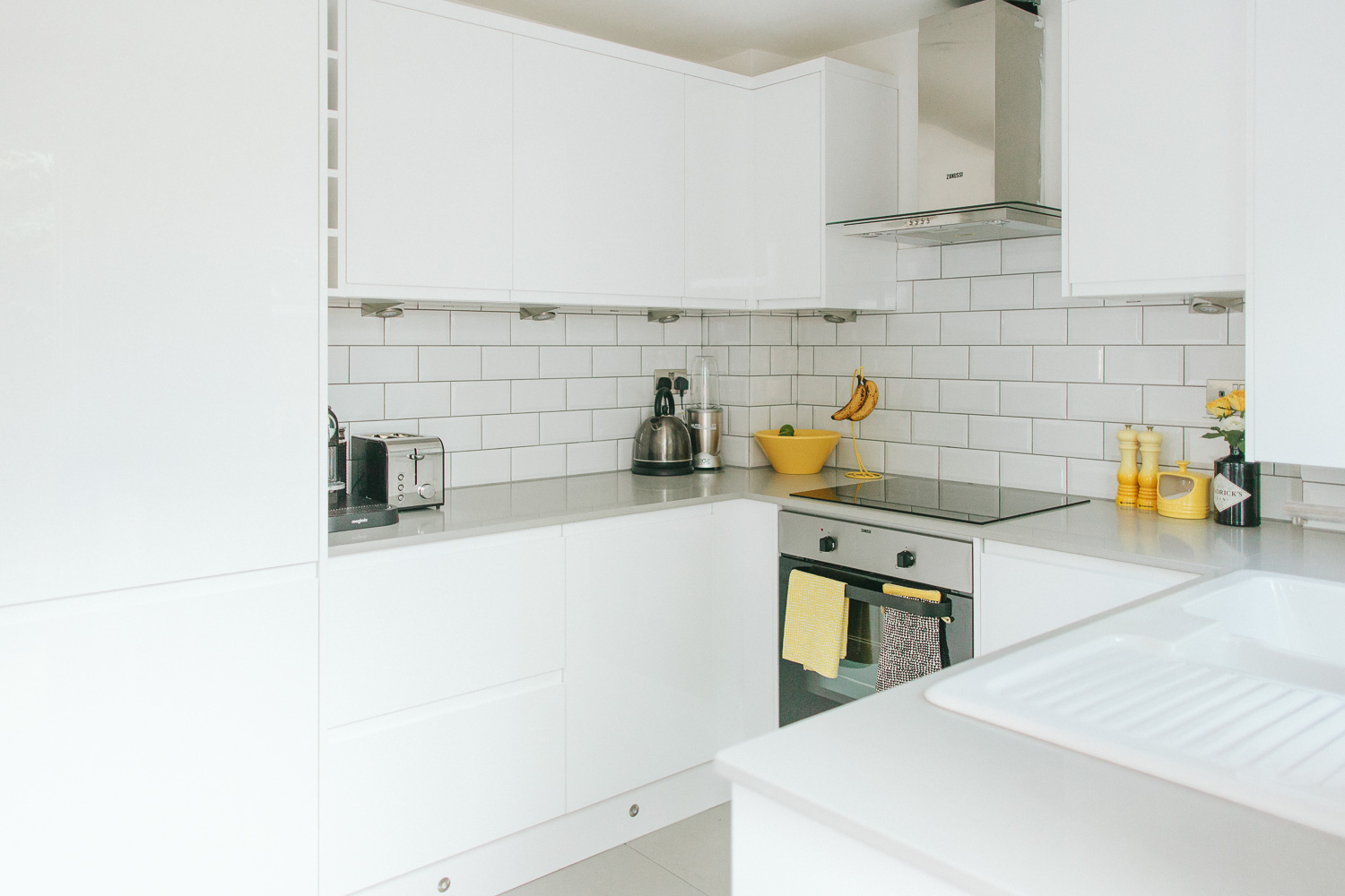
The biggest change in the new kitchen is the layout. we moved from a Galley kitchen layout to a C shaped layout. Although this meant losing floor space it increased storage and usable space. The kitchen feels larger due to the light, bright colour scheme and when standing in the room now it actually feels like a different shape. The old kitchen felt narrow like a thin rectangle; it surprised me when drawing up plans right back at the start of the project that the room is near enough square… I had to go back and check my measurements! With the new C shape layout the room feels spacious. One small decision that really opened the room up was to not have any wall units on the right hand wall. In the old layout a wall cupboard closed the room off blocking all important light from the rooms single window.
Convenience
The new layout has given us enough space to add a slimline dishwasher to the immediate right of the oven and we have also gained storage space by opting for a full height slide out pantry which sits next to the full height integrated fridge-freezer. Of course full height units mean less work surface but we’ve added worktop across the back wall and so retain as much usable work surface space as we had previously.
Finishing Touches
All of the tiles were sourced from Tile Mountain, I found their range and price to be excellent and although I was sceptical about shopping for tiles online, they make it really easy with free samples with next day delivery. The bonus of being sent samples is that you can judge them side by side in situ. For the floor we went for Doblo matt grey porcelain and the walls were treated to white metro tiles, in both cases we used a mid grey grout.
The big decision in which the RMS community helped enormously which material to choose for the worktop. Laminate, Solid Wood, Composite, Concrete or Solid Stone? We dearly wanted the industrial edge that concrete would have provided but the budget said no. In the end we chose a light grey quartz that looks enough like polished concrete. The slim 30mm profile is modern and works really well with the handleless cupboard design, the colour is also a near perfect match to the floor. The worktops were purchased from, and expertly fitted by, Hatherley Worktops a local company who deserve a massive shout out because they were incredibly helpful, did a fantastic job and were unbeatable on price. The thing I really like about the worktop is that as it is made to measure it extends into the windowsill area without a join. This makes me far more happy than it realistically should.
Finally, the colour scheme – we wanted to keep everything as light and bright as possible to maximise the space and I think we’ve achieved this. We did discuss adding a really strong accent colour to either the units, the worktops or the tiles but in the end we decided that as #thecheltenhamhouse is not our forever home that in the interest of renting or selling down the line it would be best to keep the structural fixings neutral. Instead we’ve added a flash of sunshine yellow to the non permanent pieces. Some were purchased in that hue, others – like the Philippe Starke lemon squeezer, were painted by yours truly.
The Kitchen Renovation Cost
For those interested in the project costs I’ve broken them down roughly as follows:
Kitchen units & appliances £5000.00
worktops £1500.00
Plastering, carpentry, electrical and prep work £2000.00
Kitchen installation, flooring and wall tiling £3500.00
If you have any questions regarding the renovation, the logistics or indeed anything else that I have mentioned please do get in touch via the comments section below. You can see some images from the renovation “in-progress” over on my instagram account @adamcrohill.
Adam x

Love love love it. I know what you mean about not having a join at the window sill, this would please me too.
Great work!
Thanks Rebecca, small things eh? 😉
What a transformation love it! Would you mind sharing where you got the sink and radiator from looking for something similar thanks!
Hi Claire, The sink is by Villeroy & Boch and the radiator was from Best Heating
Love it, just about to do ours so need a tip? Where’s the sink from? I can’t find it
Hi Ines… The sink is by Villeroy & Boch
Looks amazing! Totally transformed the room. And also love the yellow in the accessories – we have all the Le Creuset bits you have in Almond and Flint!
Great job you must be thrilled.
Thank Milly – gotta love a bit of Le Creuset 🙂
Gorgeous. The details are perfect. I particularly love the sink, and the yellow accents make everything pop.
I’m off to Le Creuset at lunchtime for one of those salt pigs!
Our salt pig was actually baby blue… But then it got a coating of Bright yellow spray paint from the Rustoleum “Mode” range 🙂
Oh Adam. Curse you and your craftiness! 😉
The internet suggests that a yellow version exists, but I can’t find it available to buy anywhere. Boo. Pretty sure my spray painting abilities wouldn’t be up to standard.
What a transformation, you must be thrilled. Looks amazing. Can I ask a very random question – what colour is your back door painted please?!
Hi Anna – Ha! I can find out for you…. I’ve still got the tin somewhere in the cellar… I’ll drop a comment later on today for you 🙂
Ah thanks so much Adam.
Hi Adam, I absolutely love your new kitchen it’s gorgeous. You two have good taste! I also love your honesty about the cost!! I love reading house renovation blogs but the most important question that people want to know when you want to take on a big project and make it similar to the one you read in a blog is “how much will it cost?” so a huge thank you for that! It makes me reconsider renovating my kitchen!
Marine – thank you so much for the positive comments… I think we could have done the renovation more cheaply but for us the room needed a lot of prep work in order to get the level of finish we needed to justify making this kind of investment…. I’m glad you found it useful.
[…] our very own Adam has been sharing his kitchen makeover. I think he was inspired by the sunshine with all those lovely yellow accents. It may give you a […]
I am all over the seamless window cill worktop! Nice touch. We are planning our kitchen-diner reno and it is nice to gather some inspiration. We also have our own hashtag on the go #oldmanseproject – only a few posts so far as we are throwing a few 10Ks at a boring new roof.
Did i mention husband works for the company who makes hendricks? (F R E E G I N)
Hi Sarah, thank you and good luck with the project… Any chance of throwing a couple of bottles of gin my way? I had this idea for having miniature Hendricks bottles as wedding favours for my wedding this September… It would have looked amazing but with 100 guests it was going to cost almost as much as the kitchen renovation 😉
it would be very you to do Hendricks miniatures – I have asked the Mr if they are available in the staff shop – i’ll let you know yes/no and the damage!
Sadly i don’t like gin………….!
Looks fab Adam love the yellow! also lusting lusting lusting over your dining room floor!! Looks original? Can’t wait to see more. Rebecca x {from the house you photographed last year}
Hi Adam, the kitchen looks fabulous, you must be so pleased. This … ” it extends into the windowsill area without a join. This makes me far more happy than it realistically should.” … made ME far more happy than it should (as did the other commenters) to know I am not alone in my appreciation of the details- my husband thinks I’m a fuss bag. Do you mind me asking where the units were sourced please. We are currently pricing up a complete downstairs refurb and these are the kind of doors I’m after, only with a matt finish (think yours are gloss?) Also, think you made a great choice for the worktops. Now you can enjoy the fruits of your labour!
It looks great! I’m also interested to know where the units/doors are from (forgive me if I’ve missed this) as we are planning to have handleless and I’ve heard worrying things about J-rail designs from the usual suspect big chains….
Wow what a gorgeous kitchen!
Adam your kitchen looks fantastic! I love the simplicity of it all but how it still has character at the same time. The bright white against the yellow le creuset items and your back door looks fantastic, they really pop. I also love the gin bottle with the flower in, it looks great! I’ve actually done a similar thing in my kitchen with a bottle of Merlyn Welsh Cream Liqueur 🙂
Gemma x
The British Feather – A UK Home Decor & Lifestyle Blog
Adam, the kitchen looks amazing, so fresh and bright. Quick question where are the kitchen cupboards from?
Fantastic looking kitchen, such a massive improvement! Was it very stressful? When I had my kitchen done up, I found the whole thing quite invasive.
It all looks gorgeous and…….this is going to be a bizarre request but have you binned the original kitchen units?! It’s from the same range as the one I’ve inherited but it’s been discontinued. I’ve been trawling ebay and gumtree but no luck and I need extra wall units or even just the doors. Can you help?
I just wanted to say that the link to my site is broken above, so I thought that I would leave it here for anyone that would like to pay us a visit. http://www.bestheating.com.
I also want to add that I am in love with all things yellow, so finding this post made my day 🙂 Thanks and happy heating!
Wow looks great! Well done you. I really like the radiator, fits in well. The kitchen is modern but with a nod to victorian style. Perfect for a period house…
[…] View ImageMore Like This […]