It’s fair to say pretty much all of Instagram has a slight obsession with the absolutely stunning home of Rebecca and her husband Ben. We were lucky enough to be invited to the Roses and Rolltop blogger’s old house for a home tour last year and we couldn’t wait to see their latest project, an immense Grade II listed period property. Today Rebecca takes us through the process of updating her light-filled living room from granny-chic to a truly elegant space. Let’s start with the before shots and then I’ll hand over to the Lady of the House.
The lounge was always the show stopper when we first viewed the house, although not in terms of décor – It had a nursing home vibe about it with green carpets, red curtains and numerous chairs dotted around the room! But the size, original characterful features and the huge pretty windows won us over straight away. Once we got the keys and stripped everything back in here, we realised just what an amazing room it could become and we joked that it felt almost like a ballroom! We didn’t need to do anything structural in here so it was a case of stripping out, redecorating, sorting the floors out, deciding on a layout for furniture and replacing the radiators for more traditional style column rads.
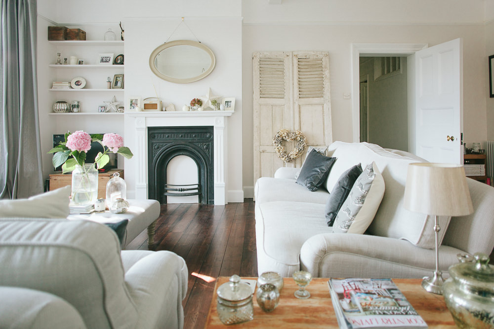
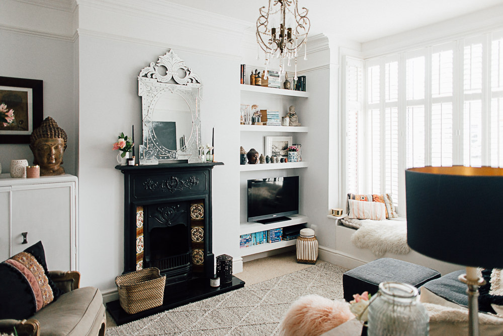
Colour wise, our last house felt very cream and a bit too beige. For this project we wanted a lot more grey and white. We ummed and ahhed about paint colours for a while, it’s a very light south facing room so we didn’t want anything that looked too clinical and cold on the walls but a lot of the greys I tried just looked too brown? In the end, we settled on Little Greene’s Slaked Lime in the mid shade. To me it’s perfect in here, a hint of grey without being too light and still with a neutral warmth. I’m like goldilocks when it comes to paint choices. For the woodwork and above the picture rails we went with pure white {not brilliant white} which gives a crisp contrast. For the floors, which are the original boards, we had them stained fairly dark so that it didn’t feel completely washed out in here.
I’ve always loved shelves in a lounge as an area to display photos, favourite knick knacks and pretty tea light holders so we used the alcove next to the chimney breast to put up shelving. I’ve also always dreamed of a window seat so jumped at the chance to have a seat pad made for the side window. Luckily the was the base already there.
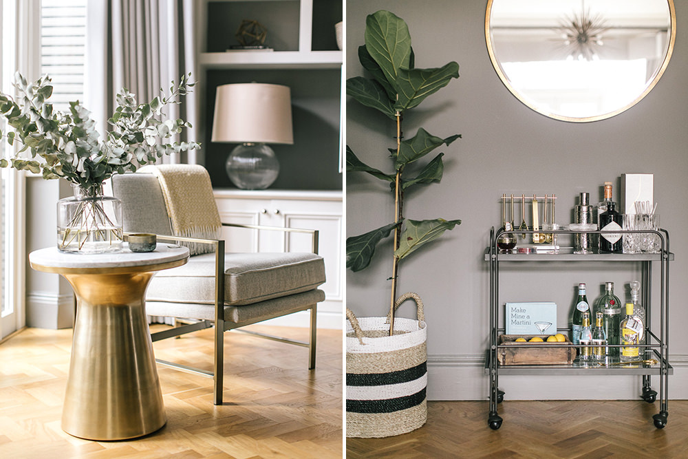
The grey tone on the walls led me to stick with the grey for choosing curtains {Ikea bargains}, the grey fabric for the footstool as well as cushions on the sofas and window seat. I think I’ve talked before about how I prefer to go for neutral colours on the big decisions in rooms but then accessorise with colour that can easily be changed. I’ve added a hint of blush pink through cushions which adds prettiness without being too girly and flowers are always great as a centrepiece.
There’s no denying that it’s a formal room so style wise we’ve tried to keep it quite classic and grown up in here. I don’t know about you but when looking for inspiration on Pinterest it can be overwhelming, I love rustic wooden chic, I love Scandi vibes, I love classic English country, I love the new industrial trend and I adore French whitewashed vintage style. How do you choose just one of those styles for a room?? In the end I guess you could say that this room has been created with elements of a few of those styles, based around items that we really love – wooden antique blanket boxes, the old 1920s mirrors, a footstool as a centrepiece and the French shutters which I’d probably run in to save if the house burned down. The shutters were bought on a whim from an antiques market, I had no idea where they’d go but now that they’re in the lounge I don’t think they’ll ever move!
There are still a few changes to make, the marble fireplace and log burner in here is in the wrong place for our sofas so we’ve just got planning permission through to open up the chimney breast in the centre of the room where we’ll install a log burner and then we need to decide whether we want a mantle around it or go for some kind of beam. At the moment we use this room every single day and night but we’re about to start a kitchen extension which will mean we’ll have a kitchen/living/diner where I feel like we’ll spend most of our time in the summer. I think then that this room will become more of a winter room or somewhere to escape to after dinner.


Oh well I’m in excellent company with the Lynden sofas aren’t I? So much love for all of this!
I’m going out on a limb to say this is the most glorious living room I’ve ever seen.
I’m going to sit here gushing over it for a while… but I also have a really practical and boring question. Where did you buy those castor cups for the sofas Rebecca? Every transparent set I buy just crack under the weight of the Lynden (and Lee’s bum) so we have ugly rubber ones.
Sorry… back to my starry eyed adoration… ☄?☄
Karen, this is an excellent question! James is always blaring out at me that our Lynden is denting the wooden floor #firstworldproblems.
I’m with you on the gloriousness of the room. I don’t think I’ve ever been in such a serene space x
Our current castor cups are a hideous beige rubber… I feel bad for even bringing it up when we’re looking at such a lovely room! ?x
Ebay! Clear castor cups to protect the precious floor! Xx
Hi Karen, oh thank you SO much. What a lovely compliment!! We’re lucky that the windows do the talking in this room so we can’t take all the credit for it and thank the victorians for building it like this. We got the castor cups from eBay xx
There’s nothing not to love in this room. I’ve been following Rebecca’s blog as well but never get tired of seeing photos of her beautiful home. I love how much difference the new layout has made, the space feels totally different and a lot more cosy while still being a spacious room. Well done x
Thanks so much Kat! So kind of you to say xxx
I’ve been waiting for this for a few weeks now (the tease has been strong RMS folk!)
I agree with Kat, such grand scale but also so cosy – and of course beauty. No wonder Rebecca has us all swooning.
Also banging photos, Adam! You’ve really got the knack for home tour pics, I always love them
Xx
Thank you Nicola! Cosy is exactly what we wanted to achieve in this room because of the size so I’m glad you think that. And I agree, I’m in love with Adam’s photography xxx
A fab cosy and homely living room.
Where are the rabbit/hare pictures from?
Hi Selina thank you. They’re from Cox and Cox xx
Ah Rebecca, everything is just sublime. Such a gorgeous, gorgeous room. My absolute favourite has to be the window seat. What an amazing feature lovingly restored. The before pics are crazy. You’ve really put your stamp on it. House goals right there xxx
Thanks so much Lorna. I get a bit disheartened looking at how much we still have to do to the rest of the house but then look back at these before pics and feel all inspired again! Xx
This room is just perfect! The paint on the walls is gorgeous – may I ask what colour was used on the woodwork?
Hi Ali. Thank you. Yes we used dulux white eggshell. Not brilliant white, just white x
http://www.rosesandrolltops.co.uk
So much love for this room. It is perfection. Also, I now feel in excellent company in my Habitat Hare cushion choices 🙂 xxx
Thanks Lottie! I love those cushions so much. Habitat has left my local Homebase recently 🙁 but think they’re still going strong online x
[…] you catch Roses and Rolltops blogger Rebecca’s living room tour yesterday? Blinking beautiful. As is her Instagram feed, where I spotted this uber-cute […]
Utter gorgeousness! Just ordered a couple of the hare cushions- well, imitation is the sincerest form of flattery ?!!
Totally my style. I love it! I could move in today. Ha ha
Great transformation! Love it.
Sofas are lovely. Can you please let me know the name of the fabric? Thanks. X